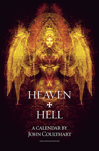
Painting from the poster art for The Highbury Working (2000) by Alan Moore & Tim Perkins.
Unlike last year, this year’s CafePress calendar arrives on time, its creation being eased by the fact that it’s a reworking on an earlier version. The idea with the previous Heaven & Hell calendar had been to alternate various pieces of infernal Cradle of Filth artwork with contrasting imagery; as things turned out I had more offerings for Hell than for Heaven—no surprise there—so the reality wasn’t very satisfying.
This year I’ve managed to fill out the Heaven sequence with more recent works, all of which have been slightly adjusted to fit the square page ratio required by CafePress. So even though these are old pieces many of them are unique to this printing. Larger copies of the pages may be seen here while the CafePress purchase page is here. As always, my thanks to everyone who buys these things.
And as before, the calendars for previous years are now available all year round; see the full range here. Note that this means you need to select January as the starting month if you want the months to run for a single year only.

JANUARY: Variation of the poster art for Angel Passage (2001) by Alan Moore & Tim Perkins.
Angel Passage was Alan and Tim’s album about the life and work of William Blake. I designed the CD, a poster, and also produced a video for the multi-media performance of the piece at the Purcell Room, London, in February 2001.
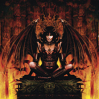
FEBRUARY: Cover for Bitter Suites To Succubi by Cradle of Filth (2001).
My first piece of Cradle of Filth art. I was a little surprised when working on this that they really did want the wings and horns; Dani loved that kind of imagery. I was even more surprised when this cover was subsequently showcased in an entire window in Tower Records’ main London shop in Piccadilly.
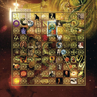
MARCH: Interior art from Snakes And Ladders by Alan Moore & Tim Perkins (2003).
Snakes and Ladders was more London psychogeography, the theme this time being people associated with Red Lion Square. The game board inside the CD insert was an attempt to cram as many of Alan’s references as possible into 100 numbered squares.
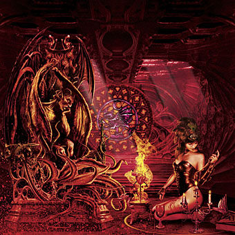
APRIL: Cover for Lovecraft And Witch Hearts by Cradle of Filth (2001).
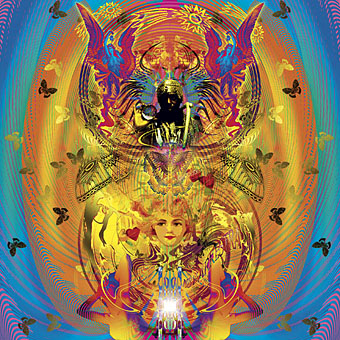
MAY: Variation on MBV Arkestra from the cover of Arthur magazine, issue 7 (2003).
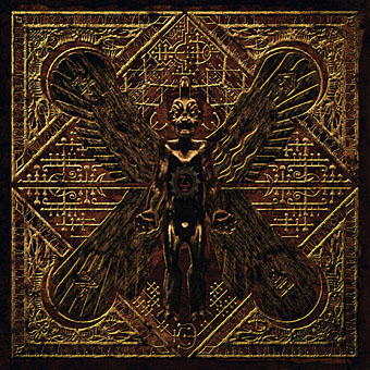
JUNE: Cover for Live Bait For The Dead by Cradle of Filth (2002).
Everyone’s favourite Assyrian demon, Pazuzu, reworked for a cover design. The CD booklet was a complicated affair printed on a series of transparent sheets, a packaging idea the band swiped from Tool’s Lateralus album. According to Wikipedia, “in his author’s bio in the first issue of Warrior magazine in 1982, comic book author Alan Moore claims to be ‘possessed by the demon Pazuzu'” so this also fits with the Moore-related things.

JULY: Variation on the front cover art for Dodgem Logic magazine, issue 4 (2010).
And speaking of Alan Moore, a slight reworking of the cover art for Alan’s magazine.
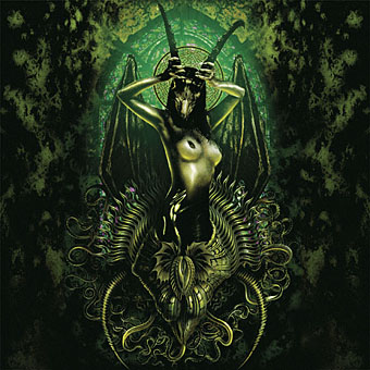
AUGUST: Cover for Eleven Burial Masses by Cradle of Filth (2007).
This was originally produced as part of the insert art for Heavy Left-Handed And Candid (2001), a live DVD, but was later reused for a live album cover. As with Bitter Suites To Succubi, this began life as a photo of a model by Stu Williamson which I had to work up into something suitably diabolical.

SEPTEMBER: Variation on the back cover art for Dodgem Logic magazine, issue 4 (2010).
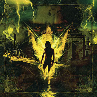
OCTOBER: Cover for Damnation And A Day by Cradle of Filth (2003).
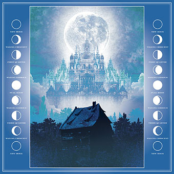
NOVEMBER: Cover for Somnium (2011) by Steve Moore.
The novel by the late Steve Moore has a lunar theme so rather than crop the picture I filled out the sides with diagrams of the phases of the moon.
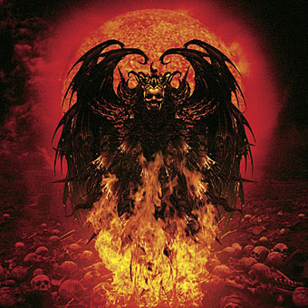
DECEMBER: Cover for Peace Through Superior Firepower by Cradle of Filth (2005).

Every time I see that ‘Somnium’ cover in the side-bar it merges in my mind with Cliff Nielsen’s contemporaneous cover for Gene Wolfe’s “The Magician’s House”.
http://www.isfdb.org/wiki/images/c/c1/THSRCRRSHS2010.jpg
(distorted in my memory by the earlier cover art for the same author’s “Castleview”).
I am surprised that no-one has commissioned any Wolfe-related work from you.
This is ALL KINDS of awesome!
herr doktor bimler: That’s one I’d not seen before. For Steve’s cover I had Wilfried Sätty’s collage art in mind (for a change…). His depiction of Poe’s Haunted Palace is pretty unique:
http://www.johncoulthart.com/feuilleton/wp-content/uploads/2010/10/satty_poe05-big.jpg
Regarding commissions, there are many factors at play: personal style, suitability for the subject, etc. Art directors often pigeonhole you unless they know you can work well in different areas. Lately I seem to have been pigeonholed as steampunk even though I only fell into the subgenre by chance.
Thom: Thanks!