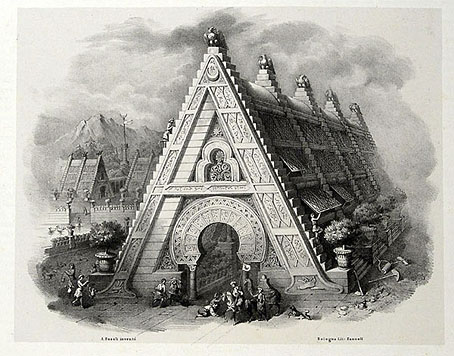
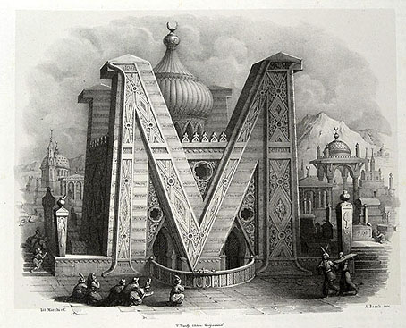
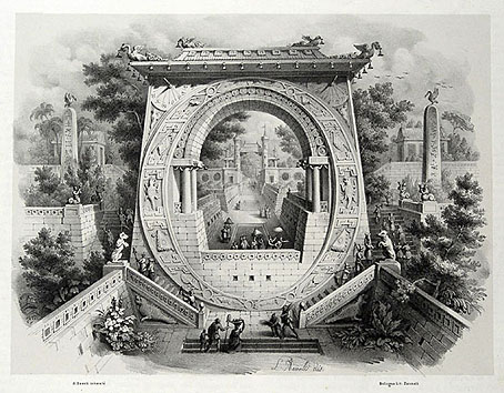
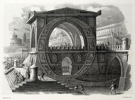
My thanks to Paul Rumsey for reminding me of the Alfabeto pittorico (1839) by Antonio Basoli (1774–1848). This is the same idea as yesterday’s pictorial alphabet but with an architectural theme. Basoli’s series of prints depicts each letter in an architectural style which matches the initial: A is for Arabia but also for aranciera (orangery). The attention to detail and the rendering of light and shade is very Piranesian, and it so happens that Piranesi had earlier designed a small number of capitals for use in books, the letterforms being created by architectural scenes. It’s tempting to see Basoli’s series as an elaboration of this idea done in the manner of Piranesi’s Prima parte di Architettura e Prospettive.
Given how much I enjoy this kind of thing I would have posted something about them by now, but seeing as they’d already been covered by the late-lamented Giornale Nuovo I stayed my hand. Mister Aitch’s post on the subject is still worth a look for the detail he supplies regarding the prints and their creator. For scans of the entire volume, go here.
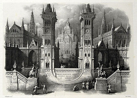
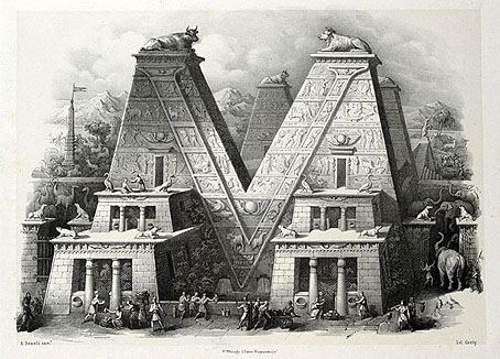
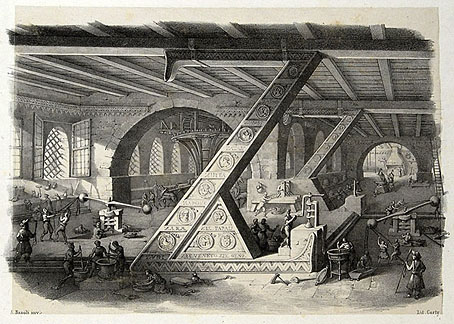
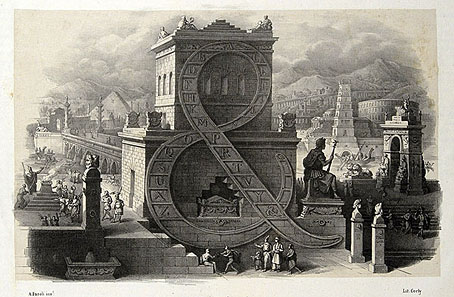
Previously on { feuilleton }
• Grand capitals
• Paulini’s mythological alphabet

The other series of architectural alphabet included in the Antonio Basoli book which I mentioned in the last post, is by Leopold Muller and Antonio and Giovanni de Pian. These are in colour, and do not have the vast Piranesi scale of the Basoli series, each architectural letter looks as if about 12 foot high.
I have a book, just on this series, called ‘Ein Schmuckalphabet aus Wien’, Stuttgart 1973.
You can see most of the series here….
http://www.antiquariat-franziska-bierl.de/dekorative_graphik/alphabet
PS, if you ever want to do a post on the Muller / de Pian architectural alphabet and can’t find good enough images on the web, I can do scans for you.
Thanks, the copies at the auction site are fine. I prefer the Basoli pictures but the others are still fascinating and inventive. Also good to see some fresh examples of this kind of thing.