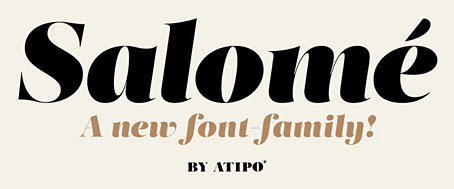
This isn’t the first font that’s been named after Salomé but Salome (without accent) by Rebecca Alaccari and Patrick Griffin was a revival of an earlier design, Cantini, from 1972, whereas Salomé is an original creation by Spanish design studio Atipo. The Atipo design itself owes something to the 1970s being reminiscent of François Boltana’s Stilla (1973), albeit without the eccenticities that make Boltana’s typeface so redolent of the period. Salomé comes in four styles, all of them variations on the extra-bold weights of Didone typefaces.
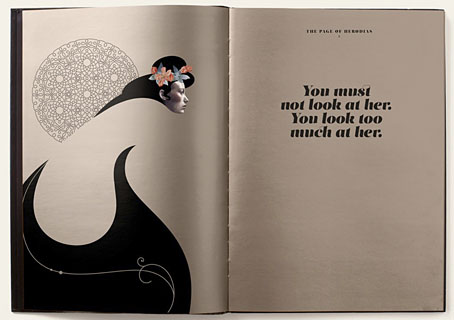
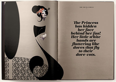
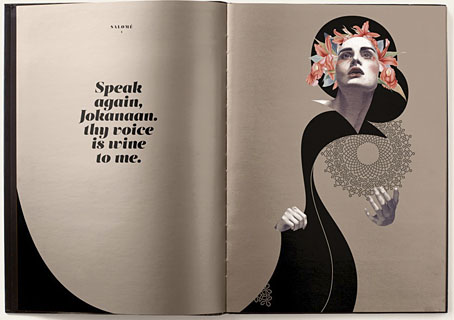
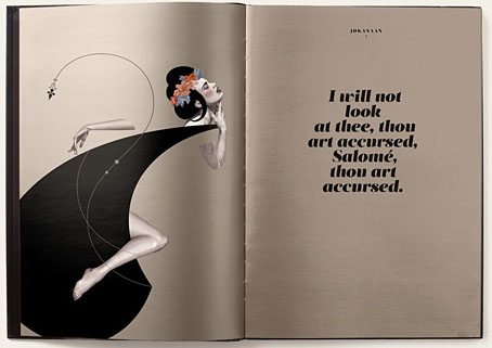
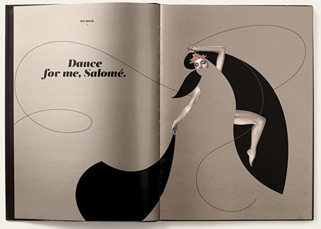
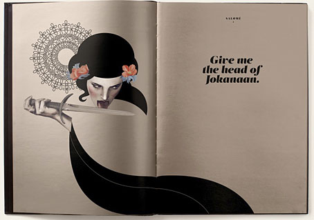
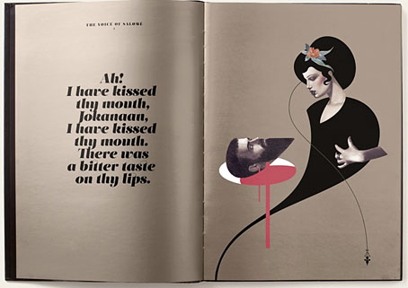
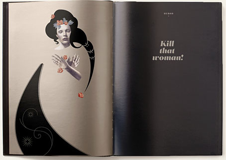
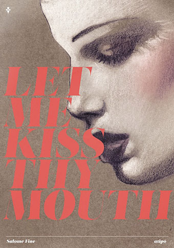
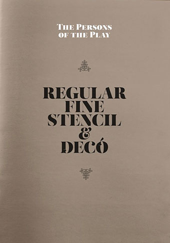
Having a predilection for this look the design appeals to me even without its associations. Atipo add to the attraction by promoting their font family with some gorgeous illustrations juxtaposed against quotes from Oscar Wilde’s play. None of the poster designs or the booklet pages below are credited on the website. The on-screen booklet highlights significant moments from the play with illustrations that manage to be Beardsley-like without going down the pastiche route. This is the way to show off a new font design, it’s just a shame the booklet isn’t available as a pdf. The icing on the cake is that the regular style of Salomé is available for free so long as you help promote it via Twitter or Facebook. The complete family is available for a very reasonable price. Now I have to find something to create that’s worthy of the design.
Elsewhere on { feuilleton }
• The Salomé archive

Fabulous illustrations!