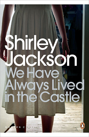
Penguin, 2009. Photo by Lisa Johansson.
Having recently re-read Shirley Jackson’s The Haunting of Hill House (1959) I thought it was about time I read her final novel, We Have Always Lived in the Castle (1962), and I’m very pleased that I did. I was less pleased, however, with the cover of the current edition from Penguin which, like many of the recent Penguin Classics, aspires to a kind of evasive blandness. There are recurrent problems in designing covers for books of exceptional quality: the more the writing opens itself to interpretation, and refuses to be easily categorised, the greater the challenge of finding a single design or image which might represent the book. It’s this that leads literary novels, classics especially, down the road of the text-only cover.
We Have Always Lived in the Castle may be of exceptional quality but it’s also very strange, dark and disturbing, something which the Penguin cover does little to communicate. The opening paragraph doesn’t match the justly celebrated opening of The Haunting of Hill House but it still sets out its stall in no uncertain terms:
My name is Mary Katherine Blackwood. I am eighteen years old, and I live with my sister Constance. I have often thought that with any luck at all I could have been born a werewolf, because the two middle fingers on both my hands are the same length, but I have had to be content with what I had. I dislike washing myself, and dogs, and noise. I like my sister Constance, and Richard Plantagenet, and Amanita phalloides, the death-cup mushroom. Everyone else in my family is dead.
Merricat (as her sister calls her) neglects to mention that they live with one other member of the family, Uncle Julian, a wheelchair-bound survivor of an unresolved poisoning that killed the rest of the family six years earlier. Julian devotes himself to obsessively writing an account of that fatal day while Constance works equally obsessively in the kitchen of the house they share. Mary does little except run errands to the nearby village (whose populace she hates and fears), and play outdoors with her cat, Jonas. Mary is the focus of the novel, a character as painfully introverted as Eleanor in Hill House but with more self-possession and some dangerous obsessions of her own. Joyce Carol Oates in the afterword to the current Penguin edition calls her a witch, which she is in a very diffuse sense. She protects the house with objects that she turns into charms, buries other significant objects, and selects words at random which she believes will protect her. Unlike Hill House there’s nothing at all supernatural in We Have Always Lived in the Castle but Merricat successfully predicts that change is going to disrupt the happily insular household which it does with the arrival of boorish cousin Charles.
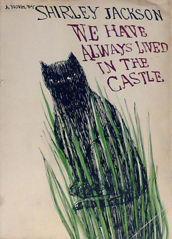
First edition, Viking Press, 1962.
What’s notable for me when looking at earlier cover designs is seeing how much more successful the original covers are compared to later editions. The drawing of Jonas on the jacket of the first edition is suitably wary and even baleful, as Merricat is where strangers are concerned. The lurching, uneven script reflects the skewed lives of the novel’s characters. The cover could have been the work of Merricat herself.
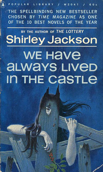
Popular Library, 1963. Illustration by William Teason.
And it’s Merricat who appears on the first paperback edition. I tend to disapprove of the depiction of central characters on book covers but this addresses the challenge brilliantly: the wild hair, the suspicious eye, the charred wood (there is a fire in the second half of the book), and the spikes which give her cat-like ears.
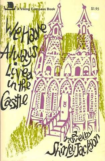
Viking Books, 1970. Cover by Gail Garrity.
Foreign-language editions have shown the isolated New England house on their covers but this is one of the few US editions to do so. (Note the cat-head door-knocker.) This is surprising considering that the house is the “castle” of the title, and the narrative hardly leaves its grounds. The more common trend, as shown below, is to try to depict the two sisters, with varying results.
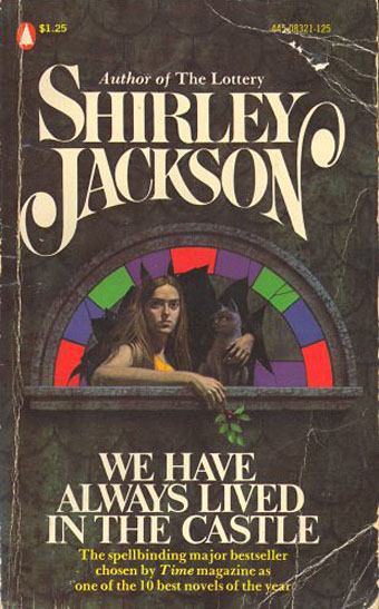
Popular Library, 1982 (?)
This edition is from a set of Jackson paperbacks with uniform covers. If you have to show Merricat then this one works well enough. Whoever the artist was they seemed to have looked at William Teason’s cover: she’s holding a plant (a raspberry branch?) and has two ear-like fractures poised above her head.
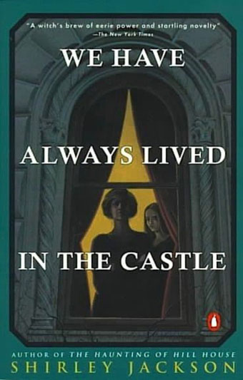
Penguin, 1984.
This edition, on the other hand, gives the wrong impression where the characters are concerned. Constance looks too old, and wouldn’t go near the window like this.
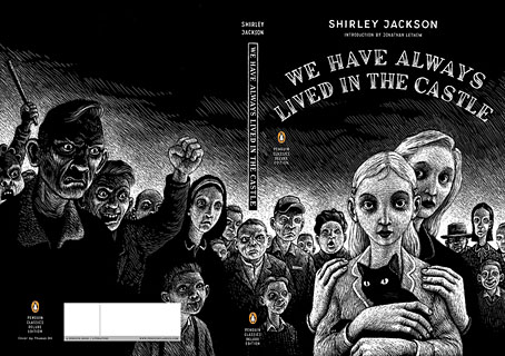
Penguin, 2007. Art direction by Herb Thornby, illustration by Thomas Ott.
This is the kind of careful, detailed design and illustration I hate to dismiss but I don’t think it works for this novel. It may be the only one to include the crowd of angry villagers—the malevolence of crowds was a recurrent Jackson theme—but the drawing style is too light and cartoony for the subject. I’ll damn it with faint praise and say it’s better than the bland 2009 edition.
There are many more Shirley Jackson covers at The Shirley Jackson Book Cover Project, and more covers for We Have Always Lived in the Castle at GoodReads. And now I want to read some of her earlier novels.
Elsewhere on { feuilleton }
• The book covers archive

John, I’ve never really liked photographs on book covers anyway.
My own favorite of Jackson’s novels (although I will concede it’s probably not as good as the two you’ve read) is THE SUNDIAL. A family and certain guests move into a secluded mansion waiting for the end of the world. A madder crew you will never see.
I am happy to report that Penguin is also bringing out a new edition at the first of the year after the book being out of print for many years. The cover is a drawing of a..wait for it…a sundial, not very imaginative or nearly as effective as the original Ace paperback.
I’ll be interested in what you think about it.
The poster for Mario Bava’s final movie ‘Shock’ “borrows” quite heavily from William Teason’s ’63 cover. http://ilgiornodeglizombi.files.wordpress.com/2012/03/schock_transfert_suspence_hypnos_john_steiner_mario_bava_005_jpg_geph.jpg
Stephen: Thanks, that was one I had in mind. By the way, sorry I’ve not put The Weird cover on CafePress yet, I’ve been very busy working on a new Lovecraft anthology.
Vadim: I spotted that one when searching for covers, don’t think I’d seen it before. I can’t think of any other examples of film posters stealing from books in that way.
Off topic: have you bought Brian May’s Diableries book yet? Thoroughly recommended: http://www.diableries.co.uk
Evasive blandness is up there with narrative mediocrity to describe current msm publishing mindset.
John, women buy fiction more than men and I guess this is some value neutral attempt to sell a ghost story?
I buy NYRB editions not because of the covers but because of the content, the introductions and the quality of the TPB.
off topic: have you read Pavane? If anyone was to compile a quality list of alternative history, it would be your goodself.
Vadim: Thanks, I didn’t know about that one. The pictures will be of interest but my eyes are permanently misaligned so I’ve never been able to see 3D anything.
Scott: Penguin still do good covers but this recent series of Modern Classics have been surprisingly lukewarm. The recent cover for Hill House could suit any number of books, as could the one at the top of this post. In cover design that’s bad form. It’s difficult to tell why this is happening since you don’t know the kinds of discussions going on behind the scenes. More people have a say in cover designs these days–authors included–so it’s easy to end up with something that satisfies all the competing demands but doesn’t really do the book any favours.
I’ve not read Pavane although I know people such as Neil Gaiman think highly of it. Even though I do a lot of sf-related work I haven’t read many of the genre classics. Was put off at an early age by the surfeit of bad writing.
My paperback copy of We Have Always Lived in the Castle appears to be a rarity as I have never seen it anywhere else. It has the outline of a cat in gold on a black background. I have a picture of it on my Eye Candy blog here: http://eye-candy-for-bibliophiles.blogspot.com.au/2010/01/general-fiction-miscellany.html
Unfortunately the gold didn’t scan well.
We Have Always Lived in the Castle is my favourite Shirley Jackson novel.
Thanks, Anne, that’s a great cover, and one I didn’t spot when searching. I can see now it’s on the GoodReads list but I missed it since the thumbnail didn’t register. (It also doesn’t enlarge at all.)
Your book page reminds me I ought to track down more of those old Panther Genet paperbacks. I only have one in that series.
Thanks–that book is a favorite from my adolescence. Seeing the covers brings back the thrill of reading it for the first time.