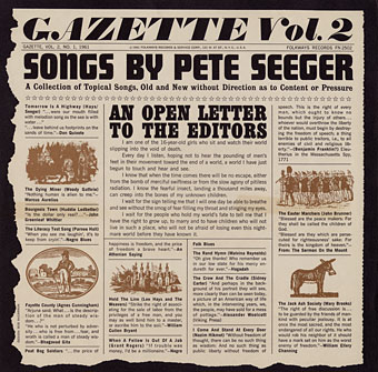
Gazette Vol. 2 (1961) by Pete Seeger.
More elaborate record sleeve design. Was Pete Seeger the first artist to have a fake newspaper as a cover design? Gazette Vol. 2 is the earliest example I can find. Some of these examples were suggested by this earlier overview. If anyone knows of any omissions then please leave a comment.
Newspaper covers offered understandable attractions to a musician: a vinyl sleeve is almost the same width as a newspaper, and, for the more verbose artist, they give an opportunity to wax satirical at the expense of print media and newspaper readers. Disadvantages would include increased production costs, more design and copywriting, and sleeves that don’t always last very long, especially if actual newsprint is used for the paper. Given the recent resurgence of vinyl I wouldn’t be surprised if we soon see further examples of this kind of design.
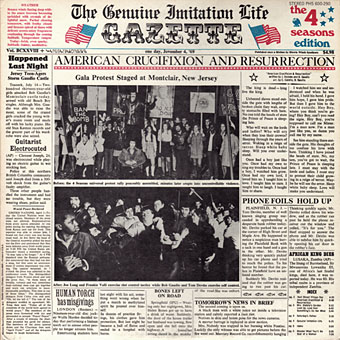
The Genuine Imitation Life Gazette (1968) by The 4 Seasons. Design: Desmond Strobel.
The 4 Seasons album is a surprise since it’s not so well-known yet features a very detailed newspaper sleeve. An 8-page insert continues the theme, and even includes a colour comic strip.
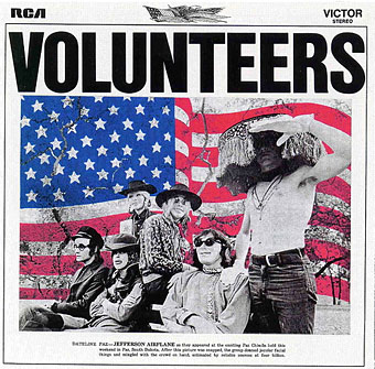
Volunteers (1969) by Jefferson Airplane. Design: Gut (Allen Turk).
Did Jefferson Airplane copy the 4 Seasons album? Seeing the progression of these designs you have to wonder who was imitating who. The Airplane album also had an insert with more newspaper pages.
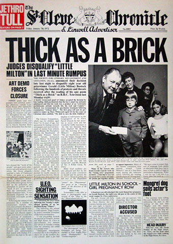
Thick As A Brick (1972) by Jethro Tull.
Jethro Tull went further than everyone by making their album a 12-page newspaper which wraps around the vinyl. The content of the pages is filled with a satirical jab at concept albums and numerous in-jokes. Even if you don’t like the band’s music very much (I’ve never been keen) you have to admire the amount of work that went into this.
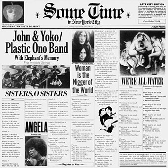
Some Time In New York City (1972) by John & Yoko/Plastic Ono Band with Elephant’s Memory. Design: Al Steckler.
After all that the Plastic Ono Band look like slackers for simply filling their newspaper columns with lyrics.
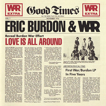
Love Is All Around (1976) by Eric Burdon and War. Design: Gribbit Studios.
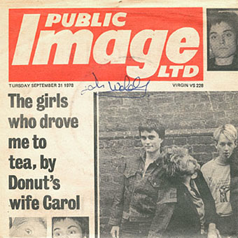
Public Image (1978) by Public Image Ltd.
No surprise that the first PIL single is done in the style of the tabloids whose hysteria helped make the Sex Pistols a success. Once again the sleeve opens out to reveal further stories, all of which involve members of the band.
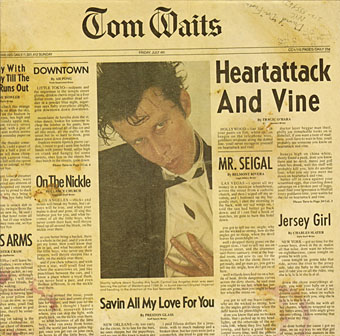
Heartattack And Vine (1980) by Tom Waits. Design: Norm Ung, Ron Coro.
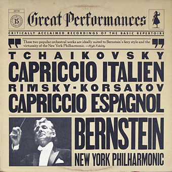
CBS Great Performances (1981).
Henrietta Condak designed a run of classical reissues for CBS in 1981 all of which used a newspaper format for their cover designs. Classical album design is often uninspired but this was an inventive solution to making the most of the vinyl square without trying to illustrate abstract compositions. Each design played around with type heights and widths. Further examples can be seen here.
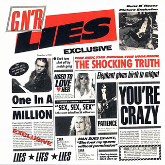
G N’ R Lies (1988) by Guns N’ Roses. Design: Deborah Norcross, Leslie Wintner.
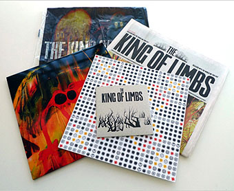
The King Of Limbs (2011) by Radiohead. Artwork: Donald Twain, Zachariah Wildwood.
The most recent example isn’t a newspaper sleeve but the special edition of Radiohead’s album included its own printed newspaper. Any more out there?
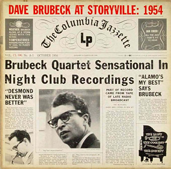
Update: Thanks to David McCarthy for suggesting the Dave Brubeck album below which does indeed predate the Pete Seeger.
Dave Brubeck At Storyville: 1954 (1955) by The Dave Brubeck Quartet.
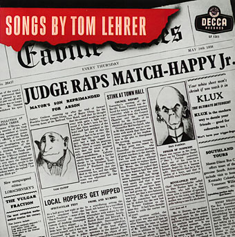
Update 2: Songs by Tom Lehrer on its UK release came with newspaper artwork filled with comic or satirical stories. Thanks to Marcus for the tip.
Songs by Tom Lehrer (1958).
Elsewhere on { feuilleton }
• The album covers archive

You forgot Tom Waits …. http://en.wikipedia.org/wiki/Heartattack_And_Vine
“The Guardian Of Stateside Steelbands” lyrics and liners insert, within Van Dyke Parks’ second Warner Bros. lp ‘Discover America’ was formatted as a newspaper front page.
Gabe: Good one, thanks. And welcome back!
Richard: Ah, yeah, I have the Ryko CD which reproduces that.
Does this one count?:
http://www.discogs.com/viewimages?release=486138
Dave Brubeck at Storyville 1954 would appear to predate these :-)
And it’s a great live album!
Hey John Glad to be back from the wilderness. Unrelated to your post have you seen this …. http://pinterest.com/pin/178525572701807870/
Mark: Looks like an interesting album but the EVO was an underground newspaper so is already in the newspaper zone to begin with. I was looking more for albums that use the newspaper format as a design choice.
David McCarthy: That’s great, thanks. Interesting how many of these examples play around with the NYT’s “All the news that’s fit to print”. The Brubeck album is another example (and probably the first).
Gabe: I’d not seen that one but I’ve seen similar ones. When I was of Lego-playing age the Minifigures didn’t exist so I tend to regard these things (and subsequent developments) as Not-Lego.
how about ‘songs by tom lehrer 1958 http://www.discogs.com/viewimages?release=2604429
my dad had this decca version
Marcus: Yes, that one’s an odd hybrid with a fake newspaper that’s placed inside the “frame” of the sleeve rather than making the sleeve itself appear newspaper-like. As with many of these covers, someone went to a lot of trouble writing all the little news stories.
The Tom Lehrer mention reminds that Eric Idles Rutland Weekend Songbook LP from his TV series parodies the Radio Times. Front cover not too impressive but the back cover is …
http://www.huwselby.com/rutles/REB233_back.jpg
http://www.huwselby.com/rutles/rutlandweekendsongbook.htm
Yes, Idle’s thing continued the tradition of the Python books in aping other print media. The RT was always easy to parody since their layout format was very distinctive and seldom changed. Charlie Brooker’s TVGoHome, which ran online for a few years, was a similar idea:
http://www.tvgohome.com/