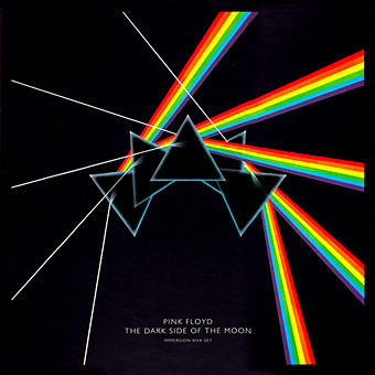
The Dark Side Of The Moon (1973) by Pink Floyd. Design by Hipgnosis.
Dark Side of the Moon is one of seven or eight suggestions we submitted to Pink Floyd. It relates to the Floyd’s concerts and their use of light shows. Specifically it was sparked off by Rick Wright who wanted something very simple, clinical and precise. It’s not a particularly original design but I do feel it is very appropriate and highly effective.
Storm Thorgerson in An ABC of the Work of Hipgnosis: Walk Away René (1978)
Continuing an occasional series. Album cover designer Storm Thorgerson died in April, a month after the 40th anniversary of the release of The Dark Side of the Moon by Pink Floyd. Thorgerson may have downplayed the originality of the cover design but it remains the most well-known of the many covers produced by Hipgnosis, a combination of the enormous commercial success of the album and the success of the design itself.
The variations below are post-Hipgnosis productions by Thorgerson and his various assistants for reissues of the album. I did have the idea of collecting a few of the better unofficial variants and pastiches but a quick image search turns up a daunting quantity of homages, parodies, imitations and other derivations. This is partly down to the way the internet stimulates an accelerated recycling of cultural signifiers, but it still shows how this simple design continues to affect people beyond its original application.
The 2011 Immersion Box Set featured further variations, some of which have been used to promote the 40th album anniversary. There’s a poster available with even more variations. If you’re still not sated after that lot then deviantART is the place to go for endless collisions between the Floydian prism and all the hottest emblems of pop culture. Just keep scrolling…

30th Anniversary reissue. Design by Storm Thorgerson & Peter Curzon.

The Dark Side Of The Moon: The Making of Pink Floyd’s Masterpiece (2005) by John Harris. Designed pseudonymously by Storm Thorgerson.

Immersion Box Set (2011). Design by Storm Thorgerson & StormStudios.
Previously on { feuilleton }
• Design as virus 15: David Pelham’s Clockwork Orange
• Design as virus 14: Curse of the Dead
• Design as virus 13: Tsunehisa Kimura
• Design as virus 12: Barney’s faces
• Design as virus 11: Burne Hogarth
• Design as virus 10: Victor Moscoso
• Design as virus 9: Mondrian fashions
• Design as virus 8: Keep Calm and Carry On
• Design as virus 7: eyes and triangles
• Design as virus 6: Cassandre
• Design as virus 5: Gideon Glaser
• Design as virus 4: Metamorphoses
• Design as virus 3: the sincerest form of flattery
• Design as virus 2: album covers
• Design as virus 1: Victorian borders
