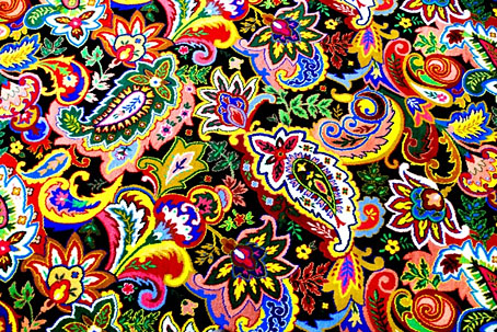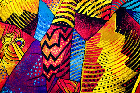
The latest work-related research has had me browsing pages of these garish carpet designs. The photos above and below are by Chris Maluszynski, a man who’s spent some time documenting the alarmingly vivid patterns used on the carpets in Las Vegas casinos. Maluszynski spoke to the New Yorker about his project in a piece which also features some speculation as to why they look the way they do:
Christine B. Whittemore, who runs a blog called Carpetology, believes that the carpets’ primary function is psychological. “A lot of the busyness of the patterns may be about keeping people active, as too much relaxing may not inspire gambling,” she said. “You also have to be careful not to use the same pattern on stairs as you do on flat surfaces, because of how the brain processes depth.”
Wired has more examples of the current state of the casino carpet art. Garish they may be but some skill is nevertheless required to create anything this wildly discordant. There are further casino carpet galleries here, including examples of discontinued designs. As for the project of mine that warrants this eye-jangling research, examples will be posted here later in the year.


that gallery of carpet pics jumped out the interwebz and fucked my
brain
damn
wth!
thank you for sharing…
—
m
Heh. This adds some depth to the scene in Gilliam’s ‘Fear & Loathing’, where Duke arrives in the hotel lobby and sees the carpet patterns crawling up the wall…