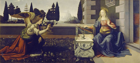
The Annunciation (c. 1472).
One pleasure of seeing paintings in an art gallery is the ability to scrutinise details. I like to be able to see that, yes, Picasso did indeed use a single stroke of the brush beginning here and ending here. Backgrounds are a recurrent source of interest if you’ve ever tried any kind of pictorial painting yourself. I always have a greater sense of the artist’s presence in the background details since that’s the area of a picture which few viewers will pay any attention to. In the foreground the artist is always aware of the viewer’s gaze; in the background the artist has a sense of being left alone. It’s there that the mind is most liable to wander when you’re at work.
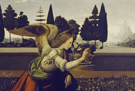
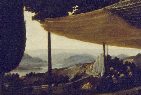
The trouble with very famous paintings is that they’re almost always preserved from this kind of close scrutiny either because they’re too popular—so you have a few seconds to stand there before having to make room for others—or they’re being monitored by gallery staff who don’t want you getting too close, or—as in the case of Leonardo da Vinci’s few paintings—they’re imprisoned behind sheets of glass. Few art books outside the weighty monographs ever show you actual brushstrokes or give you a close view of the background details, so once again it’s thanks to the Google Art Project that we can examine two of Leonardo’s paintings in a manner that wouldn’t be allowed unless you were an art historian.
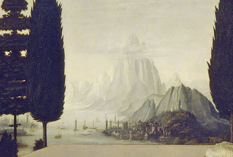
The Annunciation originated in Andrea del Verrocchio’s studio where Leonardo was apprenticed. Leonardo is believed to have painted the angel—which certainly looks like his work—and the background which includes a fantastic harbour and, in the vaporous distance, some colossal mountain peaks. I’ve always liked this painting for the composition and sense of stillness, those trees standing outside the garden like vertical plumes of smoke. We’re told that a later hand extended the angel’s wings which I can easily believe since their termination clashes with the disposition of the trees; you’d never do that deliberately when everything else in the picture is so carefully arranged.
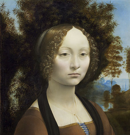
Ginevra de’ Benci (c. 1474–1478).
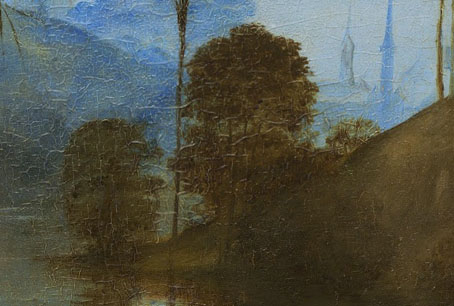
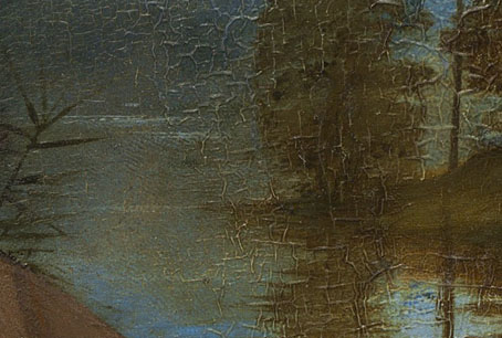
Leonardo’s portrait of Ginevra de’ Benci is another favourite for the contrast of those smooth areas of flesh with the spiky juniper leaves. I prefer this portrait to the overrated Mona Lisa. Here we have another watery background with a hint of spires in the distance. Close-ups of this particular work show individual brushstrokes and minuscule details of the wrinkled surface. I’d never considered before how abruptly the colour shifts from the umber middleground to the blue background, a different use of contrast. That background blue is echoed in her bodice ribbon.
Previously on { feuilleton }
• Leonardo’s warrior

