Here in Britain there’s no Thanksgiving so turkey as a seasonal meal is a Christmas dish. Turkey also has another meaning which the OED can supply:
6.6 U.S. slang. a.6.a An inferior or unsuccessful cinematographic or theatrical production, a flop; hence, anything disappointing or of little value.
This post concerns the latter—turkeys for the turkey season—being a series of bad or merely lacklustre album covers produced by the Hipgnosis design partnership throughout the 1970s. If the label seems unfair it should be emphasised that “turkey” is the designation applied by Storm Thorgerson himself in the appendix to the third Hipgnosis book, For the Love of Vinyl: The Album Art of Hipgnosis (2008). The following are all covers that he says Hipgnosis disliked, although not necessarily because they were bad designs:
There are some designs we would rather like to forget altogether and have been awarded turkeys to denote — no disrespect is intended for the blame lies mostly with us, save for the twin spectres of release schedules and rock egoism — “That’s a jolly interesting idea chaps but… hmm… actually we’d rather have a picture of our good selves.”
A consistent feature of the Hipgnosis books is a refusal to adopt the Olympian attitude that radiates from many design monographs. Thorgerson has always been happy to describe the history of Hipgnosis, and the practice of album cover design, in warts-and-all anecdotal detail, so it’s no surprise if he also admits to failings. You’d be hard-pressed to find other designers who would draw attention to poor work in this manner, especially in a book dedicated to the highlights of a lauded career. Most designers are self-conscious types who can be relied upon to bury their mistakes as thoroughly as possible.
I wrote a brief post years ago about bad cover design but I usually try to avoid such things, there’s already enough junk in the world without compiling lists of it. But this post is instructive for showing that not everyone gets things right however good they might be, and also that everyone has to start somewhere. Most of my early album covers are various degrees of terrible so I try to spare others the accusatory finger. That said, you have to wonder what on earth Thorgerson and partner Aubrey Powell were thinking of with some of these designs.
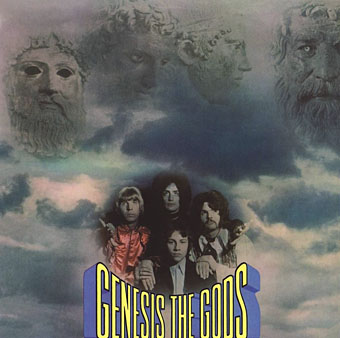
Genesis (1968) by The Gods.
Thorgerson’s introduction to For the Love of Vinyl explains the haphazard beginnings of Hipgnosis, pretty much two guys and a couple of cameras. They had no design training but a lot of luck (not least having Pink Floyd as friends), and were learning on the fly, something you can see happening with these early covers. It’s unfair to compare a design like the Gods sleeve to work they were producing a few years later when they had access to a range of professional illustrators, retouchers and models, and also budgets from record companies that paid for flights to exotic locations.

Gun Sight (1969) by Gun.
This was Gun’s second album. The cover for the first happened to feature the first album cover art by Roger Dean whose career in the music business would run parallel with that of Hipgnosis. Most of the early Hipgnosis covers are simple photos that are occasionally processed in some way. This one didn’t really work out, however, the Roger Dean cover is better.
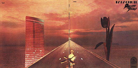
Parachute (1970) by The Pretty Things.
But at least the Gun cover doesn’t look like this bizarre attempt at Surrealist collage. Hipgnosis often tried to illustrate the album title but I can’t see how you get “parachute” from this one. The collage approach worked a lot better on the Quatermass album produced the same year.
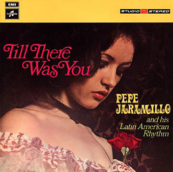
Till There Was You (1970) by Pepe Jaramillo.
This was the only cover singled out in the first Hipgnosis book, Walk Away René (1978), as something they didn’t like:
…straight down the line and utterly tasteless as a result — it doesn’t even work as a genteel piece of middle class tweeness.
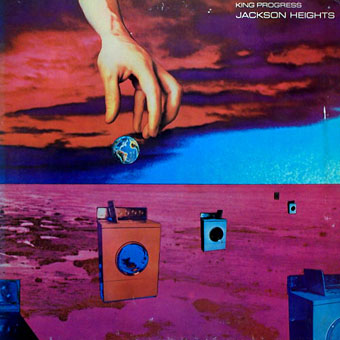
King Progress (1970) by Jackson Heights.
What would have looked for years like another piece of awkward photo-collage looks now like one of the numerous “Hey, kids…Photoshop!” covers that proliferated on dance music CDs throughout the 1990s. Does that damn it with faint praise?

Ring Of Hands (1970) by Argent.

Two (1970) by Toe Fat.
The first Toe Fat cover was an effective piece of photo-montage: naked people with their heads replaced by big toes. Here the toe people return to populate a landscape of rotting chicken carcass and other leftover food. This is not only bewildering and nausea-inducing I also wonder how it was ever approved by band, manager and record label. Three years after this they were designing the sleeve for Dark Side of the Moon.
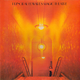
The Asmoto Running Band (1971) by Principal Edwards Magic Theatre.
An album on John Peel’s short-lived Dandelion Records label.

Tear Gas (1971) by Tear Gas.
Hard to tell what’s going on here. An egg being crushed in the hand? Many Hipgnosis covers feature freeze-frame water splashes or spray.

Quiver by (1971) Quiver.
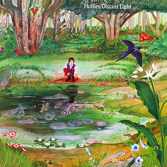
Distant Light (1971) by The Hollies.
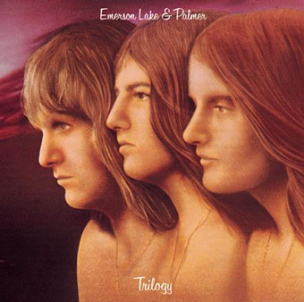
Trilogy (1972) by Emerson, Lake & Palmer.
I’d guess this was one of the capitulations to rock egos. The next ELP album looked a lot better with its memorable HR Giger sleeve.
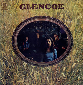
Glencoe (1972) by Glencoe.
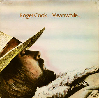
Meanwhile…Back At The World (1972) by Roger Cook.
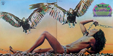
Music From Free Creek (1973) by Various Artists.
An odd all-star jam compilation with the kind of naked male you could only get away with in the 1970s. A decade later and anything like this would seem far too gay for the rock world.
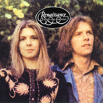
Ashes Are Burning (1973) by Renaissance.
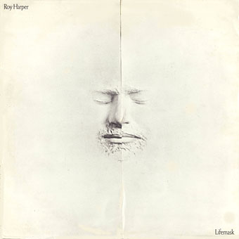
Lifemask (1973) by Roy Harper.
Not sure why this one is disfavoured. On the original vinyl the sleeve opens out from the centre to reveal a photo of Mr Harper.
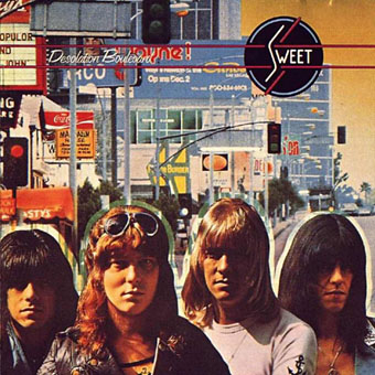
Desolation Boulevard (1974) by Sweet.

Dingo (1974) by Gary Shearston.
Gary Shearston was an Australian folk singer, hence the title. I suppose this one is awarded turkey status for being an unimaginative head shot. The cover photos were by Peter Christopherson, probably among his first for Hipgnosis.
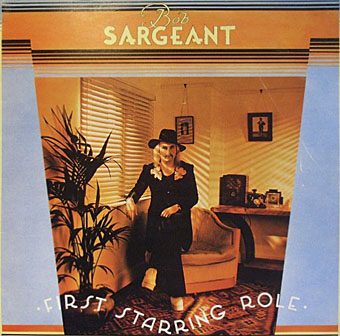
First Starring Role (1975) by Bob Sargeant.
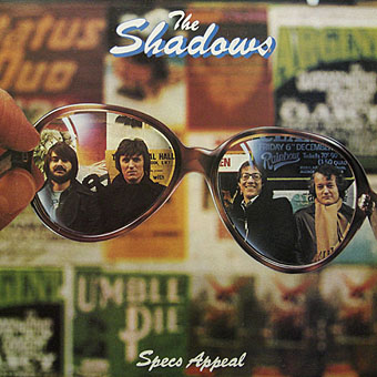
Specs Appeal (1975) by The Shadows.

Lights Out (1977) by UFO.
I’m not sure why this one is deemed a turkey either, it’s no better or worse than many others. By this point the Hipgnosis style—slightly disjunctive photo-collage, stylised typography—is immediately recognisable which I’d take as a plus. For a heavy rock album the cover is also subtly homoerotic (that guy in the background appears to be stripping off).

London Town (1978) by Wings.

True Romances (1978) by The Cortinas.
Yes, this is a lazy one. When you flip the cover you find a reverse angle with a face peering down into the street. Far better was the sleeve for the Defiant Pose single, another slightly disjunctive scene with a vomiting schoolboy to lend a punk rock touch.

Strangers In The Night (1979) by UFO.
If you comb the back catalogue you may find additions of your own but it’s better to suggest a visit to the Hipgnosis Covers site which has grown into a very thorough resource. There’ll you’ll find the good, the bad, and the ugly represented equally. When you see how many covers Hipgnosis produced over a decade-and-a-half it’s a remarkable achievement that so many are now considered classic designs. Anyone with that hit record can be allowed a few misses now and then.
Elsewhere on { feuilleton }
• The record covers archive
Previously on { feuilleton }
• Peter Christopherson, 1955–2010
• Storm Thorgerson: Right But Wrong
• Battersea Power Station

The first Toe Fat cover was an effective piece of photo-montage
Here’s a similar image from Anton Räderscheidt in 1936:
http://untitled-21.net/typolight/tl_files/photos/kunsthandel/Raederscheidt/Raederscheidt%20-%20Adam%20und%20Eve,%201936%20klein.jpg
In a way I don’t quite understand, it’s actually quite gratifying to see they could do such spectacularly awful work. That Emerson, Lake & Palmer one really takes the cake.
Caspar: I sympathise with their plight in situations where the client insists on a poor design. If you do bad work yourself then you’ve only yourself to blame whereas an aesthetically blind client can ensure that your name gets attached to a piece of work you’d never have produced otherwise. As I say above, it’s to their credit that they acknowledge these covers, few designers would be so forthcoming.
The Glencoe cover is better when you know what the back cover looks like…
http://www.hipgnosiscovers.com/glencoe.html