It’s taken a while but here at last are some of the pages from my series of illustrations based on The Picture of Dorian Gray, as featured in volume 2 of The Graphic Canon (“The World’s Great Literature as Comics and Visuals”) edited by Russ Kick. I agreed with Russ not to run everything so there’s some incentive to buy the book (or books…there are three volumes altogether). Now I’ve seen the printed edition the whole project seems even more remarkable: 500 large illustrated pages in a variety of media and art styles. Volume 2 runs through the 19th century and ends with my contribution; I opted to do this story in black-and-white but there’s colour used throughout the books. I especially like the Moby-Dick sequence by Matt Kish, a very different take on a very familiar tale.
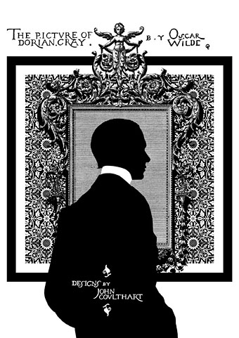
As with many of the things I’ve been doing recently I opted for adapting materials of the period. Since I have a lot of Oscar Wilde-related reference material I was able to go further and incorporate details that relate directly to the book and Wilde’s life. All the text is taken from a scan of the first printing of the novel at the Internet Archive, the title lettering being drawn originally by Wilde’s friend, publisher and illustrator Charles Ricketts. A heavy black square on each page provides some continuity as well as resembling the frames of comic pages. (Or a picture frame.) The silhouette on the opening page is another of Wilde’s friends, the writer Max Beerbohm, taken from a drawing by William Rothenstein. The pair were dandyish Café Royal regulars throughout the 1890s.
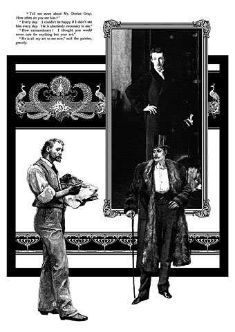
This is my favourite page. I liked the way the composition came together and also enjoyed being able to use John Singer Sargent’s portrait of W. Graham Robertson as the picture of Dorian. I’ve noted in an earlier post the similarity between this painting and the portrait seen in the BBC’s adaptation of the novel by John Osborne. Robertson was a theatre designer and illustrator who Wilde consulted when planning stage designs for what would have been the London debut of Salomé. Robertson was also (so far as we know) homosexual which adds an extra resonance.
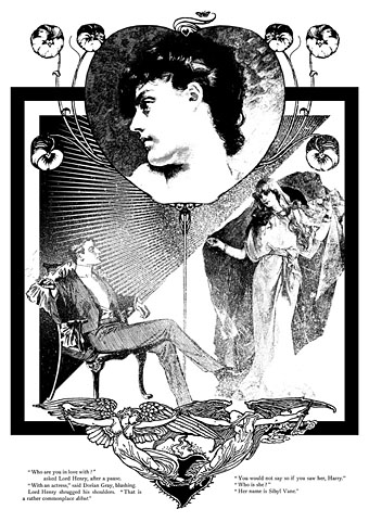
The Sibyl Vane page: a combination of details from The Studio, The Strand and The Magazine of Art. The motif at the foot of the page is by Walter Crane. Nothing of Wilde’s appeared in The Strand but that magazine’s most popular writer, Arthur Conan Doyle, had his second Sherlock Holmes adventure, The Sign of Four, commissioned at the same dinner that saw the commissioning of Dorian Gray, both novels being published by Lippincott’s Monthly Magazine in 1890.
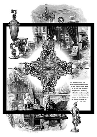
A page depicting Dorian’s distracting obsession with jewels and luxurious goods. This chapter can seem somewhat superfluous unless seen in the light of Wilde’s intention to write something like Huysmans’ À rebours (1884).
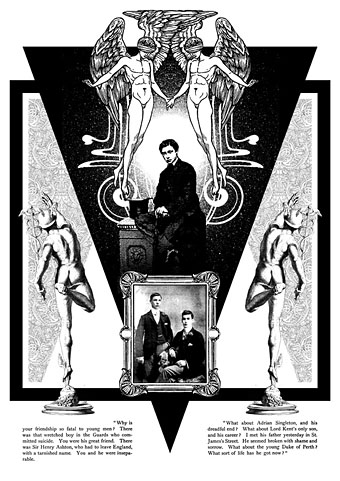
The “Love that dare not speak its name” page. This makes explicit the subtext of the book although if you read the two paragraphs I selected it’s evident enough why Dorian is causing a problem for so many young men. The blindfolded Eros was a drawing by Walter Crane which I doubled then re-drew slightly so the pair were holding hands. The boy below is a picture from The Strand of the young Edward VII, a robust heterosexual in later years but with a son, Prince Albert Victoria, who became linked to the notorious Cleveland Street Scandal which involved a male brothel catering to aristocrats. The two young men in the picture frame are described as a pair of “panthers” in Neil McKenna’s The Secret Life of Oscar Wilde (2003), by which he means that they were fin de siècle rent boys (as in Oscar’s remark about “feasting with panthers”); McKenna doesn’t give any further details about the photo but it suited the picture.
In addition to this series of illustrations, volume 2 of The Graphic Canon includes two of my Lewis Carroll illustrations in a section by different artists based on the Alice books. I’d be recommending The Graphic Canon even if I wasn’t a contributor, as I said above it’s a remarkable achievement. Watch out for it.
Elsewhere on { feuilleton }
• The Oscar Wilde archive

Lovely, makes me all the more eager to see what you’ve been up to with regards to those Wild Boys.
I love how these incorporate elements from the era’s media but are wonderfully original. I particularly like the wallpaper backgrounds – homages to William Morris? – and the framing of frieze and dado in the page with the portrait, Lord Henry and Basil Hallward. It’s always nice to see Walter Crane too (I admit to having his repro wallpaper in my house). Perhaps Mercury, aside from being a beautiful youth, is a sly reference to ‘trade’?
Wiley: I keep chipping away at them. If my spare time wasn’t already committed to other things they’d get finished sooner.
Lux: Thanks, the wallpaper is indeed William Morris although I think the design on the title page was inverted since that made it look better in black-and-white.
Mercury/Hermes was chosen mainly for his nice bum (ahem) and being a suitable shape for the composition. I suppose he also relates mythologically to Eros and Wilde’s Greek obsessions but also embraces enough symbolism to warrant inclusion for other reasons. One of the things I like about collage work is the way you’re sometimes forced to use things that you otherwise wouldn’t if the content wasn’t so formally restricted.
How completely fabulous!
Beautiful, as always.