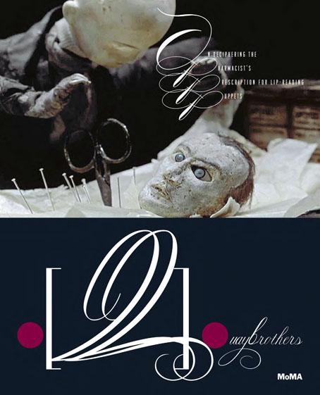
It’s not exactly the most appropriate moment to be recommending an exhibition in New York given the chaos in the city following the recent hurricane. However… Quay Brothers: On Deciphering the Pharmacist’s Prescription for Lip-Reading Puppets has been running at MoMA since August, and will continue into early 2013. A copy of the catalogue turned up this week, a slim volume of 64 pages that’s nevertheless an essential item for Quay obsessives such as myself.

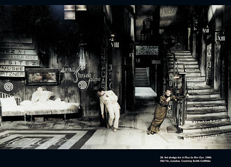
Set design for A Flea in Her Ear (1989).
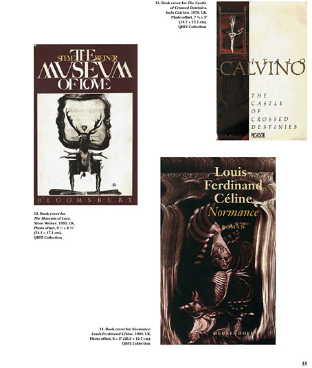
I’ve written before that while the Quays’ films are the most visible part of their oeuvre, much of their early output as artists and designers remains either obscure or unavailable. So it’s a pleasure to find a number of their early drawings, poster designs and book covers reproduced here. The catalogue also features examples of gallery installations and their designs for the stage. Ron Magliozzi, the curator, and Edwin Carels contribute essays while the Quays themselves are “interviewed” by Heinrich Holtzmüller “who was once real and now only exists under the glass of a museum vitrine in Nürnberg”. An appendix includes a thorough listing of their film works, giving me more things to chase at a later date.

In addition the Quays have also designed parts of the book, notably the title pages which feature their idiosyncratic typography. The catalogue may be purchased direct from the museum.

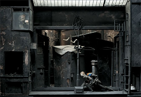
Grand Box, decor for Street of Crocodiles (1986).
Elsewhere on { feuilleton }
• The Quay Brothers archive

Superb – going to order my copy right now!
WANT.
I would like to know more about the Brothers’ title sequences, which often feature eccentric and exquisite typography.
Some of that typography also bleeds into the films themselves if you look carefully. Many of their sets (and theatre designs like the one above) have words or calligraphic flourishes crawling over the walls. I love the way they design their titles but they’re not always very easy to read, especially the end credits.
The quays work is an exceptional display of detailed artifice, attached to deep metapyshic realm of European art. Lavish an mesmeric.