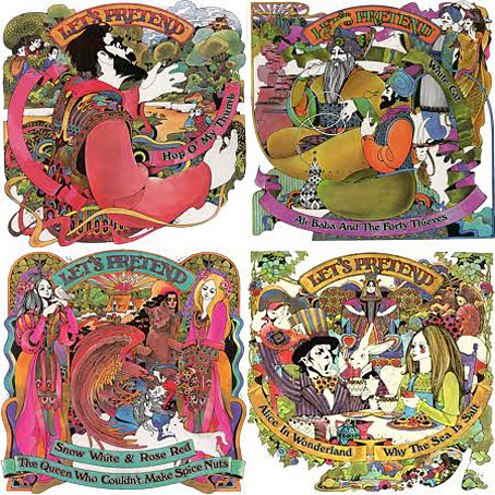
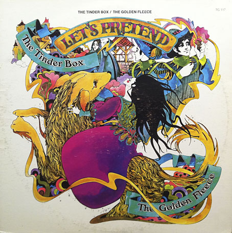
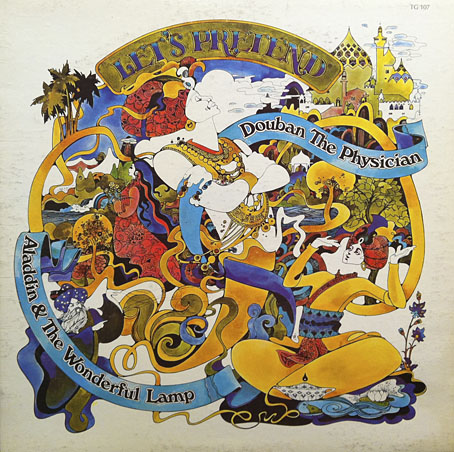
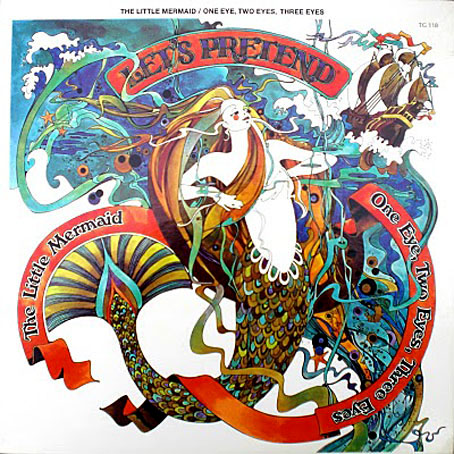
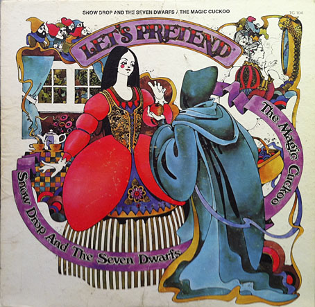
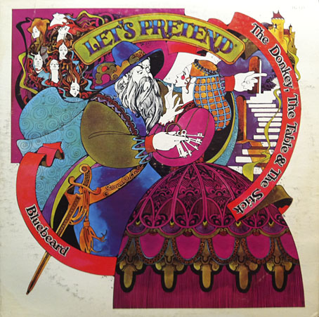
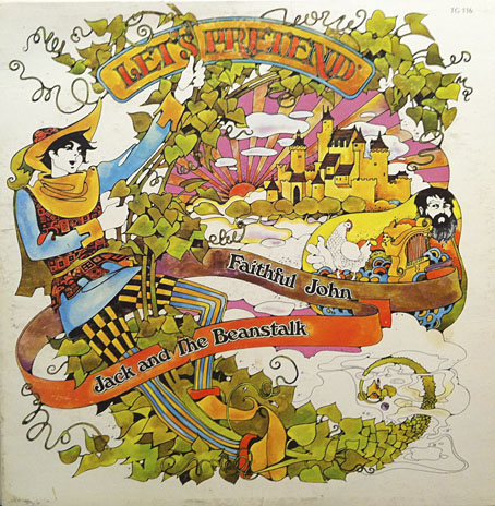
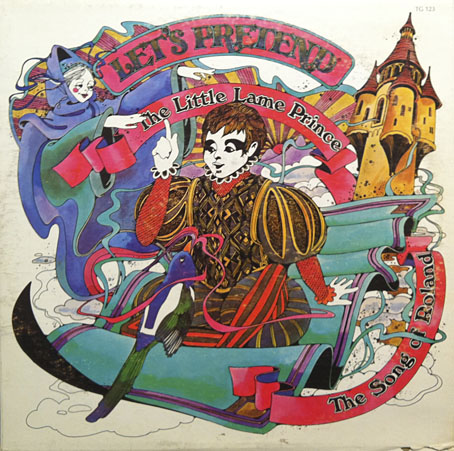
A post for Record Store Day. “Psychedelic” is stretching things here but it’s a word that always grabs the attention. Let’s Pretend was a series of fairy tale recordings released in the US in 1970 on the Stereo Dimension Records label. Each of the 25 recordings employs a radio show format, possibly because these were all radio recordings originally (there’s an older series of Let’s Pretend radio shows at the Internet Archive). Anyone desperate to experience one of them can listen to The Little Mermaid here. The sleeves are all illustrated by David Chestnutt in that post-Heinz Edelmann style that really ought to have a name of its own. Nice to see The Tinderbox turn up again, Chestnutt’s magical hound is a distinctly benevolent creature.
These sleeves were hoovered up from Discogs.com where some of them are only available in small images. If anyone finds a gallery of all 25 designs in decent quality then please leave a comment.
Elsewhere on { feuilleton }
• The album covers archive
• The illustrators archive
Previously on { feuilleton }
• The Tinderbox
• Yellow Submarine comic books
• Heinz Edelmann

The Queen who couldn’t make Spice Nuts?
I don’t quite remember that fairy tale.
All a bit Alan Aldridge to my eyes.
A recent blog post at Today’s Inspiration highlights how prevalent this kind of soft, whimsical psychedelic style was back in the day:
http://todaysinspiration.blogspot.co.uk/2012/04/flower-power-of-early-1970s.html
Nathalie: Yes, that’s an odd one.
Alfie: Yes, Alan Aldridge helped evolve the style along with Edelmann, Peter Max and others. I used to dislike things like this since they were so common when I was young, And as that blog post notes, the style became very commercialised very quickly. But that’s partly what fascinates me now. It’s probably the last graphic style that could be applied universally from the trendiest album covers to books for children and ads for soap powder.
I agree – this style was everywhere, and there hasn’t been much interest in it since it fell out of fashion, but for some reason it looks great these days. Some nice examples here:
http://www.sweetjanespopboutique.blogspot.co.uk/2012/04/linweave-tarot-1967-illustrations-of-hy.html
This John Alcorn guy was great:
http://angwyman.blogspot.co.uk/2010/04/john-alcorn.html
just reminds me of Yellow Submarine animation
John Alcorn I mean
Hey somebody’s buying up all the artwork…http://www.beatlebay.com/art_animation.htm
Yes, John Alcorn’s book owes a lot to Heinz Edelmann but I’ve no problem with that, it’s good to see more in that style. Imitating something that distinctive isn’t always as easy as it seems, something I found when I’ve tried pastiche things of my own. You have to scrutinise every aspect of something that the original artist wouldn’t have thought about to that degree because with them the decisions would have been a lot more instinctual.
Caspar Williams: Nice to see some Tarot designs by David Palladini, I’ve not seen those before. I wrote about his zodiac posters a while back.
I still have my Cinderella/Twelve Dancing Princesses and Goose Girl/Sleeping Beauty. I loved looking at the art and following all the curvy lines.
Great post, thank you! I still have some of these too. I’m sure they still reside in my subliminal as I continue to connect to similar art as a grown-up. I just visited this link today – some great photos of covers. Scroll down and click on links.
http://www.artsreformation.com/records/
Hi Michelle. Many thanks, that’s just what I was looking for!