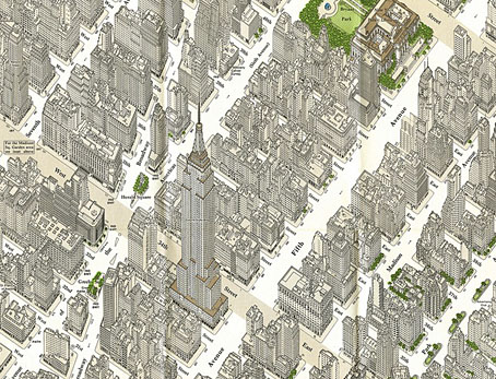
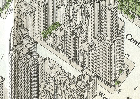
Midtown Manhattan by Constantine A. Anderson.
Yesterday’s link to a Domus article, The importance of being axonometric, features an interview with map and chart collector Michael Stoll whose Flickr account has some wonderful samples from his archives. Among the many city charts there are several maps of New York in various axonometric projections including this example designed by Constantine A. Anderson for the Manhattan Map Corporation in 1985. Anderson’s map is like a modern equivalent of Turgot’s map of Paris, and caught my attention for possibly being the one that comic artist Dave Gibbons used for reference when he was drawing Watchmen in 1986. Gibbons and Watchmen writer Alan Moore mentioned the map in the huge round table discussion I posted here in 2006 (the discussion at this point concerns the story’s recurrent street corner location):
Dave Gibbons: I didn’t actually make a model of it, although when we first conceived it I did draw a streetmap.
Alan Moore: Well, we checked it up on a map of New York.
Fiona Jerome: It’s really there?
DG: It’s a feasible corner—I’ve got a map at home.
Steve Whittaker: I noticed you put Forbidden Planet N.Y. in there at one stage—where they’re selling all the pirate comics.
AM & DG: No, that’s Treasure Island.
DG: Which would, if you had pirate comics, be FP. At home I’ve got this brilliant map they do which is an isometric projection of New York, so not only is it a street map but it’s all the buildings standing up and it’s got all the post boxes and the trees.
AM: It’s lovely, it’s a work of art you can wander round New York in your head.
DG: It’s about this big but… you know the joke about New York people look at it and say “When’s it going to be finished?” It’s the same with this map, it’s never actually finished because as fast as they put buildings in it, other ones are torn down. There are places in it where there’s just a site with a crane or something.
[…]
DG: But that corner, l’m sure that at some time I’ve been to New York I must have walked past that corner. In fact, what I’d really like to do, the next time I go, is actually walk to that junction and see what’s there. On the isometric map there is a fairly new high rise building which could be the Institute for Extra Terrestrials, another building which looks like a cinema to me because it’s got a curved front, and there are some other, lower buildings.
SW: And a fast food chain, perhaps?
DG: That intersection is feasible, right down to the way that the sun rises. This isn’t just down to me. Alan obviously made specific provision for this in his script. The sun actually does rise in the east end sets in the west, and if you look at the thing, if it’s afternoon the shadows are going this way and in the mornings the shadows are going the other way.
I could no doubt have confirmed this by asking DG on Twitter but didn’t want to pester him. Suffice to say there can’t have been many super-detailed axonometric maps of New York being produced at this time. As Gibbons notes, city maps date very quickly: to see a century of change at work compare this equally detailed map from 1879 with Anderson’s views. Stoll has a more recent axonometric map of New York by Tadashi Ishihara but that’s now twelve years old so it’ll also be out-of-date. If we want a close view of New York’s streets today we can simply fire up Google Earth but there’s still something graceless and clunky about the 3D boxes it imposes on the city’s streets. For the moment these views, especially Anderson’s meticulous line renderings, remain hard to beat.
Previously on { feuilleton }
• The Turgot Map of Paris
• Watchmen


Though not as aesthetically pleasing as the examples above, Bing’s “bird’s eye view” approximates the experience and, given that this is New York and the images are certainly more than a week old, is probably only slightly out of date. http://binged.it/xfPMAE