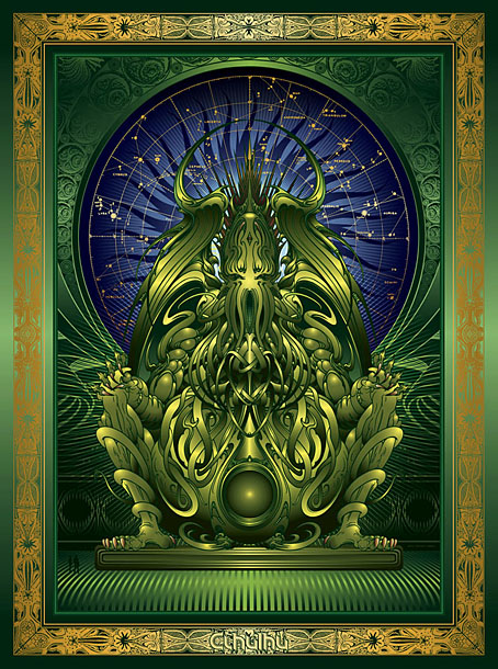
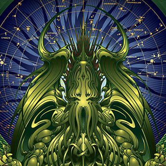
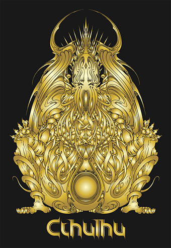
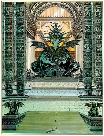
Happy Cthulhumas. I found the time over the past couple of weeks to finish a piece of art begun in September 2008, something I’d half-completed then abandoned due to pressure of other work. I’d quite forgotten about this until I discovered the files when going through some archive discs. What began as a pencil outline is now a lavish piece of vector art which I’ll shortly be making available as a poster design.
I’ve enjoyed creating vector pictures recently, it’s a different discipline to using Photoshop (although the initial art often starts in the sister application), and the hard lines and flat shapes remind me of the similar effects I used to get when I was painting with gouache. Some areas of this piece remain a little too flat but I didn’t want to start shading everything using gradient meshes; if you start down that road you may as well do the whole thing as a Photoshop painting—or a real painting, for that matter. That said, I wouldn’t mind giving this the hyper-realist treatment at a later date.
The original idea was to do a kind of “Cthulhu Buddha”, something like the above variation only coloured with more finesse. I kept thinking this was an original idea only to belatedly realise when I set the figure against a temple background that I’d been imitating the kind of massive Lovecraftian idols that populate the comic strips of Philippe Druillet. The one below is a good example.
Urm le fou (1975) by Philippe Druillet.
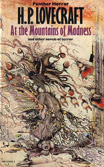
At the Mountains of Madness (1974).
My piece also nods slightly to Ian Miller‘s Lovecraft cover art of the 1970s. I always enjoyed the tiny human figures in the lower left of this illustration, a detail that makes the viewer realise with a start that the rampaging monstrosity in the foreground is enormous. Needless to say, Druillet favours a similar Piranesian effect.
Despite having announced at various times that I’m done with illustrating Lovecraft, it’s become apparent that Cthulhu is a convenient riff to use when exploring different styles of art, like the cosmic horror equivalent of a jazz standard. It’s a creature with a high recognition factor yet Lovecraft never went too far beyond his shorthand description of a “squid dragon” outline to fix the shape of the thing. At the end of The Call of Cthulhu we discover that Cthulhu has a corporeality sufficiently fluid to reassemble itself after being struck by a steamship. That’s always suggested to me that the artist has licence to interpret the squid dragon formula in a variety of ways.
As stated above, I’ll be making this picture available shortly at CafePress and another online sales outlet I was recently asked to join, I just need to find the time to jump through the various uploading hoops. More about that later.
Elsewhere on { feuilleton }
• The Lovecraft archive

A Cthulhu Buddha!!!
What’s next a Cthulhu Mohammed?
It was mainly the posture rather than it being Buddha per se. Since Mohammed is simply a man in the few representations of him there’s nothing distinctive to use. Rather than Buddha, you could say mine and Druillet’s gods resemble any Eastern idol figure.
Nice. I’ll be buying that then…
Wow, John, this is spectacular!
Great vector work.
I actually find zoning out doing vector based work, continually smoothing out lines quite therapeutic.
Sometimes I find it’s a judgement call to define certain pieces as largely vector based and let it highlight the strengths of Illustrator-based work, super clean lines and definition.
Wonderful work, Mr. C. There IS a reason why I visit your blog every day: always something provocative or wondrous. MANY thanks for all your efforts. My only regret is that you never got a chance to do an album cover for Coil. ;(
Thanks, everyone.
Alfie: Yes, Illustrator was better in some ways before they incorporated transparency and gradient meshes.
William: That’s my biggest regret too, was my fault for not making more of the connections I had with them at the time.