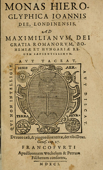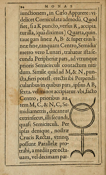
I swear I didn’t go hunting for this. Among the various library collections at the Internet Archive one can find The Getty Alchemy Collection, a substantial gathering of very old alchemical texts scanned in a variety of formats. John Dee’s Monas Hieroglyphica caught my eye during a random search, a third edition of his treatise from 1564 in which he describes his Monas Hieroglyphica, a glyph designed to combine symbols of the Sun, the Moon, the Elements and Fire in a single figure.

The glyph also intentionally resembles a human form, and Dee relates its individual parts to various astrological and chemical symbols. I’ve mentioned before that Dee scholar Derek Jarman deliberately based Prospero on John Dee in his 1979 film of The Tempest, giving the magus a scrying wand shaped to resemble the Monas Hieroglyphica.

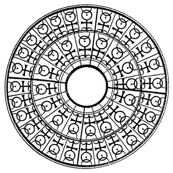
I produced my own variations on the glyph in 2009 when working on the cover of Jeff VanderMeer’s novel, Finch. The symbol recurs in Jeff’s fictional city of Ambergris and I seem to recall there being some discussion about including this doorway design somewhere in the book. In the end it was incorporated into the cover design in a rather subtle fashion. I think this is the first time the design alone has appeared in public.
The Internet Archive has a few other Dee-related items, including Lists of manuscripts formerly owned by Dr. John Dee; with preface and identifications (1921), a 500-page book by antiquarian and ghost story writer MR James.
Previously on { feuilleton }
• Mister Jarman, Mister Moore and Doctor Dee
• Alchemically Yours
• Laurie Lipton’s Splendor Solis
• The Arms of the Art
• Splendor Solis
• Amphitheatrum Sapientiae Aeternae
• The Tempest illustrated
• Cabala, Speculum Artis Et Naturae In Alchymia
• Digital alchemy
• Designs on Doctor Dee
