Symbolist? Arguably. Decadent? Certainly. Watching Francis Ford Coppola’s Dracula (1992) again this weekend I thought it worth making note of some of these resonances. The real age of Symbolist cinema was the Silent Era from around 1910 onwards, something I discussed in more detail here. That being so, several films made since can be taken as Symbolist (more usually Decadent) productions even if this was never their original intention. Kenneth Anger‘s Magic Lantern Cycle comes immediately to mind, so too Sergei Parajanov’s The Colour of Pomegranates.
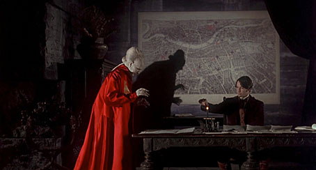
Bram Stoker’s novel was published in 1897 at the ebbing of the fin de siècle but vampires and vampirism were already recurrent Symbolist themes. Aesthetic magus Walter Pater wrote of the Mona Lisa in 1893, “She is older than the rocks among which she sits; like the vampire, she has been dead many times, and learned the secrets of the grave…” Dracula almost demands a Symbolist interpretation, and for now Coppola’s production is the closest we get. I’ve found this makes the film more satisfying in a way: you can ignore the shoddy performances by secondary characters and concentrate on the decor and details (and the tremendous score by Wojciech Kilar). Some of the following screen grabs argue my point.
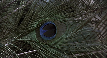
Oh look, peacock feathers. I loved the artificiality of this film, the excessive palette, the obvious models and miniatures, the layering of images. The dissolve from a peacock feather to Jonathan Harker’s infernal train journey is a great moment.
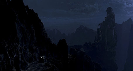
Exhibit A for the Symbolist case: Dracula’s castle was based on Resistance, or The Black Idol (1903), a print by Symbolist artist František Kupka. I tend to think they could have done more with the interiors (there are some nice sculpted heads) but we do have a borrowing from Jean Cocteau in the monumental arms holding lamps from the walls.
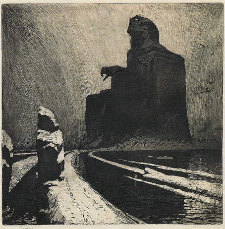
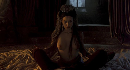
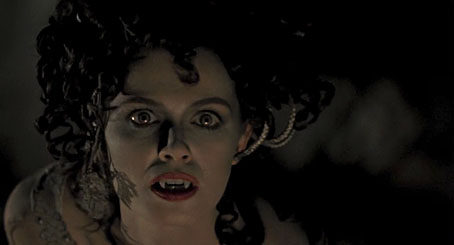
Exhibit B would be the sultry vampire brides: Monica Bellucci (above), Michaela Bercu and Florina Kendrick (below). The fin de siècle collision of Eros and Thanatos is exemplified in the seduction scene with Jonathan Harker: costumes, colours and the women themselves are all pitch-perfect.
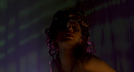
Florina Kendrick especially incarnates all the Medusoid femmes fatales of the Decadence with her serpentine hair. There’s an additional resonance when the three women appear near the climax of the film accompanied by music from Diamanda Galás. The track heard is from the Saint of the Pit album wherein Ms Galás recites various works of Romantic and Symbolist poetry.
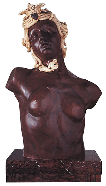
Maléficia (1905) by Phillipe Wolfers.
Finally, there’s the absinthe scene. Moulin Rouge! had to satisfy itself with a Kylie Minogue Tinkerbell; Coppola gives us a dreamy wormwood seduction complete with hallucinations and reincarnated memories. Yes, Mina, sin is at the heart of it all.
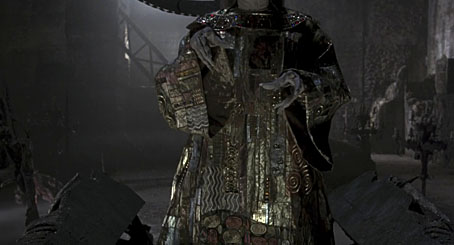
Update: Evan pointed out something I’d missed, Dracula’s Klimt-styled gown, seen mostly at the end of the film. Enough of Gustav Klimt’s work qualifies as Symbolist to make this another significant motif.
Previously on { feuilleton }
• The art of Philippe Wolfers, 1858–1929
• Kafka and Kupka
• Alla Nazimova’s Salomé
• Nosferatu

Since I was a kid, I loved the sets and Ishioka’s costumes, but as I continue to watch it I recognize just how many visual references there are. I’m particularly impressed with Dracula’s Klimt robe. Wish I could find an isolated image on the net.
At the time I found it oddly disappointing, as well as totally lacking in subtlety. Why the bestiality and the excessive gore? Why include all this stuff about Vlad the Impaler and the defence of Christendom against the Turks, but at the expense of all the Christian imagery of the book?
Since then though I’ve warmed to it quite a bit, especially as I now see that it was a homage to a lot of older Dracula films and other vampire and werewolf movies too, as well as to the book. Unless you know about Nosferatu or An American Werewolf in London, a couple of scenes will just seem ludicrous. In fact they’re rather fun.
I still think it was something of a missed opportunity though. The homo-eroticism of the book’s early chapters has never been realised on screen, as far as I can tell, nor indeed has the book’s meticulous, science-fiction-style attention to fine details of place and time. Still, Gary Oldman in his red pointy armour is (if you’ll pardon the expression) to die for.
What a delicious post! I love this film, especially when viewed upon the big screen. So visually striking, with music to match. I’ve never been too concerned about how true to the book, or past film versions, it is, nor about the performances. It’s a jewel-tinted fever dream. I shall have to watch it again soon!
“I loved the artificiality of this film, the excessive palette, the obvious models and miniatures, the layering of images.”
I’m sure alreadty aware, but this aesthetic of artifice is, at least in part, in tribute to the grand guignol movies of Italian director Mario Bava; most notably ‘Black Sunday’, ‘Black Sabbath’ and ‘Kill, Baby Kill’.
Scorcese’s ‘Cape Fear’ from the preceding year is another example as are scenes from Lynch’s ‘Twin Peaks’ finale; there was obviously a Bava meme circulating 70s movie brat directors around that time.
Bava Jnr (Roman, who oversaw the in-camera visual effects for his father’s film) would a few years later direct ‘CQ’, his own Bava tribute.
Evan: Added! And thanks for the prompt. The references to other films were very deliberate as I recall, Coppola said as much in interviews at the time. He also once said he was the kind of filmmaker who could see himself working in any genre, so this was his all-stops-out stab at horror. Some of the references are a little oblique–the green mist is taken from The Ten Commandments–but they’re more satisfying for me than the kind of “here’s more of my geeky childhood” thing that Joe Dante and other directors do.
Catholic Boy: I always had the impression that the script got mangled somewhere during the production. James Hart apparently wanted to be very faithful to the novel, hence the addition of Stoker’s name to the title. And they are more faithful than other films at times, especially with Dracula being active during the day. But someone apparently wanted a “creation” moment, so we get the thing about Vlad and the Turks. The most faithful screen version is still the BBC adaptation from 1977. Cheap and stagey but they follow the book very carefully.
Thom: Fever dream is exactly right!
Vadim: And the photography for this one was by Michael Ballhaus who’d been working with Scorsese a lot at the time. Scorsese had Freddie Francis on Cape Fear partly for his Hammer associations. I enjoyed CQ, I wrote a review a while back.
Always wondered why it was “BRAM STOKER’S” DRACULA.
I’ve always been an admirer of the BBC adaptation. We called it the “Masterpiece Theater” version. It’s finally been released in the US on DVD and worth a look. Jack Shepherd does a terrific Renfield. Spooky ondes martenot sountrack.
You didn’t mention Bart Simpson’s Dracula
In Spanish
http://www.zappinternet.com/video/vaxZriJraH/www.adnstream.tv
I have a book that exclusively deals with the costumes used in the movie, picking it up initially because I simply loved the black-armored look of that mysterious coach, both feral and aristocratic, who picks up the oh-so convincingly English Keanu Reeves on his way to the castle. Very akin to something Yoshitaka Amano would drawn for ‘Vampire Hunter D.’
I’ve forgotten the name of the woman who designed all the costumes for the movie, though I know she is Japanese (I wonder what she thinks of Amano). Her original design for the brides of Dracula was the only one that Coppola threw out. Apparently they more so resembled the ‘green fairies’ featured in popular Absinthe related depictions, than the symbolist femme-fatales featured in the movie. I am with you, Coppola made the right decision, the ending look for the brides was all but perfect.
Also, as a straight man, or perhaps simply an overgrown straight boy, I have to say, off the top of my head I cannot think of a silver screen creature more delicious looking than Monica Bellucci in this film.
One of the striking things abut the film when viewed all these years on from its making, and moreover from a time when too much fantasy cinema seems… to me at any rate… to be over-larded with CGI, is the way in which Coppola employs ‘stage’ and in-camera effects to pull off his tricks. The moment where Dracula transforms into a seething column of rats is achieved with a mechanical ‘rig’, clever editing and real rats. The old stage illusion of Pepper’s Ghost is employed for dissolves. However subliminal these moments, they permeate the film and give it a tone that’s marvellously stagey. Nevertheless for me it’s fatally flawed by misjudgements. From the moment we lay eyes on Sadie Frost as Lucy, she’s arch, fevered even, and sexually predatory, leaving her nowhere in particular to go once she’s been ‘infected’ by Dracula. Frost, not the most subtle actress, goes straight from ‘in heat’ to… well… slightly more ‘in heat’! (But I do like the reverse film effect that gives her gait a striking oddness when she descends to her crypt in that marvellous shroud and funereally creepy headgear!) Meanwhile Keanu, who should be at least be a Jonathan Harker we can root for, is so terminally awful that not even his beauty nor the vision of him being stripped and and mauled by those wonderful Brides of Dracula, can make me the least bit interested in what befalls him, and that’s one hell of a gaff. He should be a man in peril of losing his immortal soul, though Reeves looks like a stoned jock at a frat party!
Favourite moments: Dracula’s independent shadow, the ‘puppet’ Elisabeta that steps elegantly from the window to plummet to the rocks below, and the aforementioned descent to the crypt by Lucy. Oh and the costumes of course. They are marvellous. Not just the fantasy suits of armour and Klimt robes, but the construction of the women’s costumes, corseted and bustled and with hats cockaded and be-ribboned in shimmering shot-silks and taffetas. Staggering confections every one. Frost and Ryder clearly had a ball in the wardrobe department. But alas, costumes alone do not make a film, and indeed can overwhelm the performers making them mere mannequins. Sometimes less can be more. I’m being picky here. I feel that the film is marvellously campy, but it could also have been moving, and it isn’t that, despite the mis-judged and soupy end.
P.S.
I once directed a ‘symbolist’ version of an Anthony Shaffer play, but the most fun I ever had with an ‘ism’ is when I designed and directed an Expressionist ‘Little Shop of Horrors’ at Theatr Clwyd. I’ve blogged about the production recently, and you can see an account of the set design here:
http://clivehicksjenkins.wordpress.com/2011/01/30/little-shop-part-two-designing-the-set/
and the design for the puppet here:
http://clivehicksjenkins.wordpress.com/2011/02/08/re-visiting-the-little-shop-designing-the-pot-plant/
I think this one might be right up your street John!
Wiley: The costumes were by Eiko Ishioka, something I ought to have noted above. A shame there doesn’t seem to be a good single website devoted to her work.
Clive: I recall they were quite proud of the effects being done using older methods; I love all the shadow-play in the castle. It’s a shame more effort wasn’t put into casting the thing better, all the attention seemed to go on the look and style of the thing. Anthony Hopkin’s performance seemed very badly misjudged among other things. I have a vague memory of him saying that because Van Helsing seems (to us) to be a maniac, that was how they decided to present his character, which makes no sense of the story. His actions might not pass in our world but our world isn’t one with murderous vampires in it either!
I’ve been reading all your Little Shop of Horrors posts, thanks. That puppet is fantastic. Was going to comment on them earlier then got distracted, I’m rather jealous you got to design an Expressionist production! Lotte Eisner’s The Haunted Screen has been a favourite book for years.
John, how fantastic! The Haunted Screen was my bible on Little Shop, indeed has been my Desert Island book ever since I read it long before that. That book is largely the reason why I decided on the Expressionist mode for LSoH. I love the way Eisner writes. You barely have to track down the films, so comprehensively, and so evocatively does she summon them in her descriptions. (In fact in some instances I find Eisner’s descriptions more enjoyable than the films she references.) Her section on stairways was key to my decision to set Mushnik’s florist shop below ground, so that a stair, vertiginous, off-kilter and perilous, could form the conduit between worlds. A kind of psychological hinterland that has to be negotiated by every character entering or leaving. The actors got into it so thoroughly that I noticed in stage rehearsals they never arrived in the shop via the wings, but always laboriously climbed the off-stage stairs to approach it from the raised sidewalk, through the shop door and down the staircase. It almost became an un-named character. Oh how I wish you’d seen that production. It was the best thing I did in the theatre.
Have you her books on Murnau and Lang?
Clive:
Ishioka and Coppola, according to the dvd extras, agreed to downplay much of the architecture into the shadows and put the highlight instead on the costumes. That special feature is actually titled, “The Costumes Are The Sets.” I appreciate the Grand Guignol absurdity of the whole production, but too much is never enough for me.
I enjoyed seeing glimpses of your Little Shop of Horrors production. Striking.
Evan, the film has much that’s visually entrancing, and the costumes are up there among the best aspects of it. Oddly, despite the originality and beauty of the costume designs, there’s been little like them in cinema since.
Glad you enjoyed the LSoH post.
Indeed, I’m not sure why so few films “go there” with costumes. Eiko Ishioka has still not worked with another major director, but perhaps that’s her own choice. She designed costumes for Tarsem Singh’s The Cell and The Fall, but that’s about as mainstream as it’s been in the last fifteen years. She’s been working with Cirque du Soleil a bit and did some suits for the Olympics.
The fact that more costumers haven’t taken her example, or been given permission to, is a shame.
Clive: I have the Murnau book, I was always grateful I read that before I got to see The Last Laugh and Sunrise, I might not have appreciated them as much otherwise. I read a library copy of the Lang book. I agree that The Haunted Screen makes many of those films seem more interesting than they are when you watch them! That’s a great testament to her writing.
Evan: The road of excess leads to the palace of wisdom.
I should have just assumed those were Eiko Ishioka’s designs in The Cell, when that tyrant walked down the stairway ascending to his throne, his cape unfurling from the very walls, the first recollection I had was the elder Dracula’s long crimson gown.
Not really related; but have you seen these great designs for ‘Black Swan’?
http://trendland.net/2010/12/20/black-swan-poster-by-laboca/#
Yes, I’ve seen those, they’re great. I enjoyed the film as well. I might have posted the posters had I noticed them sooner.