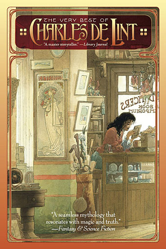
The Very Best of Charles de Lint. Art by Charles Vess.
Over the weekend I found the time to finally update the book design section of the site, adding new pages for most of the titles I’ve been working on recently. There’s still a couple of things missing but I’ll add those in due course. Many of these design jobs have been for the interiors only so what follows is a comparison of title spreads from books I’ve worked on that have been published this year. Lest it seem that I have an army of clones at my service it should be emphasised that I was working on several of these last year (and Engelbrecht was completed in 2008) but the nature of release schedules means they all carry 2010 publication dates.
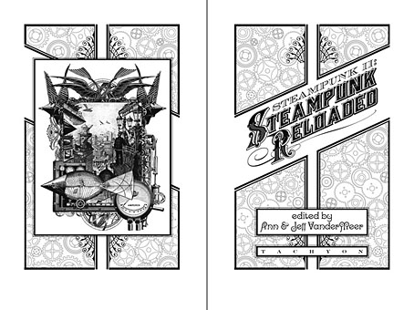
Steampunk II: Steampunk Reloaded, edited by Ann & Jeff VanderMeer.
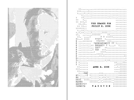
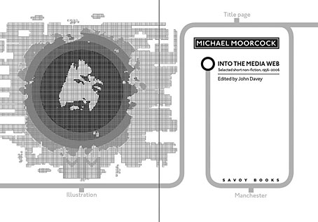
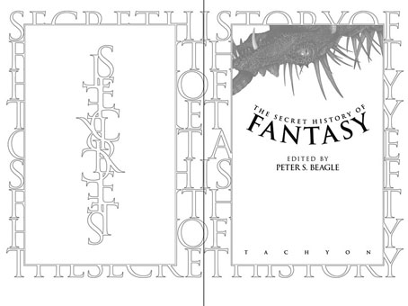
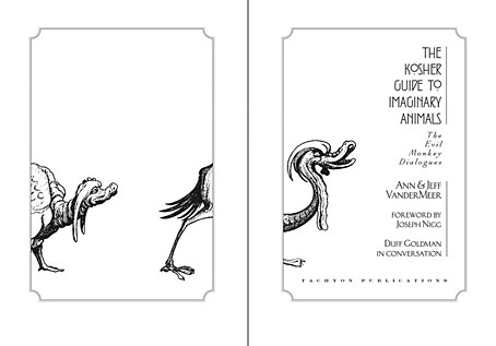
I invariably make a feature of title pages, usually creating them as a spread in order to heighten their impact. The title page is a kind of gateway to the rest of the book which gives you an opportunity to establish a mood for what follows. It’s also the area where you can be most lavish with your graphic treatment and, where necessary, add illustrative material without worrying too much about intruding on the content. With a number of these designs I was following typographic choices from pre-designed covers so the challenge was to find something that would match the cover and connect to the rest of the interior. The Charles de Lint book was a variation on this process in that the author had chosen a Charles Vess drawing for the cover art. I designed a cover to accommodate the drawing then carried the design inside. The colours were chosen to match Vess’s artwork while the general Art Nouveau style came from an Alphonse Mucha poster he’d placed on the wall. With a different cover picture the entire book would have had a very different design.
The Search for Philip K Dick by Anne R Dick.
Into the Media Web by Michael Moorcock, edited by John Davey.
The Exploits of Engelbrecht by Maurice Richardson. Illustrations by Kris Guidio and James Boswell.
Darkness: Two Decades of Modern Horror, edited by Ellen Datlow.
The Very Best of Charles de Lint.
The Best of Joe R Lansdale.
The Secret History of Fantasy, edited by Peter S Beagle.
The Secret History of Science Fiction, edited by James Patrick Kelly & John Kessel.
The Kosher Guide to Imaginary Animals by Ann & Jeff VanderMeer.

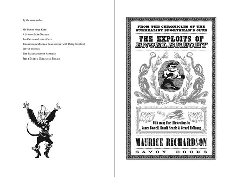
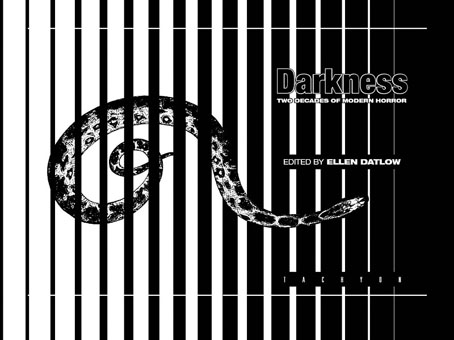
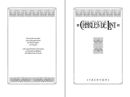
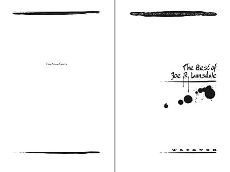

For some reason I like the Englbrecht cover the most.
Reminds me of the Black Ajax cover
http://img1.fantasticfiction.co.uk/images/n12/n61279.jpg
Do you get to do many covers or mostly interiors?
I like the contrast between the two best of interiors.
Thanks, I wanted Engelbrecht to look like an old playbill or poster design. You’d probably like the book as well, the stories at times approach Monty Python for their absurdity and invention.
For Savoy I do everything, inside and out. For Tachyon the majority of books have been interiors but there’s been a few where I’ve done the covers as well. I don’t mind concentrating on the interior alone, it can still be a lot of work and having someone else design the cover sometimes pushes things in a direction you might not otherwise explore.
Where does the image of all the lines radiating out on the Secret History of SF come from?
I’m sure I’ve seen it somewhere else before but can’t remember where
It’s OK I just remembered
http://en.wikipedia.org/wiki/File:Pioneer_plaque.svg
Ha. It’s the cosmic map from the plaque on Pioneer 10. Not sure how many people have figured that out. The cover of the book has a spacecraft detail on it so I wanted a graphic that implied space travel while remaining abstract.
Oops, your comment crossed mine.
You should have mentioned that a sample chapter of Englebrecht is available for Download at:
http://www.savoy.abel.co.uk/HTML/engelb.html
Great minds think alike.
Another book to add to my Christmas wish list.
At the risk of sounding repetitive, this is great stuff, John!
Thombeau
Mystery date is obviously Shirley Maclaine wearing the dress she used in Irma la Douce.
Gabriel: LOL!!
…or was it Sweet Charity?
Anyway it’s definitely Miss MacLaine
;-)
I would have guessed it was Shirl as well.
My mother-in-law is named Shirley. Believe it or not there is a Shirley Club in Australia. The only requirement to become a member is that you first name has to be Shirley:
http://www.shirleyclub.com.au/
Should be Sheila, surely?
Cue the late Leslie Nielsen saying “Don’t call me Shirley.”
Have you guys been drinking again??
The truth is worse, I don’t drink. (Well, rarely…)
Ditto.
Maybe over Xmas I might have something.
http://www.youtube.com/watch?v=0A5t5_O8hdA
PS How Titanic should really have ended
http://www.youtube.com/watch?v=9Q6JLPJcV6o&feature=channel
HA! Well, back to my original point, John: great work!
Back to Shirley and that dress:
http://www.youtube.com/watch?v=bLQYsTNKaoU
or if you prefer William Wyler to Billy Wilder:
http://www.youtube.com/watch?v=lX6EhE1ZPXU
Sorry yes back on topic the Kosher Guide back cover blurb animal with trumpet reminds me of some Gilliam Holy Grail animations about halfway down this page:
http://www.digitalmediafx.com/Features/terry-gilliam.html
Thanks Thom.
Gabriel: Those animals are grotesques by Arent van Bolten from c. 1630.