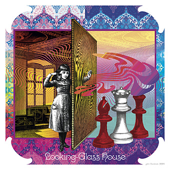
Looking-Glass House.
So here it is at last, this year’s much-delayed calendar design, the sequel to last year’s well-received Psychedelic Wonderland. I’ll get the business stuff out of the way first: would-be purchasers should go to the CafePress shop here while for a better preview of all the artwork look here.
Update: This calendar is now available again.
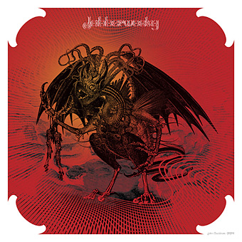
Jabberwocky.
“Seeing Alice’s adventures through the psychotropic prism of the late Sixties showed me the way into Wonderland,” I wrote last year, “What’s needed now is to do the same next year for Looking-Glass Land.” Where the first design was a pleasure to work on—and somehow only took me three weeks—this one turned into a considerable chore. It was my fault, I got started too late, hadn’t really thought what I was going to do (although the earlier design was completely improvised) and, worst of all, was trying to get this done whilst engaged with a stack of far more important work at the same time. As a result it’s a relief to have finished it at all since I nearly abandoned things on more than one occasion.
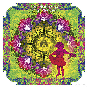
The Garden of Live Flowers.
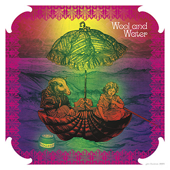
Another problem was the nature of the two Alice books. Wonderland is a lot easier to illustrate than Looking-Glass although I didn’t quite realise this until I’d begun. The chapters of the first book are very distinctive scenes, each with a differing flavour from those that precede them. The second book either repeats settings—there are many woodland encounters since the chessboard across which Alice moves is a landscape—or the chapters are wholly confused, as in Wool and Water which begins in a train carriage, switches to a shop then ends up in a rowing-boat. As you’ll see below, I opted to illustrate the boat.
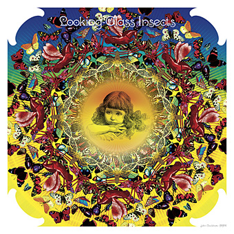
Looking-Glass Insects.
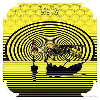
Excuses and complaints aside, I’m very pleased with a couple of these pictures; the Jabberwock came out better than I expected considering I was working at a rate of knots while the Wasp in a Wig (from the book’s lost chapter) could be given a Whistlerian title like Arrangement in Yellow and Black. As with the previous calendar design, the Alice figures change dramatically since they’re all taken from 19th century illustration or advertising art. And I’m now rather tired of looking at insipid pictures of Victorian children… If I do a calendar next year I think I’ll return to compiling earlier work unless inspiration and free time miraculously coincide. For now I hope that everyone who enjoyed the earlier calendar appreciates this one to the same degree.
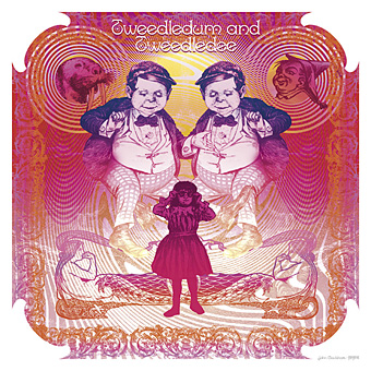
Tweedledum and Tweedledee.
Wool and Water.
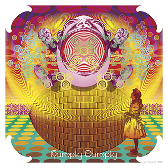
Humpty Dumpty.
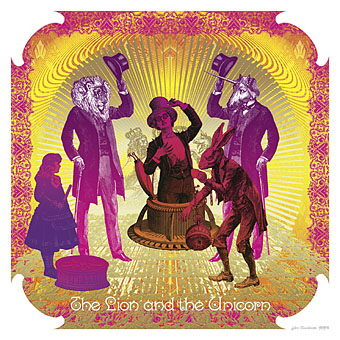
The Lion and the Unicorn.
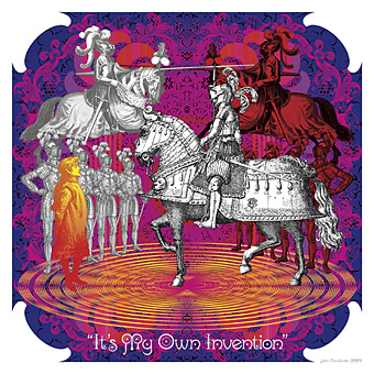
“It’s My Own Invention.”
The Wasp in a Wig.
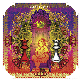
Queen Alice.
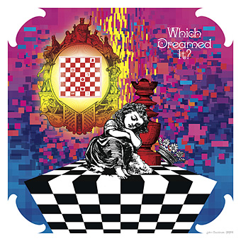
Which Dreamed It?
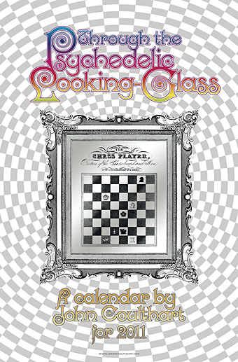
The cover.
Previously on { feuilleton }
• Jabberwocky
• Alice in Acidland
• Return to Wonderland
• Dalí in Wonderland
• Virtual Alice
• Psychedelic Wonderland: the 2010 calendar
• Charles Robinson’s Alice’s Adventures in Wonderland
• Humpty Dumpty variations
• Alice in Wonderland by Jonathan Miller
• The Illustrators of Alice

Love the colours and images.
Why not do The Hunting of the Snark next year?
PS
What did you think of Tim Burton’s film version? I liked the imagery but didn’t care too much for what they did to the story.
Alice on acid!
Love the wasp in a wig and and jabberwocky.
Thanks, Nathalie,
Gabriel: I still haven’t seen the Burton film, it always takes me forever to watch anything new. Having seen the trailers the storyline seemed as mangled as I’d expected. A number of earlier screen adaptations pad out the first book with characters from the second, confuse the Queen of Hearts with the Red Queen and so on.
I’m not sure I could summon the enthusiasm to do another Carroll adaptation. I should however have mentioned that the heads of Tweedledum and Tweedledee are swiped from Henry Holiday’s illustrations for The Hunting of the Snark. The boyish face worked perfectly on a fat body from a political cartoon.
Lovely work, John. I very much like your Jabberwock: he looks a very nasty piece of work as well as being a lovely piece of work, if you get my drift. It got me thinking, along the lines of those old “Godzilla vs …” movies, of Jabberwock vs Cthulhu. Now there’s an image to conjure up.
I’m with Gabriel McCann on the Burton movie: good imagery but shame about the story. Why do they do it – wasn’t Carroll good enough? It makes you wonder.
Wonderful, John!…But i’ve noticed this time you haven’t put high resolution images of this calendar, as you’ve done for your previous calendar ‘Psychedelic Wonderland’. Why this?…I’d like to appreciate the smallest details.
Another success, and I like the fact that the composition evolves since last year’s. This calendar has several images that are more simplified and focused on subject, which makes it stand on its own. I want to go back to Through the Looking Glass now.
And, of course, Wasp in a Wig describes some of my favorite people.
Thanks, Andrea. There’s a link in the top para to the page with the larger pics but I’ve also linked that page to each image if anyone clicks them. It took so long prepping and uploading everything to this page, the art section of jc.com and CafePress that I skimped a little.
And thank too, Evan. I still would have preferred to work on some of these for longer, the Wonderland set have better compositions over all but the clock was against me. If I’d have come up with the Wasp picture at the outset I would have gone further down that Op Art route and skipped the more florid stuff.
Hi John! I’ve just realized and uploaded on my YT channel a video based upon your two psychedelic calendars of Alice. It’s a tribute to your art, but if you don’t like it or you don’t agree my musical choice i will be ready to delate it. Several months ago i realized another video upon your first calendar ‘Psychedelic Wonderland’ with a different soundtrack, also this on my channel. Anyway, i will be happy to read your comment, if you want.
Andrea: You’re welcome to use the pictures for your video, I don’t mind anyone reposting things this way, it’s flattering when people take the effort. And I like Michael Brook’s work (especially his Hybrid album) so there’s no problem there. I have a couple of tracks from the U Srinivas collaboration on compilation albums.
Given a choice, the music I’d select to accompany this set of pictures would be a song I linked to earlier, Which Dreamed It?, the B-side of a one-off single from 1968 by Boeing Duveen and the Beautiful Soup. It’s the poem from the end of Through the Looking-Glass placed in a very pastoral psychedelic setting, and a lot better than their version of Jabberwocky which was the single’s A-side.
Excellent! Got a migraine aura now mind ;o but still Excellent! :)
I dissappear for a few days and look what happens! Amazing work ,John, and easily as good as last years calendar. I LOVE the humpty dumpty one with its Martin Sharp – esque circles, “wool and water” , which has a Satty feel, and of course the Jabberwocky which is simply amazing.
Nothing here looks rushed or slapdash – if you hadnt told us about how hard it has been to create, id just have assumed it had sprung from your head fully formed.
Go on, think of something cool for next year – give us another mindfuck!
Extremely fabulous, John, Of course!
Thanks everyone, I’ve stopped fretting as it’s become apparent that people do like this one as well. As for next year, I’ll make no promises just now.
hi! congrats on this fantastic new rendering of alice & friends… i just loved your work! coolest find of the month.
i was wondering, how can i get this calendar (this simply *must* be part of my “alice”-related collection…!), & how much would it cost to have this sent to argentina?
all the best!
martín
Hi martín. Thanks for the interest. You can still get an updated calendar for 2012 here:
http://www.cafepress.co.uk/psychglass.487706948
Oh, and I should have said, the other 2012 calendar (based on Wonderland) is here:
http://www.cafepress.co.uk/psychwonderland.584497840
thanks so very much, john, & –once again– congratulations on your most frabjous work! ;)
very best wishes to you from argentina! cheers!
martín
magp_ie@yahoo.com
facebook “cheshire cat catrroll”