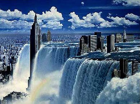
Waterfall by Tsunehisa Kimura.
Continuing an occasional series. Japanese artist Tsunehisa Kimura (1928–2008) was initially inspired by the polemical graphics of John Heartfield to create his own photomontages, a painstaking collage technique now rendered obsolete by Photoshop. Kimura’s work exchanges Heartfield’s satire for an overt and frequently apocalyptic Surrealism, as in his most visible piece, Waterfall. The copy above is one of a number of pictures reproduced by Geoff Manaugh at BLDGBLOG from a 1979 Kimura collection, Visual Scandals by Photomontage.
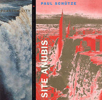
Design by Anne-Louise Falson & Paul Schütze.
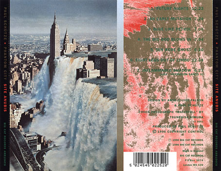
I was first startled by Waterfall in 1996 when Paul Schütze released his Site Anubis album, the product of a “virtual group” comprised of musicians recording in different studios around the world:
The musicians comprising Phantom City—the name, incidentally, originating from the book title Topology of a Phantom City by French novelist Alain Robbe-Grillet—never met for the recording of Site Anubis, as each one recorded in a different studio in a different country: guitarist Raoul Björkenheim in Helsinki, bass- and contra-bass clarinetist Alex Buess in a Basel studio, soprano saxophonist Lol Coxhill in London, bassist Bill Laswell at Green Point Studio in Brooklyn, New York, trombonist Julian Priester in Seattle, drummer Dirk Wachtelaer in Brussels, and Schütze himself in London and Basel. Incredibly, Laswell had only Schütze’s electronic backing track to respond to. Wachtelaer had Laswell and Schütze to play against, Björkenheim had drums and bass,—in short, certain players had more information than others.
Kimura’s picture is an ideal accompaniment to this excellent album, especially when you note a Ballard reference in the titles (not the first in Schütze’s oevre), and read the scene-setting piece of fiction on the CD insert, an explanation of the album title:
That morning a report came in from an unmarked helicopter somewhere over the city. The waters were subsiding and the smoke from a thousand fires had begun to drift inland revealing an impossible new structure. Towering some eight hundred feet over the gleaming devastation of the streets, its base occupying an entire city block, was a colossal black basalt figure. The body was male and human, – the head, which stared expectantly toward the boiling western horizon, was the head of a jackal. From the air it was clear that the pattern of destruction on the ground was radial and that the massive figure was sited precisely at its centre.
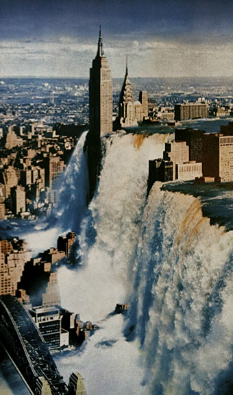
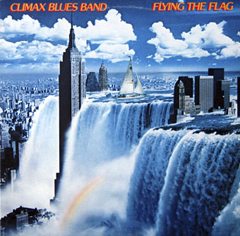
This wasn’t the first use of Kimura’s work in the music world, however, and here we encounter some vaguery on my part. A slightly different photomontage showing a flooded New York appeared in 1980 on another album cover, the sleeve for Flying the Flag by the Climax Blues Band. The Discogs entry for this album credits Kimura as the artist responsible so that would explain image below which I found when searching for more of the artist’s work. I’d guess that the band asked to use the picture for their sleeve then someone in the record company art department cropped it and added the outsized and ill-fitting yacht to the waterfall.
The attraction of Kimura’s work for use as cover art is obvious, these pictures are visually arresting in the same way that the photomontages created by Hipgnosis were in the 1970s. And by coincidence, Tightly Knit by the Climax Blues Band had an early—and not very notable—sleeve by Hipgnosis.
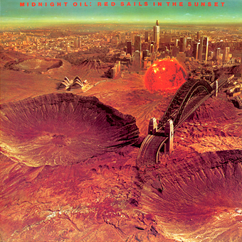
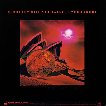
Four years after Flying the Flag, Australian band Midnight Oil used Kimura’s work for the outer and inner sleeve of their Red Sails in the Sunset album, a stunning reversal of the inundation of New York as Sydney becomes the site of another Ballardian apocalypse; from The Drowned World to The Drought with the additional threat of a mysterious sphere of ruby plasma. One can find connections with Waterfall via the harbour bridge which appears transplanted into the lower corner of the earlier picture, and also that crater which looks like the one described in Paul Schütze’s fictional note.
When there’s increasing discussion of flood threats to New York, and when Sydney itself was subject to last year’s incredible dust storm, it’s impossible to look at Kimura’s pictures today without seeing them as exaggerated auguries of the near future. Equally, they show the value of a strong imagination for any kind of visual juxtaposition. What little I’ve read of Kimura’s working methods makes it clear that the idea for the picture came first with its realisation following after. Hipgnosis always worked the same way. Photoshop may have made this kind of work easier to create but the onus remains with the software operator to dig the vision from their unconscious.
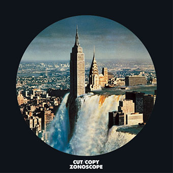
And so to the present where everything comes full circle with Waterfall used again by Cut/Copy for a new release, Zonoscope, which will be out in February. Cut/Copy are Australian, as are Midnight oil and Paul Schütze; Simon Sellars who runs Ballardian is also Australian… Is there something I’m missing here? If so, shouldn’t we be told?
For more of Kimura’s work see Gunnery Pagodas / Manhattan Niagara / The University of War at BLDGBLOG. For some Japanese graphic design (and another side to Kimura’s work) see Give Us Back Man – Japanese Graphic Design at A Journey Round My Skull.
Update: Paul Schütze writes to say he found Kimura’s picture on the cover of Delinquent Visionaries by Ben van Berkel & Caroline Bos during the recording of Site Anubis.
Elsewhere on { feuilleton }
• The album covers archive
Previously on { feuilleton }
• Design as virus 12: Barney’s faces
• Design as virus 11: Burne Hogarth
• The coming of the dust
• Design as virus 10: Victor Moscoso
• Design as virus 9: Mondrian fashions
• Paul Schütze online
• Design as virus 8: Keep Calm and Carry On
• Design as virus 7: eyes and triangles
• Design as virus 6: Cassandre
• Design as virus 5: Gideon Glaser
• Design as virus 4: Metamorphoses
• Design as virus 3: the sincerest form of flattery
• Design as virus 2: album covers
• Design as virus 1: Victorian borders

Thanks for posting this. Being a long-time fan of Kimura’s work I have six collections of his work, all of them in Japanese. If anyone feels compelled to explore further I’d like to recommend the most recent one, available from Amazon.co.jp ( http://www.amazon.co.jp/gp/switch-language/product/4894190567/ref=dp_change_lang?ie=UTF8&language=en_JP ). Unlike some of the others it’s not pocket-sized, and contains a good selection spanning from 1970 to 2001.
Hi Jens. Thanks for the tip, I was wondering about that. He’s another notable Japanese artist whose work you’d imagine would attract western publishers. When Geoff Manaugh posted those pics at BLDGBLOG they were reproduced all over, there’s obviously a demand.
When Red Sails in the Sunset came out most Aussies probably thought the front cover was in reference to Mad Max Beyond Thunderdome.
http://en.wikipedia.org/wiki/Mad_Max_Beyond_Thunderdome
As it happens, Mad Max 2 was always one of JG Ballard’s favourites.
What about 3
Beyond Thunderdome is #3.
God help us they’re planning on doing a 4th one now.
I don’t think Mel Gibson will be in it
http://blogs.crikey.com.au/cinetology/2010/06/30/casting-confirmed-for-mad-max-4-fury-road/
;-)