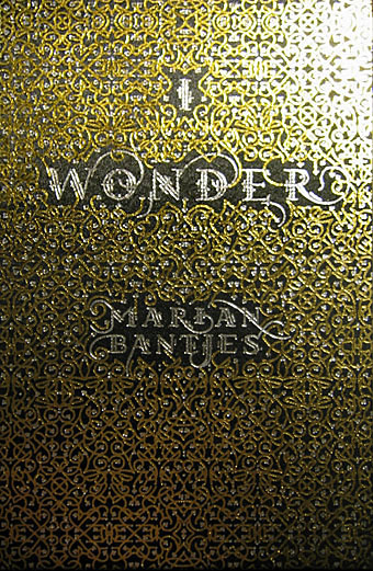
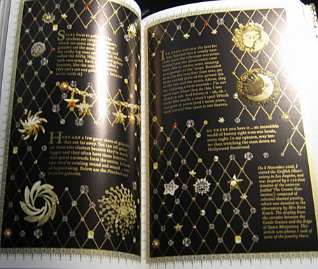
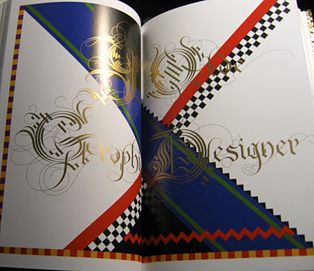
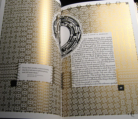
Book of the year, without a doubt. I only bought this yesterday and it’s been another hectic week so I’ve barely had a chance to look at it, never mind read the thing. What we have is 208 pages of unique creations by one of my favourite graphic designers, Marian Bantjes, in a truly beautiful production from one of my favourite publishers, Thames & Hudson. The text comprises Bantjes’ musings on art, design, decoration, pattern, and her personal development, together with some well-chosen quotes from other writers. I could waste a lot of pixels larding the book with superlatives but you really have to see a copy for yourself, words and pictures do it little justice.
More than anything I’ve seen recently this book is a tactile experience, and yet another volume (that designation which Borges always used to emphasise) which makes a nonsense of the idea of screens as an adequate replacement for all books. The boards are blocked with a gold and silver pattern, the page edges are also blocked in gold and there’s a liberal use of gold ink throughout. There’s so much gold ink on the exterior that leafing through the pages leaves your clothes and fingertips lighted dusted with a glittering residue. As an additional grace note, each volume comes with a length of purple bookmark ribbon.
Unlike many monographs from graphic designers this isn’t a “greatest hits” collection (although I’d still buy it if it was), all the layouts were created for the book alone. It’s not all gold ink and florid decoration, there are 21st century designs as well as hand-drawn pieces. And pasta. She doesn’t need a computer or even a pencil, she can work wonders with pieces of dried flour and water. Of the quotes, two stood out following a cursory perusal. The first is a humorous occurrence of the famous “Less is more” from Mies van der Rohe, placed in small type on an otherwise blank page. The second is from Oscar Wilde’s The Critic as Artist (1890):
Still, the art that is frankly decorative is the art to live with. It is, of all our visible arts, the one art that creates in us both mood and temperament. Mere colour, unspoiled by meaning, and unallied with definite form, can speak to the soul in a thousand different ways. The harmony that resides in the delicate proportions of lines and masses becomes mirrored in the mind. The repetitions of pattern give us rest. The marvels of design stir the imagination.
You can have your imagination marvellously stirred for nineteen pounds and ninety-five pence.
Update: The Bantjes Covers, in which the designer explains how her cover design came together.
Elsewhere on { feuilleton }
• The book covers archive
Previously on { feuilleton }
• T&H: At the Sign of the Dolphin


