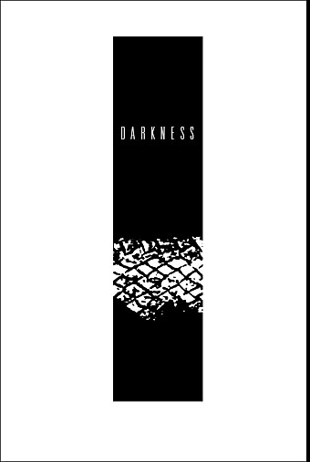
Darkness: half-title page.
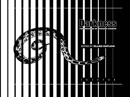
I’m still behind with site updates but here are two recent design jobs come to cast a shadow over the summer. Darkness is another fiction anthology from Tachyon, edited by Ellen Datlow and subtitled Two Decades of Modern Horror. Ann Monn’s cover design has a snake writhing through shadow so I carried the serpentine motif into the interior design. The book runs to 478 pages and, as the title implies, features lots of big names including Clive Barker, Joyce Carol Oates and Stephen King.
Darkness: title spread.
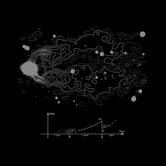
Dark Matter, on the other hand, is a double-CD compilation of singles from Bristol’s Multiverse label which is released this month. If you need a descriptor then many of the tracks here would be classed as dubstep, and a few are doomy enough to serve as soundtracks for urban horror. Skream is one of the featured artists, and his Trapped In A Dark Bubble on Tectonic’s Plates 2 collection (which I designed last year) has a great sinister ambience.
The design is very minimal with silver ink on a matt black digipak. The label requested graphics that mixed esoteric symbols with references to modern physics or astronomy without any of the allusions being too specific as to their origin or meaning. For the fonts I used the Fell types which take the design back to grimoires and old manuscripts.


Dark, indeed! Wonderful, John!
Thanks, Thom. :)
I love the cover. Thank you John.
hi, not really related to this post, but I found a rather nice design/ font site you might be interested in: http://www.virusfonts.com
Yes, I’m very familiar with the Virus fonts, thanks (and Jonathan Barnbrook’s work), we used one of them for a recent Savoy volume.