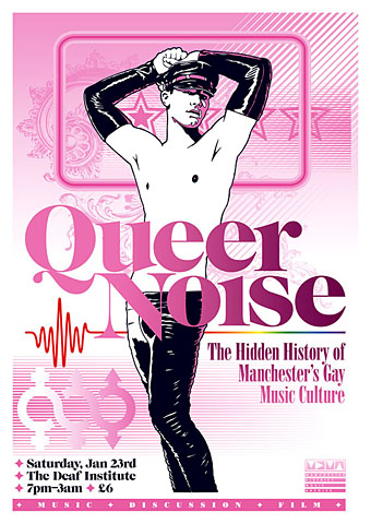
Two recent pieces of work which were being created at the same time so they share some similarity of style (and the same baroque flourish). Queer Noise is a music-related event taking place in Manchester (UK) next month. Music journalist Jon Savage will be leading the discussion and some may recognise the event title as relating to his Trikont CD compilation Queer Noises 1961–1978: From the Closet to the Charts. There are further details about the event at the MDMArchive.
Designing for gay content can be a fraught business since it’s almost inevitable that someone will disagree with your choices. Best then to abandon any thought of trying to please everyone and follow your own instincts. Making this a riot of pink seemed like a good way to offset the fetishised figure as well as making an eye-catching design. My first impetus had been to try an arrangement of pink and black on white similar to that used by Barney Bubbles in one of his Ian Dury designs. In the end this evolved away from that idea but it was a useful starting point. And while we’re on the subject of pink, there’s a growing backlash against the way the colour is forced on young girls:
Back in the 1800s, most children were dressed alike. Gender differences weren’t really apparent until they could walk, or later: boys and girls both wore dresses or skirts until they were six or so. By the end of the century, as the Ladies’ Home Journal noted, boys’ and girls’ clothing styles began to diverge. According to Professor Jo Paoletti of the University of Maryland, pink emerged as an appropriate colour for boys because it was “a close relative of red, seen as a fiery, manly colour”. Blue was considered better suited for girls because of its associations, in art, with the Virgin Mary. (More.)
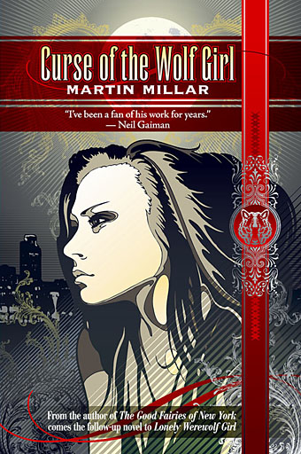
Curse of the Wolf Girl is a young adult title by Martin Millar about which I can tell you very little at the moment other than I’ve finished the cover and the book will be out some time in the new year from Underland Press. More about that when it happens.
Previously on { feuilleton }
• Coming Out Day
• Over the rainbow
• Queer Noises


I’m tickled that this is happening at a location called the Deaf Institute. I just googled it. It’s a pity I’d have to drive through the Atlantic to get there.
Beautiful cover for Martin’s story!
Thanks Nathalie.
Evan: I’ve heard of the Deaf Institute (ahem) but never been there so it should be an interesting event.
I like both these pieces, and think that you have cleverly referenced the cover of Lonely Werewolf Girl without sacrificing your own style.
That’s fascinating about the historical use of pink and blue in children’s clothing – I wonder when they got swapped over?
Thanks. The publisher asked for something which seemed like a continuation of the earlier book.
In that article about the anti-pink campaign it says that the colour reversal didn’t occur until around the 1940s although that claim needs some detailed research. The Nazis invented the pink triangle as a homosexual marker (but when? 1930s or 1940s?) which means that in Germany at least, pink was seen as un-masculine. There’s some evolutionary psychology stuff quoted in the article which seems rather spurious to me, a lot of this kind of thing evolves from cultural signifiers which can be arbitrary. In the Christian world red is masculine because of Jesus’s robe (which signifies the Passion) while blue was given to Mary partly because lapis lazuli was the rarest of pigments until the early 19th century.
For another counter-intuitive detail, according to Wikipedia “In Russian, the word for light blue, ???????, can be used to mean ‘homosexual’.”
Nicely done, old bean!
Wow! That QN poster is gorgeous! Razzles my dazzle.
Hi Tony, and thanks, glad you like it.
hi, i want haunter of the dark. can you send me one?