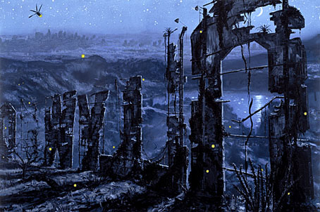
Hollywood at Night (2006).
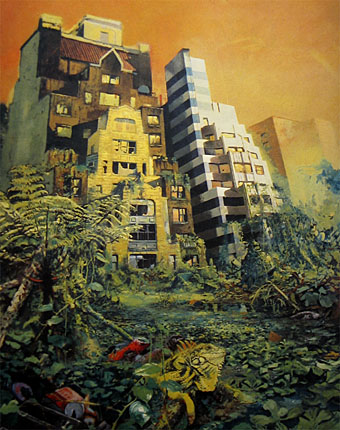
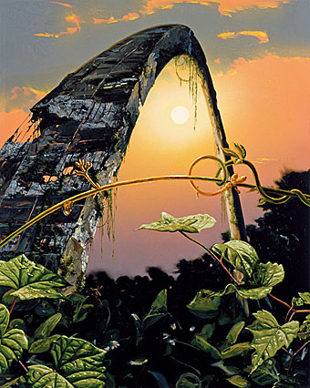
Alexis Rockman‘s paintings of swamped or ruined American landmarks present views which are a novelty in contemporary art galleries whilst being very familiar to science fiction readers. Many of these could well be illustrations for JG Ballard’s 1981 novel, Hello America, which imagined a depopulated United States reclaimed by flora and fauna. Others would suit The Drowned World, of course, and they bear favourable comparison with Dick French’s illustrated edition (below) which was also published in 1981.
Gateway Arch (2005).
Rockman’s hothouse atmospheres remind me of earlier paintings of Brazilian wildlife by another American artist, Martin Johnson Heade (1819–1904), many of whose tropical landscapes only require a distant ruin or two to match Rockman’s work. (Tip via Design Observer.)

The Drowned World by Dick French (1981).
While we’re on the subject, Ballardian has posted the first of three features about my colleagues at Savoy Books, beginning with a Michael Butterworth interview which discusses some of Ballard’s connections with Savoy. One of the subsequent posts should see yours truly discussing the visual dimension of the Savoy world. More about that later.
Previously on { feuilleton }
• The coming of the dust
• Ballard and the painters


Anything that brings Ballard to mind is very welcome and I’m looking forward to read your interview to “Ballardian”.
Best!
These are great – they show how much more beautiful the world will be after we have gone. Not that im misanthropic or anything………….
For Ballard the attraction of these kind of views was always an imaginative one, he talked a lot about “psychological landscapes”, and the attraction in fiction is often the use to which an abandoned city or planet can be put.
Beyond that there’s the old Romantic attraction of ruins in general. Ruined buildings of any age have a fascination for the way they look when they’ve lost the battle against entropy on the one hand and the depredations of nature on the other. I don’t think you have to be misanthropic to tire of a poorly built and rebuilt environment. I like the city area I live in but there’s a particularly shitty entertainment complex nearby, a big featureless box of cinema, bowling alley and fast food places surrounded by acres of car park which I’d love to see collapsed and overgrown. People could do their bowling elsewhere, the foxes and squirrels would have a new place to live and we’d have something more pleasant to look at.
I’ve often fantasized about contemporary architecture becoming reclaimed by nature. For me, there’s a connection to coral reefs that develop from old fuselages, etc.
The back of the Hollywood sign is wonderful. I hear that people are murdered behind the letters with startling frequency, and they’ve become more ominous as a result. Of course, this may be an urban legend.
A friend recommended Ballard’s “Why I Want to Fuck Ronald Reagan” as a precursor to Crash. Have you read it?
I think these pictures are pretty close to what we see in today’s world, something that falls down.
Evan: the Reagan piece is a part of The Atrocity Exhibition, a book I was attempting to illustrate at one time. (I still have no idea how I would have approached that chapter.) Crash is prefigured throughout The Atrocity Exhibition–there’s even a chapter called ‘Crash!’–but it isn’t necessary to read The Atrocity Exhibition first, Crash stands alone. They’re both very different stylistically; The Atrocity Exhibition is written in Ballard’s “condensed novel” style, where a chapter has enough content for an entire novel with all the extraneous matter stripped away. Crash is conventional style-wise with very unconventional content.
As California continues to slide and decay, these images might be seen as prophetic.
The gateway arch is really an impressiv building. Especially the elevators are awesome. I really recommend everybody to check it out.
I have an original watercolour by dick french for the book which wasn’t included. would you like to see it?
Hi Celia. I’d love to see that, thanks, and could make a post about it if you don’t mind.