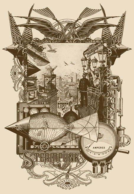
Steampunk: Life in Our New Century!
I’m behind on work updates again. Still being very productive on a range of different fronts—mostly book and CD design as usual—but the workload means that site updates tend to suffer. Anyway…
This new Steampunk illustration was a quick piece done at the weekend to accompany an article Jeff VanderMeer is writing. The collage came out better than expected considering it was pretty much slammed together in an afternoon. Coincidentally, the same weekend there was a request from Modofly for new designs to adorn their range of bespoke notebooks. The last Modofly design I produced was also a Steampunk one (depicting Jeff’s Steampunk formula) so I quickly worked this up into a new book design. I’ve also slightly reworked the Nyarlathotep design done earlier this year so it fits Modofly’s book format. When I get the time I’ll be making some Cafepress products from these designs; I’d like to see both of them as posters for a start.
Update: Jeff’s article, which includes two of my illustrations, is now posted here.
Previously on { feuilleton }
• Nyarlathotep: the Crawling Chaos
• Steampunk Redux
• Steampunk framed
• Steampunk Horror Shortcuts


why can’t we see the illustration? it’s bound to be better than merits vandermeer’s writing, and being denied it is just nooot on.
Hi wordling. It’s because Jeff wanted an exclusive image for his piece which I agreed to then posted it here without considering the prior agreement. That’s partly because I’d reworked the illo as a Modofly book cover. Jeff’s article will appear on a film site on September 5th, after which time I’ll reinstate the picture.
I’m kind of gobsmacked that you “slammed this together” in one afternoon – any chance you could do a blow-by-blow “how I did it” account for one of these pieces…I’m fascinated by what decisions designers make during the production of such pieces, as well as the nuts and bolts of how it’s actually done.
cheers
B Smith
Things got a little confused here after I substituted the Steampunk picture–done for an article which is now posted–with my Nyarlathotep piece. I’ve swapped the Steampunk one back and it’s this which was put together very quickly; I should have amended the text earlier. The Nyarlathotep picture took several days.
Both of them are similar in that they’re collage works pieced together in Photoshop from scans of copyright-free material. The Steampunk one didn’t take so long partly because the central picture is a genuine Victorian illustration from an old magazine, and much of the other stuff I already had to hand after I’d done a similar Steampunk piece last year. So it was really just a case of making an interesting frame for the picture. Composition is everything when you’re doing something like this, and it can take a while until everything feels like it’s in the right place.
I’d love to do a tutorial thing some time–my post about designing a book cover was very popular–but lengthy posts along those lines take some time to put together. Lately I’ve been far too busy; maybe later.