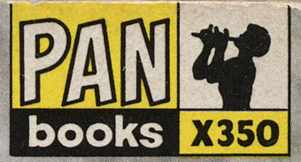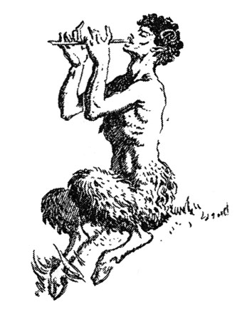
Another charity shop book-raid this week netted me a copy of Ian Fleming’s On Her Majesty’s Secret Service in its 1965 Pan Books edition, one of the Bond series with great covers designed by Raymond Hawkey. The sight of the tiny Pan silhouette above reminded me that this logo was based on drawings commissioned from Mervyn Peake when the company was launched at the end of the Second World War. The design persisted for many years, usually printed on a yellow background.

I wasn’t sure I had a copy of Peake’s original version to hand but G Peter Winnington‘s Peake biography, Vast Alchemies (2000), includes a reproduction, one of two drawings Peake produced for the publisher. The other can be seen on this Pan Books site which also reveals that Peake’s Pans were printed at quite large size on the initial run of books. The design model may have been the early Penguin style which nearly always had the famous bird prominently placed in the lower third of the cover. In book terms at least, the Penguin has proved to be the more powerful god, having survived virtually unchanged since 1935. Peake’s Pan is long gone, dropped in favour of two red squiggles.
Elsewhere on { feuilleton }
• The illustrators archive
Previously on { feuilleton }
• Buccaneers #1
• Recovering Bond
• Mervyn Peake in Lilliput
• James Bond postage stamps
• Wanna see something really scary?
• T&H: At the Sign of the Dolphin

the pictures in this post are not visible – is it just me?
Sorry. Ignore me. They just took unusually long to load.
That’s amazing John, I was fascinated by the Pan logo as a child and had no idea it was based on a Mervyn Peake design! As for the two red squiggles… what on earth are they supposed to represent? At a stretch you might interpret them as the leaves of a book, but really they’re more like a flag or a pair of ribbons. I guess the Great God Pan is considered just too un-PC for todays delicate literati.
That piper silhouette always prompts my childhood memory as well. My parents had a number of Pan paperbacks, including a couple of James Bonds. Also the trauma-inducing third Pan Book of Horror Stories.
The Pan Books history site shows a later logo with the piper emerging from an open book which seems to be the origin of the squiggles/waves. Pan has been absorbed into the sprawling Pan Macmillan group, and the wave shape makes a letter M. It seems emblematic of the way most of the big publishers have lost any character they once had, turning into anonymous corporate entities.
They should have used Peake’s original drawing instead of the silhouette, which takes away all the oomph in Peake’s drawing.
Which reminds me, have you seen the minimalist version of Pan on the cover of Jitterbug Perfume by Tom Robbins? It’s rather nice. (But annoyingly, not available on the web.)
Hi Yvonne. Peake’s Pan was no doubt deemed too detailed to be used at a small size, a common trend with these things, as I noted with Methuen’s water gate. Penguin’s bird logo has survived partly because Jan Tschichold tidied up the design when he set the guidelines for Penguin book covers.
Not seen the Tom Robbins cover but I’m a Pan-spotter so I’ll look out for it!