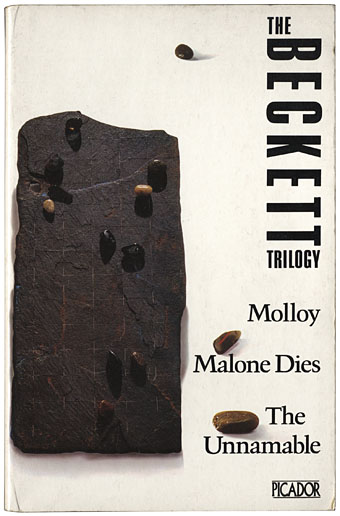
This 1979 Picador edition of The Beckett Trilogy is one of my favourite paperback cover designs. The “illustration” (as it’s described on the back) is a photograph of an artwork by artist/designer Russell Mills and the minimal credit gives no indication as to whether it was Mills who was responsible for the striking type layout. I’ve noted previously the equally striking Picador designs by the Quay Brothers who were responsible for both art and layout on their covers. Mills extended his work into graphic design later with album cover designs (and some book design) for Brian Eno, David Sylvian, David Toop and others so I’ll give him the benefit of the doubt in this case.

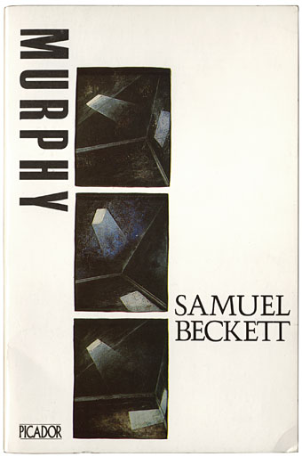
The Picador edition of Murphy was published in 1983 and comprises part of this week’s book haul. The three small Mills paintings suit the novel but I prefer his sculptural and collage works. I’ve taken to collecting more of these older Picador editions in recent years since they don’t turn up secondhand as often as they used to. As with the Quay Brothers and Italo Calvino, I wonder now how many Beckett covers Mills produced for Picador. The books list More Pricks than Kicks and Company in addition to these titles. He was still working for them up to 1986 when he and Brian Eno collaborated on the graphics for Don DeLillo’s White Noise. Unlike the world of Penguin collecting, this area lacks adequate documentation; further investigation is required.
Elsewhere on { feuilleton }
• The book covers archive
Previously on { feuilleton }
• Thursday Afternoon by Brian Eno
• Crossed destinies revisted
• Beckett directs Beckett
• Crossed destinies: when the Quays met Calvino
• The art of Shinro Ohtake
• Not I by Samuel Beckett
• Film by Samuel Beckett

I’m think I might have a one or two more Becketts in the same series (possibly Watt), certainly bought at the same time from a remaindered book store in Northampton in the 80s/90s whose owner was a Burroughs collector. He dug up great treasures at a time when very little of them were in print in the UK – lots of Calder Burroughs editions, Gysin’s novels, Crowley stuff. Something new and cheap every week, at a time when your average remaindered bookshops full of tat were starting to appear in the high street.
Anyway, I’ll have a look.
Watt is another in the Picador series–the Trilogy lists different titles for some reason–as is Mercier and Camier, so there’s more to search for.
Picador were pretty much on fire at that time (or at least at the time I was harvesting the remaindered fruits) with WSB titles like Cities of the Red Night & The Western Lands (don’t recall them doing Place of Dead Roads), Mailer’s Ancient Evenings etc. In fact I would say my teenage hipster bookshelf was almost entirely Picador and Calder. If only someone had seen it and been impressed.
They were on fire with a few odd exceptions such as their rather uninspired covers for the first run of Cormac McCarthy books in the 1980s. Those were the first UK editions so I think his name printed in large type took precedence.
Calder got the rights to Dead Roads as far as I can tell, the copy I have is a Calder edition anyway. My colleagues at Savoy Books very nearly published the first UK edition of Cities; they’d exchanged contracts then went bankrupt following the collapse of distributors NEL.
I own Picador editions of Company and More Pricks Than Kicks and can confirm that these two both have a credit on the back for “Cover Illustration by Russell Mills”. More Pricks features a photo of a bundle of nails, whilst I could not even begin to describe the object that graces the cover of Company beyond that it is rectangular. I thought it was an empty leather wallet at first, then an empty sleeping bag, but now I’m not sure what it is except that the objects I perceive would not be out of place in Beckett’s world. All that waffling and I think all I’m trying to say the cover suits the subject matter of the novel.
Picador were ahead of their time in one aspect, that of size format. I remember that I used to have to group all my Picadors together as they were larger than most of the other paperbacks I bought, but now it’s rare to come across a new paperback that isn’t “Picador sized”.
Thanks, Jok, more to look out for in that case. The size format was an inspiration for Savoy at the time. And Picador’s success also seemed to inspire Penguin to produce their King Penguin line.
The Beckett covers were designed in collaboration with Russell Mills by Gary Day-Ellison, who was art director for Pan and Picador in the 1980s. Day-Ellison took an adventurous approach to illustration, giving the artists he worked with a lot of freedom, if he believed they were in tune with a book. Mills and Day-Ellison became friends and some strong projects resulted, including the Becketts – Mills had an obsession with the playwright and had created other pieces inspired by his work. For Picador, Mills also illustrated (if that’s the right word) a group of Ian McEwan covers made by isolating and photographing sections of a single large semi-abstract artwork. The covers had typography by Vaughan Oliver and were highly influential in the mid-1980s.
Day-Ellison never received his full due for this work, which was certainly ahead of the field at the time. He is still working as a designer and shows a selection of Picadors on his website (http://www.day-ellison.com/picador.html) where you can see Mills’ cover for McEwan’s First Love, Last Rites, Robert Mason’s for Notes of an Anatomist, Andrzej Klimowski’s for Bliss, and the Brothers Quay’s for Mr Palomar, among others.
Day-Ellison’s predecessor at Picador, Dave Larkin, also commissioned some excellent illustration, though he experimented less with typography and layout. I’m fairly sure that Thomi Wroblewski’s fine cover for Cities of the Red Night (1982) – previously shown on Feuilleton – would have been commissioned by Larkin. Its collage/texture style owes a great deal to Russell Mills’ sci-fi collage illustrations of the late 1970s. Other exceptional covers art directed by Larkin include images by Candida (also known as Candy) Amsden for Thomas Pynchon’s V (1975) and The Crying of Lot 49 (1979).
Thanks Rick, that immediately fills in a lot of gaps. And I didn’t know Larkin was involved with the Picador line although it makes sense seeing as he was working for Pan. I wrote something a while back about the great line of Larkin-edited art books which Pan/Ballantine produced in the 1970s. Those had very distinctive white covers; can’t help wonder now if there’s some connection between them and the Picador style. There was at least one book from Picador–a large format exploration of Bosch’s Garden of Earthly Delights–which is almost an offshoot of the earlier Pan series.
The Mr Palomar cover is immediately identifiable for me as the Quays even in shrunken form by the presence of the Hradcany Castle shape they used in The Cabinet of Jan Svankmajer. Now I have to find a copy of that book…
I was Creative Head at Picador Books throughout the 80s and personally responsible for the design & art direction of these covers. I wonder how old these posts are and if there is still an interest in their genesis?
Hi Gary. I’m certainly interested, of course, and I looked at your site earlier following Rick Poyner’s comment above. While these posts fall away into the archives, people do return to them for information via searches, especially if the subject is a very specific one.
The typography was mine, that said, Russell and I worked closely. His ideas ran on similar lines. I was pushing Russell to follow his fine artist instincts (rather than regular ‘illustration’). His response was excellent.
White Noise was not exactly as the credits suggest. I had loved Brian Eno’s since his first solo album. I commissioned him do design the cover. Sadly it was not a success and I very reluctantly had to reject the results. Even a genius has a bad day. I guess he was busy. I called Russell in and we set set about a rescue mission. There was a new (vast) piece of pre-Mac kit in Soho. We both took bits to play with. I remember my Braun alarm clock was a last minute grab. Russ and I then spent a happy day playing with the new toy. As staff, my name never appeared on credits. And somehow Brian’s name remained.
Now that White Noise cover makes sense… Always felt it was atypical for Eno even though it fitted with your policy of commissioning people with more of a maverick sensibility.
Thanks for the comments on other posts. I’ve sent you an email.
re: post from Jok.
[Picador were ahead of their time in one aspect, that of size format. I remember that I used to have to group all my Picadors together as they were larger than most of the other paperbacks I bought, but now it’s rare to come across a new paperback that isn’t “Picador sized”.]
Art Director David Larkin worked with an equally brilliant publisher at Granada called Sonny Mehta (now big cheese at Knopf. They moved to Pan, and with Simon Master, set up Picador. At that time Penguin pretty much had one wall to themselves in most bookshops. They wanted Picadors to be kept together but separate from the competition. Hence the choice of ‘B’ format, 197mm x 130mm.