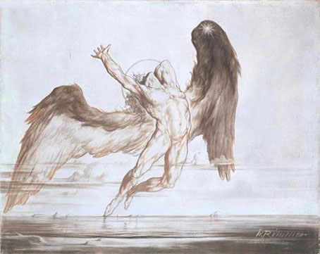
Evening: Fall of Day by William Rimmer (1869–70).
This curiously sexless figure is a good example of a work by an artist whose reputation may not have been as elevated as many of his contemporaries but who nonetheless created an image which speaks to future generations. Rimmer (1816–1879) was an American artist who produced a number of pictures along these pre-Symbolist lines. This particular drawing (a blend of crayon, oil and graphite on canvas) became hugely familiar in the Seventies when it was chosen by Led Zeppelin as the basis for their Swan Song label logo (below).

Swan Song was launched in 1974 with designers Hipgnosis handling the artwork. The reworking of Rimmer’s picture was by Joe Petagno, an artist most associated these days with his many Motörhead cover designs. Seventies’ rock has a well-deserved reputation for sexism but there was more of this kind of imagery around than you’d expect…or maybe it’s just me noticing the naked men. Whatever the reason, shortly after Swan Song appeared you could see Rush’s “Starman” logo, their Hemispheres album cover and also the cover of Going For The One by Yes (another Hipgnosis design).
And so to the present with this updated version by photo artist David Vance. Vance has a number of creations along these lines in his “Spirit” series. Am I the only person who finds it ironic that it takes a homoerotic artist to give the figure a set of genitals and make this icon of rock finally look like a real man?
Elsewhere on { feuilleton }
• The gay artists archive
Previously on { feuilleton }
• Saint Sebastian in NYC


Hipgnosis did some really interesting stuff.
Your juxtaposition of images reminds me of Gatochy’s image associations and the picture itself reminds me of a beautiful one of Lucifer falling which a friend posted on their Livejournal but which I can’t find, annoyingly (think it was a Symbolist artist though; not the Gustav Doré one).
Good links, thanks. Mariana is a fellow traveller in these regions.
I love the work Hipgnosis did in the Seventies and Eighties, they were a huge inspiration for me as I usually mention in interviews. In the case of lesser bands, their designs were often better than the music they were asked to package.
A friend of mine had a book of Hipgnosis covers; I spent many a happy afternoon browsing through it.
It’s a pity CDs are smaller – so much less space to work with.
I have that very book, Hipgnosis – Walk Away René. My copy is rather battered, I keep intending to find a better one since they seem unlikely to reprint it.
CDs are very frustrating to design for, especially some of the designs I’m asked to do which are heavily pictorial and which lose all their detail and impact when shrunk to CD size.
Where can I purchase a copy of the orignal ?
Hi Ron. The original of Evening: Fall of Day is owned by the Museum of Fine Arts, Boston. I’d suggest contacting them to see if they have prints available.
http://www.mfashop.com/contact-us.html
Hello,
I believe the reason why the angel in this piece has been portrayed lacking any vestiges of genitalia is not out of modesty and protection of innocents alone.
As far as Biblical angels are concerned, they do not reproduce and thus are not equipped to that end.
Though, Vance’s work is sterling, I think it goes outside of Rimmer’s intentions to depict an angelic being.
I always loved Hipgnosis and their work on albums by TenCC and Pink Floyd particularly.
the space people are really lucifer and his fallen angels….