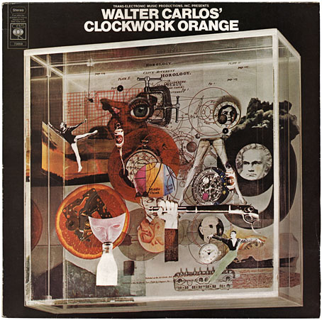
CBS 73059; construction by Karenlee Grant, photo by David Vine (1972).
A1 Timesteps (13:50)
A2 March From A Clockwork Orange (7:00)
B1 Title Music From A Clockwork Orange (2:21)
B2 La Gazza Ladra (5:50)
B3 Theme From A Clockwork Orange (1:44)
B4 Ninth Symphony: Second Movement (4:52)
B5 William Tell Overture (1:17)
B6 Country Lane (4:43)
Viddy well the stuff of obsessions, O my brothers: Kubrick, cover design and electronic music in one convenient 12-inch package. Those of us in Britain who were too young to see A Clockwork Orange during its initial run had to wait a long time for its re-release after Stanley K withdrew the film from circulation. Until bootleg VHS copies started to turn up in the 80s I knew the film mostly from the MAD Magazine parody and the soundtrack album which was ubiquitous in secondhand record shops. Having become familiar with the score, an additional layer of frustration was added when it became apparent that two soundtrack albums had appeared in the 1970s, the “official” one, which was a mix of the orchestral and electronic music used in the film, and another which contained all the music Walter (later Wendy) Carlos recorded.
The Wendy Carlos music was the principal attraction for this electronic music obsessive and I fretted for a long while trying to find a copy of her Complete Original Score album which was paraded in all its elusive glory on old CBS vinyl inner sleeves. Half the tracks are present on the official release but the omissions are crucial: Timesteps, the incredible composition which accompanies Alex’s first deprogramming session was edited down from thirteen to five minutes, there was Carlos’s Moog version of Rossini’s La Gazza Ladra (an orchestral version is used in the film) and also an original piece, Country Lane, intended to accompany Alex’s police brutality session at the hands of his former droogs. The score was one of the first projects to successfully incorporate a vocoder into electronic compositions; Rachel Elkind, Carlos’s regular collaborator, provided the vocalisations. Finally securing a copy was no disappointment, in fact I was overwhelmed. This is still my favourite Wendy Carlos album and one of my top five favourite analogue synth albums. The transcription of La Gazza Ladra is nothing short of miraculous, thundering away with the power of a full orchestra yet created by laboriously recording one note at a time. (Wendy Carlos’s very thorough website goes into detail about the recording process.)
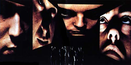
The original Human League, circa 1979.
I wasn’t the only person to take note of this, the album had already made a an impact on Martyn Ware and Ian Craig Marsh in Sheffield, whose early electronic music as The Future, and later The Human League, owed much to the early Carlos Moog albums. Albums such as this were important to the electronic groups that came to prominence later in the decade for the simple reason that there was little music of this quality around. Cross the Wendy Carlos ACO with Trans-Europe Express by Kraftwerk and The Human League is the result.
The Future were keen to create cut-up lyrics à la David Bowie, who’d been swiping William Burroughs’s writing techniques several years earlier. Rather than chop up notebooks as Bowie was doing, the Marsh and Ware approach was effected using a (no doubt rudimentary) computer system which they named CARLOS: Cyclic And Random Lyric Organisation System. Connections to A Clockwork Orange were reinforced following their 1980 split from The Human League when their post-League band, Heaven 17, took its name from Burgess’s novel (the group is also mentioned in the film’s record store scene). A brief post-League incarnation as the British Electric Foundation had them include on their releases a 30-second BEF ident, composed by Malcolm Veal “in the style of Bach and Purcell”. Wendy Carlos’s first synth album was Switched-On Bach, of course, and the title music to A Clockwork Orange is based on Purcell’s Music for the Funeral of Queen Mary.
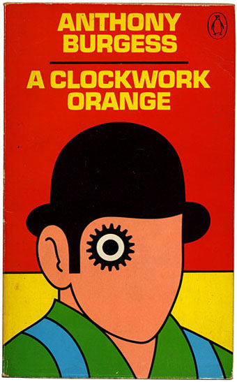
David Pelham’s classic Penguin cover for the 1972 paperback edition. Kubrick’s film has the droogs wearing white but this cover honours the description of their coloured outfits. The film has come to dominate later representations of Alex and company and the current Penguin edition continues Kubrick’s white-on-white minimalism.
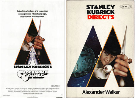
The original 1972 poster and a 1973 paperback edition of Alexander Walker’s Kubrick study.
It’s always gratifying when an album you like a great deal has good sleeve art and the illustration for the Carlos ACO I still rate as one of the most successful designs based on Burgess’s novel, with its focus on the themes rather than Alex’s character. Kubrick’s film and the official soundtrack is still promoted with variations on the original poster art by illustrator Philip Castle (above). I’ve yet to discover who designed the fat Seventies-styled title lettering.
The Carlos cover was the work of Karenlee Grant, a CBS designer and cover artist. Of the other designs of hers that I’ve been able to trace this is easily the best, alluding in its combination of collage and perspex case to the work of American Surrealist Joseph Cornell.
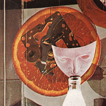
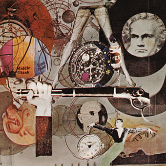
Close scrutiny reveals a wealth of clever detail, not only the obvious juxtaposition of clock parts and an orange slice, but elements such as the eye caught in a vice and the medical drips labelled “yes” and “no” which refer to Alex’s treatment.
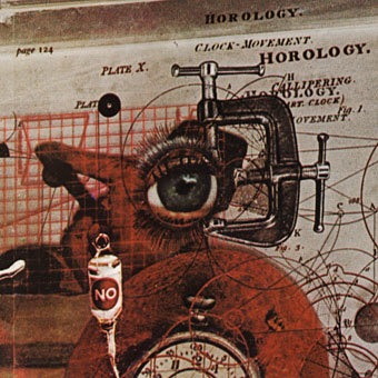
This detail below crams a huge amount of reference into a small space, from Ludwig Van’s “thunderbolted litso” in the background, snared by a Helvetica numeral, to the Freudian motifs in the foreground.
Another of Ms Grant’s designs from this period was a self-titled release by the Jeff Beck group, not an especially notable design apart from the curious detail of the orange among the photos. No oranges are mentioned in the songs, as far as I’m aware. Given that the album was released five months after Kubrick’s film, was this a strained attempt to cash-in on the huge publicity the film generated?
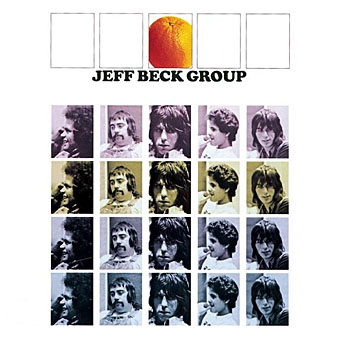
Jeff Beck Group by the Jeff Beck Group (1972).
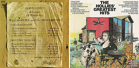
Glenn Gould: Consort of Musicke by William Byrd & Orlando Gibbons (1971); The Hollies’ Greatest Hits (1973).
A couple more Karenlee Grant covers obliquely related to the ACO sleeve, with another constructed object as the focus of one and a collage work for the other. Glenn Gould offered the highest praise to Wendy Carlos’s earlier Bach recordings so I imagine he would have appreciated ACO as well. What Karenlee Grant did after the mid-Seventies is unknown, I can’t find much work mentioned after this period so I’m guessing she left the music business.
Wendy Carlos’s album was reissued on CD in 2000 on the ESD label, a superb edition which added a couple of minor outtakes. My only gripe was that Karenlee Grant’s cover art wasn’t reused for the cover (it’s reproduced in the booklet) but I have to accept it wouldn’t have been the same reduced to CD size; some album sleeves were intended to be seen in their 12-inch glory.
For anyone interested in Wendy Carlos’s oeuvre, this album is the place to start. For anyone interested in the history of electronic music, this is an essential purchase.
Elsewhere on { feuilleton }
• The album covers archive
Previously on { feuilleton }
• White Noise: Electric Storms, Radiophonics and the Delian Mode
• Juice from A Clockwork Orange
• Penguin book covers
• Clockwork Orange bubblegum cards
• Alex in the Chelsea Drug Store

If you’re not aware of it already, check out this brand-spanking new reworking of the ACO poster:
http://www.flickr.com/photos/keepsmesane/2542689020/in/set-72157601618281265/
This is the first time I’ve ever seen an inversion of the droog outfit… obvious really. It doesn’t quite work for me, but I can’t put my finger on why. Maybe it’s the arbitrary feel of the ‘knife’ or the lack of dynamism in the pose. A decent enough attempt, though.
The other posters in this flickr set are worth checking out, my personal favourites being Psychomania and Rashomon. Least favourite is probably Blow-up – a missed opportunity IMHO.
Hi David and thanks for that which I hadn’t seen before. I nearly went searching on Flickr for more ACO stuff but this post was already sprawling.
A nice idea to try updating film posters although many of them look to me more like book covers (in fact one of them is, for Dr. No); they’re self-consciously clever in a way books are still allowed to be but Hollywood posters rarely are, as a glance at Apple Trailers regularly confirms. Some really nice work there, however.
As it happens, all Kubrick’s later posters tended to be very spare like book jackets, one of them (for The Shining) being designed by Saul Bass. From 2001 on, he advertised his films with a single striking image.
The font, I think by Michael Hagemann, is called ‘Timepiece’. It’s actually free to download (Google it). The 3D version is an illustration just for the poster.
Hi Matt. Yes, I’ve seen that font before, think I even have a copy somewhere. The question for me is who designed the ACO poster type in the first place, I’ve yet to see that credited anywhere.
I’ll note for the record here (and so I don’t forget) that the title lettering looks like it may have been based on Milton’s Glaser’s Baby Teeth typeface. Then again the Seventies had a lot of these fat type designs.
And it’s a style that’s been coming back recently.