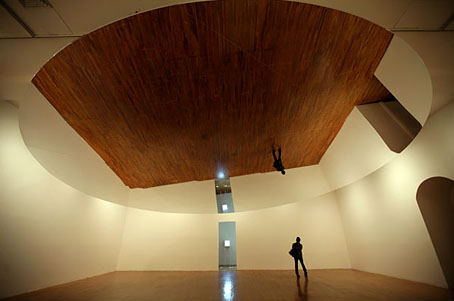
New work by Danish artist Olafur Eliasson is always welcome here and the above is exactly that, a large rotating mirror installed at the P.S. 1 Contemporary Art Center, New York, along with other pieces comprising a major survey of his work.
Take Your Time a new piece at P.S. 1, made for the show, consists of a huge, tilted, disc-shaped mirror suspended horizontally from a gallery ceiling. What strikes you at first is the omniscient, bird’s-eye reflection of the room below, with you standing in the middle of it. Then you notice that the mirror is rotating very slowly, and with a subtly undulating motion that causes the room itself feel warped and unstable. You experience this as much with your sense of balance as with your eyes.
The New York Times takes a critical look at Eliasson’s work and complains about his not being radical enough, an objection which seems curiously old-fashioned as well as being the kind of issue that only plagues art critics, other artforms getting on perfectly well without concerning themselves with being avant garde and challenging above all else. Better to ignore the redundant polemic and look at the slide show of his works.
Take your time: Olafur Eliasson runs until June 30, 2008.
Previously on { feuilleton }
• Olafur Eliasson’s BMW
• Olafur Eliasson’s Serpentine Pavilion
• New Olafur Eliasson


I have to admit, I don’t get it. We saw his MOMA show, and, well, I wasn’t wowed. It’s possible that I just failed to do my homework and had I known more I would have been impressed, but it all felt a bit empty.
Hi Claire. I don’t think there’s any homework necessary with Eliasson’s work, in fact I often complain about contemporary art which requires too much context extraneous to the work itself to be understood. But if you don’t respond then that’s a perfectly valid thing; no art from any era carries a compulsion to be enjoyed.
I was very impressed by Eliasson’s Weather Project at the Tate in 2003 and I like the way he varies his approach. Too many artists today find one niche area which they then exploit ad nauseam; once you know that Rachel Whiteread makes casts of objects the only new thing to discover is what new thing she’s made a cast of and how it’s been arranged. Eliasson is more inventive than that. And I like his use of light, something that bears comparison with James Turrell.
There was one piece in the MOMA show that I did like — a floor of old, driftwood-like worn wood that made interesting sounds as people walked across it. Making it cooler was the discovery that the floor was actually on top of a shallow pool of water that continued on to the other side of a screen, with a light illuminating the surface of that part of the pool creating interesting reflections from the overlapping waves. But the rest, not so much.