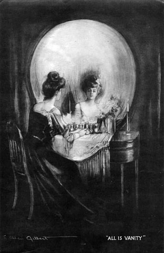
All Is Vanity by Charles Allan Gilbert (1892).
The subliminal skull is another of those perennial motifs that recur in art from time to time, and one which has become especially prevalent since the late 19th century. There seem to be a number of reasons for this, the most obvious being that if you’re going to show how clever you are by hiding one image inside another you may as well make the hidden thing something that everyone recognises. A secondary reason would seem to be the waning power of the vanitas theme. As painting became more pictorially sophisticated it wasn’t enough to simply show a skull and expect people to accept this with a stern moral as the principal content. Hence the development of death as a non-skeletal character in Symbolism and the reduction of skulls in pictures to a kind of playful game.
Holbein’s anamorphic skull in The Ambassadors is probably the grandfather of all the later versions but the more recent popularity of the hidden motif can be traced back to Charles Allan Gilbert whose 1892 picture, All is Vanity, drawn when he was just 18, was sold to Life Publishing in 1902, and subsequently spread all over the world in postcard form. Despite giving birth to a host of imitators, Gilbert’s picture is the one that still inspires artists and photographers up to the present day.
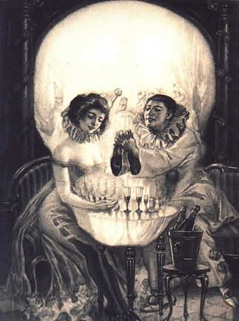
A Pierrot’s Love (uncredited) (1905).
Another very popular version.
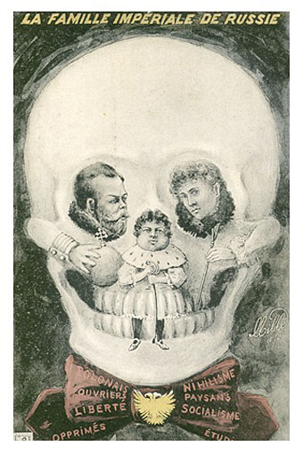
La Famille Impériale de Russie; French postcard (1908).
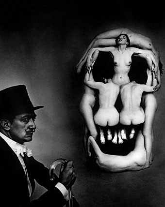
In Voluptas Mors by Salvador Dalí & Philippe Halsman (1951).
Dalí was the master of this kind of pictorial illusion, of course, and worked several of his own variations with skulls. The most famous is the Philippe Halsman photograph which was recapitulated in the poster art for The Silence of the Lambs in 1991 and, more recently, The Descent.
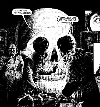
The Adventures of Luther Arkwright by Bryan Talbot (1982).
Gilbert’s picture was reproduced as a poster in the 1960s, and eventually began influencing rock album sleeve art. The Damned used Gilbert’s picture in 1977 while Def Leppard produced their own version for Retro Active in 1993. Far better than the metal attempts was Trevor Brown’s sleeve for Coil’s Hellraiser Themes EP which you can see on his blog page together with some other 20th-century examples of the motif.
Bryan Talbot’s panel from the first book of The Adventures of Luther Arkwright is less well known. I’m sure there’s been a lot of this kind of thing in the comics world over the years but Bryan’s version is the only one I have to hand.
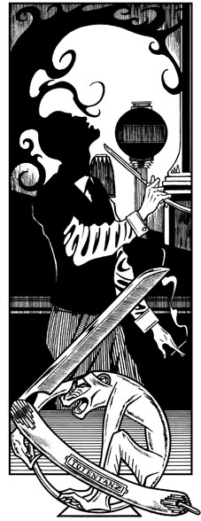
Lord Horror: Reverbstorm (1991).
And speaking of comics, here’s my own variation in a panel from Reverbstorm #3, drawn in 1991 but not published until 1995.
Poison by Dior, photographed by Vincent Peters (2002).
And so to the 21st century and this award-winning ad shot which brings us full circle in its imitation of Gilbert’s picture.
The effect was achieved with skilful lighting, set design and photography rather than post-production trickery, says Peters.
“The image recalls the blending of art and psychology that occurred at the end of the 19th century. I shot it straight, with very little post-production. The trickiest part was getting the composition right – there was only one spot I could take the shot from; an inch to the left or right and the effect would have been spoiled.”
He stresses that the resulting image was “a collaborative effort” and makes special mention of the agency’s creative team. “The agency came to me with the idea and asked me how I would do it. These day it’s rare to be approached for your technical skills. Normally it’s because you can achieve a certain mood. In this case I added the fin de siècle atmosphere.”
Previously on { feuilleton }
• Darwin Day
• Vanitas paintings
• Giant Skeleton and the Chocolate Jesus
• Perfume: the art of scent
• Very Hungry God
• Dalí Atomicus
• History of the skull as symbol


I am familiar with most of these apart from the last three. The black and white one is particularly striking. The skull on the Dior commercial reminds me of Darth Vader…
I’d seen the first two and the Dalí before. Nice to satisfy the curiosity and find out who did what and when. There’s actually several blogs and web pages that repeat all this stuff but at least I managed to add a couple of new examples.
a very interesting subject, overall in these times in which we tend to hide the death, as if this did not be a part of our life.
That “In Voluptas Mors” one was used last year I think in some form of hell appelation… I can’t remember the name of that movie unfortunately.