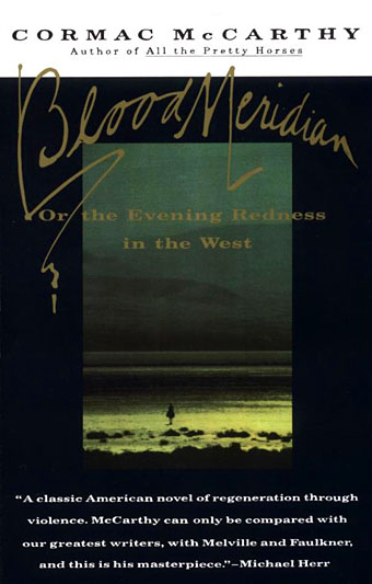
Still in pursuit of a Cormac McCarthy obsession I picked up a copy of the (American) Vintage International paperback of Blood Meridian this week, almost solely for the cover. As it turns out it’s also an easier book to read than the UK edition, less tightly bound although the body text in both looks as though it was printed from photocopied galley proofs. The cover design is by Susan Mitchell, with photography by Craig Arness, and forms part of a small series among the Vintage reprint editions. Mitchell resists the understandable temptation to put red on the cover, saving that for McCarthy’s tale of a murderer, Child of God.
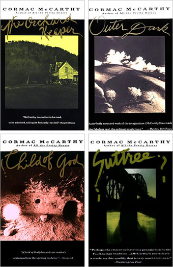
Vintage reprints (1992–1993).
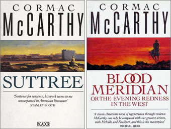
Picador editions from the 1980s.
The set of UK paperbacks put out by Picador in the 1980s sported very vague painted illustrations by George Sharp. Blood Meridian here comes across as a generic Western, which it most certainly is not, while the illustration for Suttree is particularly lazy with its generic riverscape that looks nothing like the Knoxville river featured in the book.
Following the publication of All the Pretty Horses in 1992, McCarthy’s novels were reissued with new uniform jackets based on designs for American editions by Chip Kidd. There’s a parallel here with the Vintage covers in their use of ominously empty, tinted photographs but it’s the Vintage books that have the edge for me, with their black surrounds and combination of hand-done titling with vaguely antique typography. The lone rider oppressed by bands of darkness on the Vintage cover of Blood Meridian communicates far more about that story than Simon Marsden‘s photograph of Monument Valley.
Picador reprint (1990).
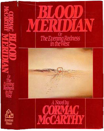
Random House first American edition (1985).
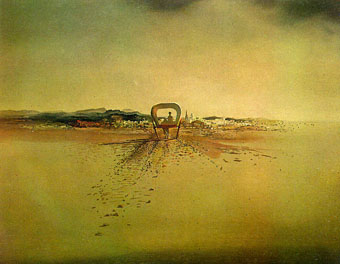
It’s a shame that McCarthy’s masterpiece looked so shoddy in its first edition. This design overdoes the red while the type seems more suited to a bestselling romance than an apocalyptic exploration of violence and madness in the Old West. Things are slightly redeemed by the cover painting, The Phantom Cart by Salvador Dalí. McCarthy’s story certainly approaches Surrealism in some of its more lyrical flights, and the Spanish village here can easily stand for the similar villages along the border of Texas and Mexico where much of the novel takes place.
The Phantom Cart by Salvador Dalí (1933).
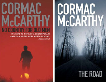
No Country for Old Men (2005), The Road (2006). Both Picador.
And so to his latest works which in their UK editions manage to be functional but completely bland, looking like the products of design-by-committee. No designer is credited for The Road and its cover photograph is a stock shot from Getty Images. It also features that most egregious of publishers’ tricks, metallic foil on the title type (showing grey in the example above), used in the belief that “the magpie reflex” makes people pick up anything shiny or reflective. That it also makes novels appear cheap and tacky never seems to cross the minds of marketing people. None of this matters in the end; McCarthy is still one of the greatest living writers and maybe one day these new designs will seem quaint the way they reflect the period in which they were created. In the meantime we can wait for a Susan Mitchell of the future to dress them more appropriately.
Elsewhere on { feuilleton }
• The book covers archive


John
I concurr that McCarthy, along with so many other writers of significance, have been poorly served in terms of how their books have been presented over the years. However, even the worst of some of the past ‘mistakes’ are usually more interesting than the bland, innocuous and tediously ‘safe’ designs of the 21st C – with stock images and fonts more suited to corporate brochures.
I do like the 1990’s Picador covers (more so than the 80’s editions)but the Vintage reprints are worth tracking down just for the covers alone. I particularly like Mitchell’s design for ‘Suttree’ (his best book, for me) – the solid, almost graffito scrawl of the title over an image that manages to encapsulate the pervading mood of the novel.
Bland cover aside though, ‘The Road’ is one of the best books I’ve read this decade.
Yes, the current Picador editions have a nice consistency. Most of them are Simon Marsden photos, I think, and few people will get the surreptitious and appropriate link between him and his more Gothic pictures. In fact that picture of Monument Valley is also in his Poe book.
The Road is still waiting to be read here while I work my way slowly through the thousand pages of the Border Trilogy. Looking forward to it though.
I’ve always quite liked Chip Kidd’s Cormac McCarthy covers, actually; have you seen those?
http://www.booksamillion.com/bam/covers/0/67/974/439/0679744398.jpg
http://www.booksamillion.com/bam/covers/0/67/974/719/0679747192.jpg
http://www.booksamillion.com/bam/covers/0/67/976/084/0679760849.jpg
Hi Eric. Were those from Chip Kidd? If so they were used in slightly-altered form for the Picador editions here, although I’ve seen The Crossing with another cover besides the skulls one. As I said, I like them, just feel that the Vintage editions get closer to the heart of his work. And I should perhaps have included the US first edition of The Road here, it’s stark minimal approach is a lot better than the disappointing UK edition.
Hi,
I am doing some bibliographic research on Blood Meridian and I wonder if UK versions have different layouts/page counts than US editions. I notice from my library’s description (I wasn’t able to access the book itself) that the first edition has a page count of 337: identical to my Vintage paperback edition and the 2001(?) US hardcover with Harold Bloom’s introduction. Your comment that the type looks like galley proofs is intriguing. I wonder if you know any versions that deviate from that type and page count.
Thanks
KC
Hi KC. The two editions I have are the Picador one with the Simon Marsden cover and the Vintage one shown at the top of the post. Comparing the texts it’s evident that the Picador is a direct copy of the Vintage typesetting, with 337 pages, although slightly shrunk since the book isn’t as tall.