I’ve yet to see Tom Tykwer’s film of Patrick Süskind’s novel, Perfume—The Story of a Murderer, and remain reluctant to do so; it’s a rule in cinema that good books make bad films and vice versa. Perfume is a good book and a favourite of mine which makes the prospect of film adaptation even more worrying. (As an aside, Tykwer dispels the persistent rumour that Stanley Kubrick dismissed Perfume as an unfilmable novel.)
Reservations apart, I’ve been listening to the tremendous soundtrack all week after a recommendation from a friend (hi Philip!). The music is credited to Reinhold Heil, Johnny Klimek and the director, and features the near unprecedented involvement of conductor Simon Rattle and the Berlin Philharmonic, an orchestra that rarely stoops to the level of the film soundtrack. This prompted speculation about the distinct challenge Süskind’s book presents to a designer: how best to represent the entwined strands of Grenouille’s career as a perfumier and a murderer of young women?
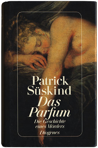
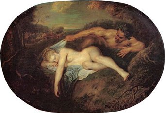
Süskind’s novel was published in 1985 and I was fortunate to find the German first edition from Diogenes Verlag in a charity shop for the grand sum of 89p (no, I don’t want to sell it). The cover shows a detail from a painting by Antoine Watteau (1684–1721), Nymphe and Satyr or Jupiter and Atiope (1714), and establishes the sleeping woman motif that’s followed the story ever since. The first edition also includes details on the boards from Michel Etienne Turgot’s stunning Plan de Paris of 1739.
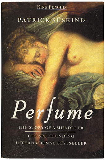
The Watteau design was carried over onto foreign translations of the book,
including the original Penguin publications.
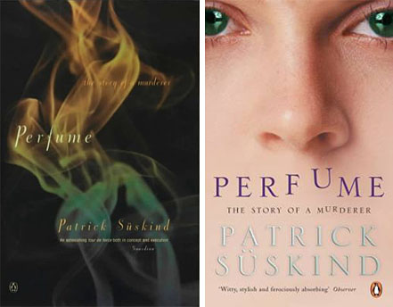
More recent Penguin editions have tried the abstract approach (but that’s smoke, surely?) followed by a close-up of the face of Laure—the auburn-haired, green eyed girl who obsesses Grenouille later in the book—as she sniffs the letters in the title. This seems to confuse matters since the story is concerned with Grenouille’s preternatural sense of smell, not that of the other characters.
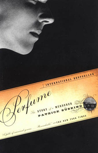
Given the theme, it’s understandable that the nose should be a focus and on that score at least the cover of the Random House paperback is very successful. A simple yet striking design, with elegant typography (Bickham Script for the title), and a nice detail of what looks like one of the Seine bridges (Pont Neuf?) as a tiny vignette.
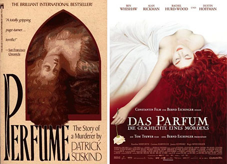
Ordinarily I’d say that the Random House cover is superior because American book jackets are usually better-designed than their European counterparts. The Washington Square Press edition (above, left) shows that this isn’t always the case, resurrecting the sleeping woman concept in a nasty-looking posterized treatment. Little better is the European film poster which is equally vague and poorly-rendered. The UK poster only managed to show Grenouille’s face (with prominent nose) hovering over a woman’s midriff.
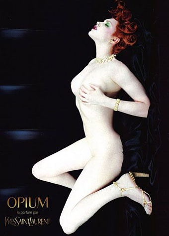
Nothing to do with book or film but a far better picture than the two latter examples is the controversial Yves Saint-Laurent Opium ad artwork from 2000. In an odd conjunction with the book, model Sophie Dahl was given red hair and green eyes and (in the horizontal version) becomes another recumbent female. I thought this was a wonderful image at the time, unusual in being used in both vertical (billboard) and horizontal (magazine spread) formats. Unfortunately a small minority of the British public disagreed and complaints caused it to be withdrawn from circulation as a poster.
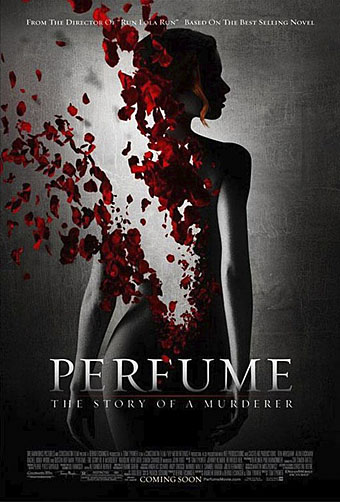
And so to the US cinema poster and another great design. This image could have been created before the age of Photoshop but might not have worked so effectively as a painting. The highlighted strand of the girl’s hair is especially subtle for a contemporary film poster at a time when Hollywood graphics have devolved into an endless parade of giant heads floating against coloured backgrounds. Whatever the merits of Perfume as a film, the poster and the soundtrack prove welcome exceptions to current trends.
Elsewhere on { feuilleton }
• The book covers archive
Previously on { feuilleton }
• Metropolis posters
• Film noir posters

Hi Callum,
I feel better about the film after having heard the soundtrack although I felt that Ben Wishaw wasn’t ugly enough for Grenouille. But that’s the problem, isn’t it? No studio would bankroll a film about a thoroughly ugly and repellent central character; all Hollywood villains?including Hannibal Lecter who often seems to owe something to Süskind’s creation?are soft-pedalled in this way.
I know what you mean about American books (and the TV graphics!), especially bestsellers. I was thinking more of literary titles. It’s all terribly subjective but US publishing houses seem to have access to better designers on the whole. There are certainly no “star” cover designers in Britain on a level with Chip Kidd in the US. Afraid I can’t raise many good examples apart from suggesting that the American edition of David Mitchell’s Cloud Atlas:
http://www.amazon.com/Cloud-Atlas-Novel-David-Mitchell/dp/0375507256/
is a better design than the UK version:
http://www.amazon.co.uk/Cloud-Atlas-David-Mitchell/dp/0340822783/
Heh, I was going to mention American Beauty since it got there first with the rose petals. The derivative aspect may even be deliberate on the part of the designers, given the intensely commercial area they’re working in.
Hiya,
You must go and see the film. It uses light (which I guess is cinema’s medium) in the same way that the book uses scent. Grenouille is played by one of those ugly-beautiful actors who are utterly compelling to look at. The final scenes are staggering.
I was surprised to read you saying you thought US book cover designs are normally better than UK ones. I always thought it was the other way around. I always feel there’s something too, I don’t know – ‘gold’ – about american graphic design, compared to a ‘silver’ feeling with British graphics. Like the difference between the design of say, Fox News and BBC News on the TV.
We can agree about the poster though… that is a truly magnificent piece of work – even if it does feel a little derivative of American Beauty – but then anything now with red petals and female nudes is going to….
I hope you go and see the film, John: the photography and the lighting are beautiful.
.
I still have to read the book as our library copy always seems to be out on loan but I’ll definitely see the film especially as I’ve already seen his previous Run Lola Run. Reviews here recommend seeing the film first and then reading the book to understand what the film can’t reproduce from the novel.
I think the last poster is the most interesting.
Next film to see on the big screen. Either Perfurme or Pan’s Labyrinth.
I have seen both the film and read the book. I think in this rare instance, the transition from book to film has been a happy one. The movie captures pre-Revolutionary France in exquisite detail. It also does the impossible; it conveys scent with a dazzling array of visuals. Grenouille extraordinary gift his humble and harsh life is so expertly portrayed that you would swear the filmmakers had a time machine. The book has several more characters but I think the scriptwriters did a wonderful job distilling the book. Their added touches of irony only add to the narrative
The actor Ben Wislaw portrays Grenouille is so sympathy and subtle manner [he cannot have had more the a few lines of dialog] that you are completely enraptured by him from the beginning. No matter what he does or has to endure, you are rooting for him to succeed. Even his murders of the 13 women in the movie [24 in the book] are more like and artist laying paint out on his palette before creating his masterpiece. The heavenly hypnotic scent he reveals at the end of the movie, results in the largest orgy ever film on screen. I loved it when the old executioner pulls off his hood and declares Grenouille and innocent man
Hi Richard. Yes I got to see the film finally and fully agree, they did an excellent job of a very difficult task. Great production values throughout with superb photography.
My main quibble concerned the end when Grenouille thinks back to the girl he tries to have sex with, the implication being that if they’d got together he wouldn’t have become a murderer. I went back to the book and couldn’t find any such implication at all, he remains a thorough misanthrope, disgusted with himself and humanity. But that’s a minor point beside the overall success of the rest of the film.
I haven’t seen the movie Perfume – Story of a Murder yet but your blog post reminded me of the Original version of the film Shaft! Before you laugh or dismiss this hear me out… Shaft is another movie adaptation of a 1971 novel by Ernest Tidyman. The Director of the film was world famous photographer Gordon Parks. The way he shot the film was spectacular. He shot the film like a photographer and many of the scenes and cut scenes were like watching a photograph come to life.
This prompted speculation about the distinct challenge Süskind’s book presents to a designer: how best to represent the entwined strands of Grenouille’s career as a perfumier and a murderer of young women?
Like this part of your blog post, Parks, as a photographer, was challenged to how best represent the book on flim.
Anyways, I’m rambling.
How very odd… one of the movie posters above (the one with Laure lying back against white, with her exceptionally red hair) is almost exact to the cover of a Jessie Matthews album in iTunes. I was nearly sure when I saw it, and then I went and checked- there are VERY few differences. The girl on the album is holding a flower, but other than that, it is the same, the same white background with flowing hair brought to the for. And I am almost 100% certain that the girl on the album is NOT Ms.Matthews. I am able to find no explanation for this… Strange…
Hi,I enjoyed the read. Regards for this post. Thank you!. ;)