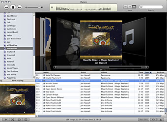
Finally, us poor CD designers are being treated with a bit more respect in the digital music world. Lots of improvements in the new iTunes (is it my imagination or is the sound processing better in this version?) but best of all is the splendid Cover Flow feature which allows you to select music by flipping through the album covers.

Very smart indeed although the graphics processing required is making my old G4 groan a bit. You also need to have artwork attached to all your ripped albums otherwise you’ll be looking at a lot of black squares with quavers on them. iTunes can get the missing artwork for you but only from the iTunes Store which rather limits the field; the more eclectic your taste, the more you’ll have to search for the covers yourself.
Another very welcome new feature: you can finally hear continuous tracks without gaps or clicks, something I’d complained about since v.1. It remains to be seen whether bands and record companies (and Apple, of course) are going to work out a way of giving us the rest of the album artwork but for now this is keeping me happy.
Previously on { feuilleton }
• Neville Brody and Fetish Records
• The lost art of sleeve design


Funny I should come across this post. I’ve been attempting to get album art for all my music, preferably of the 600×600 quality that the iTunes store provides, and some of the inevitably trickier ones are the various Moon and Serpent CDs that you provided memorable covers for. So I have blurry versions of those, and a high res version of the Beatles’ White album cover. Doesn’t seem quite right…
Hi David. In case you haven’t looked already, the M&S artwork is here.
I usually keep iTunes art between about 300 & 400 dpi (the latter when possible). And I certainly don’t use iTunes’ own facility for grabbing artwork after it mistook The Kinks for The King’s Singers. Discogs.com is a good source of cover scans, especially for obscure releases.
Thanks John, I think I’d discovered the art there before, but hadn’t grabbed it for some unfathomable reason. Gorgeous work. And a belated thanks for putting up Moore’s Asmodeus pic, that’s one I’d been looking for since I saw the cropped version on the cover of Esoterra. Cheers.