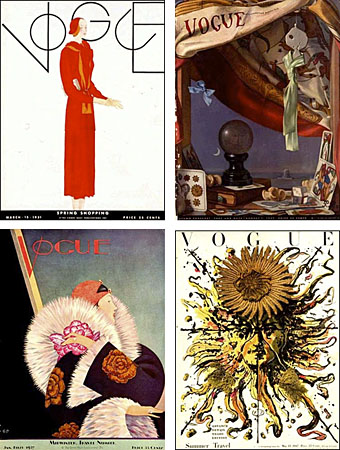
In the days before colour photography most magazine covers were created by illustrators (as the New Yorker still is), a situation that’s left behind a rich legacy of wonderful artwork often far more stimulating than any of the magazine contents. This site has a great collection of early Vogue covers that show an amazing amount of variety and originality at play. Some of these early issues even break with the understandable stricture for a fashion magazine of having a female figure as the focus.
Looking over this selection, it’s impossible not to compare the rich designs of the 1920s with today’s bland uniformity. Vogue now looks like any other magazine for women, with an overly made-up (often celebrity) face filling the cover and the whole picture crowded with sub-headings and a general clutter of typography. UK Vogue‘s own cover archive pages show the gradual degeneration of a stylish flagship to a condition of cultural muzak over the passage of ninety years.
Previously on { feuilleton }
• Vintage magazine art I
• View: The Modern Magazine


I agree. I am currently wrighting a paper on fashion illustrations in the 1920s, VS. covers nowadays, and it is quite striking how mush effort and playfull experimentation, both layout wise and in choosing motive, there was in that periode. Now, it is all about kreating/acting out a cool expression and getting someone, a model or someome famous, to show their bare shoulder and smile at the same time. I mean, that’s nice, but whats the point if everyone is doing that.
Once Vogue truely was first, last, everything; perhaps because we, the people, where more united – and this is not in a world peace kind of way – but there was a fashion way and if you liked fashion then you fallowed and read and you where interested in the paths it showed you. Now, I guess we are more divided, in the dressing department, also. Quite ironic actually, because, would you want to be an individualist who reads and looks in a magazine created for you or would you rather read something that did not attempt to catagorize you? Ok, think I’m digging too deep, and I am not quite sure what I’m looking for.-=
To sum.: Sure is sad about boring covers.
These covers are indeed rather lovely. They have elegance and flair, but, unlike modern magazine covers, have an essence of utter beauty. These amazing artworks really have so much more personality and style compared to the lacklustre, boring photographs of celebrities posing and smiling clad in skimpy clothing. These magazine covers are just so pleasing to the eye, and they make you think: “Wow, are these only magazine covers? They truly look like fine art.” Then you remember that magazine covers were once fine art. Adieu to those wonderful days.
All the old stuff I wore as a child is coming back. Kinda scary and makes you feel old, but it looks great most of the time.
That’s an awesome design, nice find.