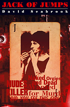
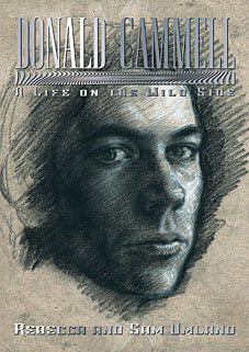
I designed these two very different covers last year (with some slight tweaking later). Books always take a while to reach publication, however, so both titles have ended up appearing in the same month. I was particularly pleased to be involved with the Donald Cammell book as this is the first substantial biography of the artist, writer and filmmaker.
Jack of Jumps by David Seabrook. (Granta)
Between 1959 and 1965 eight prostitutes were murdered in West London by a serial killer. These murders were the most notorious unsolved crimes of the 20th century. The killer’s motive and identity were the subject of endless speculation by the media, who dubbed him ‘Jack the Stripper’. Links to the Profumo scandal, boxer Freddie Mills and the notorious Kray twins were rumoured. By the time the body of the eighth victim was found in February 1965, a massive police operation was underway to catch the killer. The whole country waited to see what would happen next. The police had staked everything on the murderer striking again. But he didn’t….
By October that year, the Daily Express was asking ‘Is the Nude Killer Dead?’ In 1970 the detective who had led the enquiry announced in his memoirs that the police knew the identity of the killer ? that he had committed suicide as the net closed around him, and that the police had vowed never to reveal his identity. And that was that. Until now.
Seabrook has interviewed surviving police officers, witnesses and associates of the victims and examined the evidence, the rumours, and half truths. In this unique book, he reconstructs every detail of the investigation and recreates the dark, brutal world of prostitutes and ponces in 1960s West London. He questions the theory that the police’s prime suspect was Jack the Stripper, and confronts the disturbing possibility that the killer is still at large.
Donald Cammell – A Life on the Wild Side by Rebecca and Sam Umland. (FAB Press)
When Donald Cammell, the Scottish painter, filmmaker and novelist, committed suicide in 1996, he left behind a handful of unusual, innovative, frequently disturbing films. One of them – Mick Jagger’s acting debut Performance – is now an acknowledged masterpiece of world cinema.
“Donald Cammell was a wicked guy. I loved Donald, but he was wicked. I know so many people who will want to read this book.”
Roman Polanski
Donald Cammell’s extraordinary life was shrouded in both mystery and legend. In this provocative and comprehensive biography, Sam and Rebecca Umland explore Cammell’s remarkable life and times, from his father’s friendship with the notorious Aleister Crowley, to Donald’s early career as a society portrait painter in Chelsea and the beginning of his film career in Paris during the ‘Swinging Sixties’, via numerous doomed collaborations with Marlon Brando, to his final years of frustration and ultimate tragedy in Hollywood. In an effort to account for his wasted genius, the authors scrutinize revealing patterns in Cammell’s life that help to unlock the enigma of his death.


There’s a good documentary about Cammell I saw on TV once called DC: The Ultimate Performance
http://www.imdb.com/title/tt0168684/
http://www.sensesofcinema.com/contents/directors/02/cammell.html
http://www.callnetuk.com/home/compulsion/cammell.htm
http://www.screenonline.org.uk/people/id/456265/index.html
Shattered Borges image on the following link:
http://home.comcast.net/~flickhead/Performance.html
Yeah, I’ve got the documentary on tape. Excellent stuff. good to see it’s available on DVD now.
Cover Art
Forgot to comment on how good the cover was.
Nice how you have subtle touches like the lettering changing from light to dark and I like whatever it is you’ve done to the bit between David Cammell and A Life on the Wild Side but why is the image on your site
http://www.johncoulthart.com/bibliopoesy/cammell.html
so much better than the one used at the Fab Press site
http://www.fabpress.com/artwork/large/FAB072.jpg
(Dark and light bits on the writing seem reversed) and which was the final version used?
Thanks! The lettering for the online images of the cover has been processed to look like the silver ink used in the printing. I don’t have a copy of the book yet but even if I did these effects rarely reproduce well when scanned. The FAB site has an earlier version, hence the difference.