The BBC’s Great British Design Quest has reached a shortlist of ten:
1) Catseyes. Hmm, more of an invention to me but the brief here seems to be pretty broad.
2) Concorde. Can’t imagine this winning seeing as it’s generally regarded as a costly failure. In design terms though, it was a great-looking plane.
3) Grand Theft Auto. Er…a computer game? And one that merely imitates Hollywood at that.
4) The K2 phone kiosk. Some of these choices seem to be determined by nostalgia more than anything else. The cast-iron urinal phone booths are distinctive but I’m not sure they could be called “great”.
5) The Mini. This is a design classic, and, like the VW Beetle, still in use today.
6) The Routemaster bus. More nostalgia.
7) The Supermarine Spitfire. And again… I wonder what people would think if Germany voted in a similar competition for the Stukka divebomber?
8) Tomb Raider. Another computer game… Yes, it was surprising at the time but it was another game aping Hollywood. In game terms, something like the Rubik’s Cube was far more “classic” and original. But then that’s not British, is it?
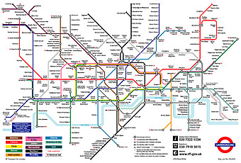
9) The London Underground map. This is the one I’d vote for. Harry Beck’s solution to mapping the first underground rail network was brilliant and elegant. Not only that but it’s stood the test of time and been imitated (and parodied) in similar transport maps all over the world. While we’re at it, let’s also remember Edward Johnston and Richard Kegler’s 1916 type design for the Underground system, the world’s first widely-used sans serif lettering.

10) The World Wide Web. Respect to Tim Berners-Lee and all, but, again, is this a design or an invention? And how British is the web? Do they mean the web or HTML?

Even though I’m not British I’d vote for the London Underground Map too or perhaps your version of it would be a better choice.
http://www.johncoulthart.com/pantechnicon/kabbalah.html
Well my variation wouldn’t exist without the original. There’s a site here that has a collection of some of the other playful variants people have produced:
http://www.geofftech.co.uk/tube/sillymaps/