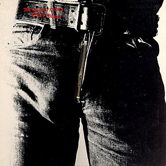
Listening to the Rolling Stones’ Sticky Fingers recently had me musing about the great cover design by Andy Warhol, probably his most well-known after the first Velvet Underground album. The music may sound better than it ever did in the Seventies but CD reissues can’t reproduce the brilliant sleeve which included a real metal zipper on the front of the jeans. The Seventies were the golden age of cover design, popular music had evolved considerably since Sgt. Pepper and the “album as artform” meant that bands were searching continually for new ways to exploit the medium of the record sleeve. Gatefold sleeves became commonplace, then expanded into multiple foldout affairs; expensive gimmicks like the Stones’ zipper arrived pretty swiftly and there were other striking novelties like the first Faust album, a clear vinyl record, in a clear plastic sleeve.
Significantly, Warhol’s Velvet Underground design was also a) gimmicky, with its peel-able banana skin, and b) similarly phallic-oriented, as the banana beneath the skin was a pink one. (Original copies of this album are easy to spot in shops since they’re nearly always missing the skin). Joe Dallesandro is supposed to be filling out the trousers on the Stones’ album, a refreshingly homoerotic moment in the often resolutely sexist world of rock graphics. Nice of the Stones to be so daring but then Jagger at least didn’t mind dancing along the boundaries of sexuality in Performance and it was about this time that they were playing their scurrilous rent boy song, Cocksucker Blues. It’s also quite a macho image, of course, and aggressively sexual, so they get to have their cock cake, and eat it, as it were.
Fancy album sleeves fell out of fashion somewhat when punk came in but there were still things like the first Durutti Column album with its sandpaper sleeve intended to destroy the records it was stored with. I was fortunate to be able to do some vinyl design when I was starting out in the early eighties, even if I wasn’t allowed to design anything quite so elaborate. Some of the designs for the Alan Moore and Tim Perkins CDs take advantage of different booklet arrangements but it’s not the same as having all that space to play with. Now that music is thoroughly digital the visual component is reduced even further. A 300 x 300 pixel image in iTunes is a poor substitute for the tactile (and erotic…) pleasures of the album as artefact.
Elsewhere on { feuilleton }
• The album covers archive

I just discovered this blog via AceJet and – as a designer with a music blog – I’m very happy to have found it.
I don’t think punk killed sleeve design, fancy gatefolds may have gone out of fashion but records still came in some very inventive sleeves (the first PiL single wrapped in a fake newspaper for example). What killed sleeve design was the CD. There just isn’t the room to be as conceptually clever anymore and the typography has to be ‘louder’ to get noticed.
Far from killing record sleeve design, Punk actively promoted it, with an explosion of bands and their low budget recordings all demanding a strong visual presence.
Barney Bubbles did some of greatest work 9for Stiff and Radar) in the wake of Punk, and Peter Saville’s inimitably magificent works for Factory Records would not have happened without the impetus of the Sex Pistols spurring the whole country into a frenzy of musical activity.
Bubbles.
Garrett.
Saville.
Oliver.
Plus,before Punk, there was virtually no such thing as a single sleeve.
Punk definately upped the ante in terms of record design.
TB