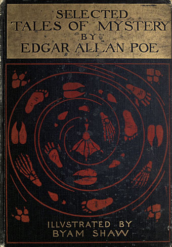
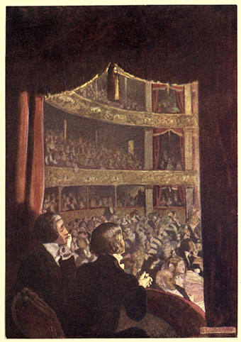
There’s always more Poe. Selected Tales of Mystery was published in 1909, and is one of several illustrated editions produced by British artist Byam Shaw (1872–1919), a painter like Frederick Simpson Coburn who was better suited to the one-off canvas than the illustrated text. There ought to be a term for this kind of illustration—”The Easel School”, perhaps—in which all the techniques and staging of the academic artist are applied to stories or novels, techniques which too often lead to a succession of well-painted figures gesticulating to each other in well-painted rooms. The canvas painter in the first years of the 20th century was also subject to the limitations of print technology which at the time could only reproduce a narrow range of colours.
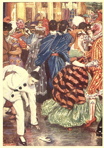
William Wilson
The question of how best to illustrate a story using realism rather than stylistisation has been a recurrent one recently with regard to a commission of my own. I’ll be discussing this later but something that occurred to me while considering the issue was that illustrators today have access to a visual vocabulary derived from cinema that didn’t really exist until the 1920s. An artist like Byam Shaw would never think to depict a scene from a very high or very low angle, even though high- and low-angle views of dramatic scenes had been familiar to theatre audiences for many centuries. (He does use a high angle for A Descent into the Maelström but so do most artists who illustrate that particular story.) Virgil Finlay’s 1952 illustration for The Tell-Tale Heart is a cinematic view with its combination of flattened perspective and deep focus. In the same issue of Fantastic there’s an illustration by Gaylord Welker that could be a still from any film noir of the 1940s.
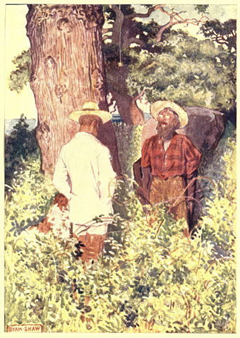
The Gold Bug
Reservations aside, Shaw’s Poe is worth a look if only to see which moments he chooses to highlight from each of the stories…or those he doesn’t. One of the problems with illustrating a popular writer like Edgar Allan Poe is that you have the choice of attempting to compete with other artists by illustrating the same scene as everybody else or you avoid the obvious moments in favour of something new. Shaw had an advantage in working without the burden of precedent but his climax for The Masque of the Red Death is overwhelmed today by our acquaintance with Harry Clarke’s definitive illustration. The most original thing about the Shaw edition is its cover, with a trail of human and animal footprints spiralling into a maelström towards…what? A webbed foot? This curious design suggests a set of illustrations that the contents don’t deliver.
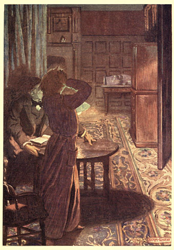
The Fall of the House of Usher
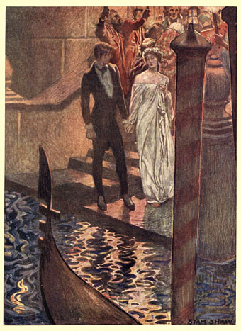
The Assignation
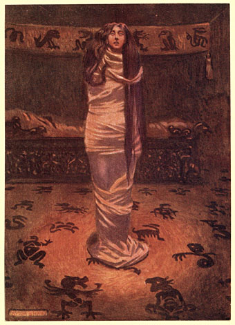
Ligeia
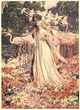
Eleonora
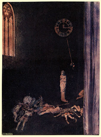
The Masque of the Red Death
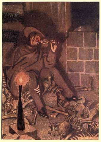
The Cask of Amontillado
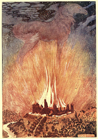
Metzengerstein
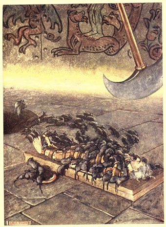
The Pit and the Pendulum
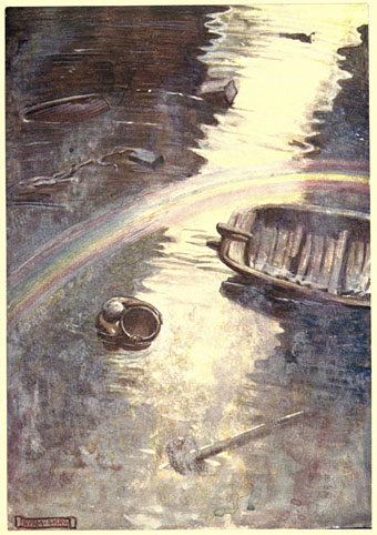
A Descent into the Maelström
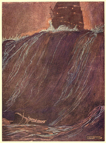
MS. Found in a Bottle
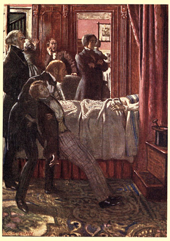
The Facts in the Case of M. Valdemar
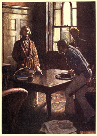
The Murders in the Rue Morgue
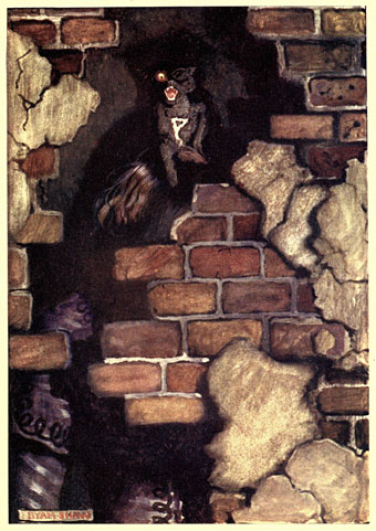
The Black Cat
The Spectacles
Elsewhere on { feuilleton }
• The illustrators archive
Previously on { feuilleton }
• The Purloined Eidolon
• Martin van Maële’s illustrated Poe
• Narraciones extraordinarias by Edgar Allan Poe
• Fritz Eichenberg’s illustrated Poe
• The Pendulum, the Pit and Hope
• Hugo Steiner-Prag’s illustrated Poe
• Burt Shonberg’s Poe paintings
• Illustrating Poe #5: Among the others
• Illustrating Poe #4: Wilfried Sätty
• Illustrating Poe #3: Harry Clarke
• Illustrating Poe #2: William Heath Robinson
• Illustrating Poe #1: Aubrey Beardsley
• Poe at 200
• The Tell-Tale Heart from UPA
• William Heath Robinson’s illustrated Poe

Ian Miller’s version https://archive.org/details/talesofmysteryim00edga_2/page/30/mode/1up?view=theater
Thanks, I’d not seen that one before. There’s always more…