So I had a bright idea at the end of September… Instead of rehashing old work for a CafePress calendar design, I thought I’d try something new. I hadn’t done any artwork for myself all year, everything I’d been working on was a commission of some sort. In addition to that, I’d spent a large portion of the year delving deeper into the psychedelic music of the late Sixties, especially the wealth of obscure British bands to be found on the seemingly endless series of compilations which have trickled out over the past two decades. Everyone is familiar with Jefferson Airplane’s White Rabbit but, as I’ve noted before, themes from, and allusions to, the Alice books run through British psychedelia to an even greater degree. The Beatles put Lewis Carroll in their pantheon of influences on the cover of Sgt. Pepper, and Wonderland’s atmosphere of Victorian surrealism chimed perfectly with a resurgence of interest in Victorian art and design.
So at the end of September, mulling over ideas, I picked up one of my Lewis Carroll volumes and looked at the chapter list: 12 chapters…12 months…I could do a psychedelic Alice in Wonderland! The only drawback was being weighed down by ongoing work which meant that anything I did would have to be created quickly and easily. I reckoned it was manageable if I put a few rules in place first: try and rough out a chapter a day; make copious use of clip art decoration and scanned engravings; keep things bold and florid without worrying too much about fidelity to minor story points. In theory I could do the whole thing in about two weeks if I kept on schedule. As it turns out the whole thing took me three weeks as I got increasingly involved with illustrating the story. You can see the results below and larger copies of the pictures here. Two years ago I was saying I probably wouldn’t ever illustrate Lewis Carroll. That was true at the time since I couldn’t find an approach to the stories that would sustain my interest and (possibly) bring something new to the books. Seeing Alice’s adventures through the psychotropic prism of the late Sixties showed me the way into Wonderland. What’s needed now is to do the same next year for Looking-Glass Land. Watch this space.
Some notes on the pictures follow below.
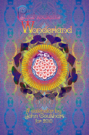
Update: By popular demand, this calendar is now available again.

Down the Rabbit Hole.
A great secondhand find recently was a 1970s reprint of the entire Harrod’s catalogue for 1895, over 1000 pages of engraved pictures which was a big help in quickly establishing mundane details such as bottles, watches, etc. Alice changes size and shape from month to month; since I was working at speed I had to live with that. The figures are from Victorian ads or Punch magazine illustrations. In order to keep them consistent I tinted the girls in each picture the same colour.
The typeface used throughout is a design from 1879 called Kismet. Not only does it appear in the Harrod’s catalogue, I’ve also seen it used on the covers of psychedelic compilations which made it the perfect choice for these pictures.
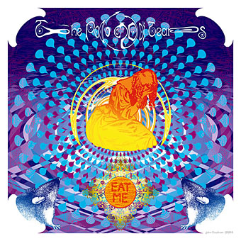
The Pool of Tears.
Things are still pretty bold at this point. Yes, there should only be one mouse but the symmetry worked better.

A Caucus-Race and a Long Tale.
I kept to the schedule for the first two pictures but this was the point where it started to get difficult. Tracking down all those animals took longer than intended and this became the pattern for many of the subsequent pictures. Roughing them out was easy but I’d then spend ages looking for one precise detail. Sometimes it really is quicker to just draw something…

The Rabbit Sends in a Little Bill.
The house is made from parts of a Victorian architect’s catalogue set against a rather splendid paisley background.
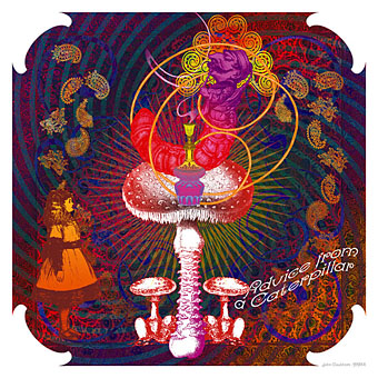
Advice from a Caterpillar.
The mushrooms are Fly Agarics, of course, and it’s been pointed out to me that their arrangement is rather phallic; that wasn’t my intention but never underestimate the power of the subconscious. The paisley background I wanted to look like a Persian carpet. The hookah—which I amended with an extra bowl—was another detail from the Harrod’s catalogue.

Pig and Pepper.
The Cheshire Cat is Steinlen’s famous Chat Noir while the Duchess is the painting of La vecchia grotesqua by Quentin Massys upon which Tenniel is supposed to have based his drawing. I gave her a pair of “granny glasses”. Finally, the fractal background is made from one of Louis Wain‘s psychedelic cat faces.
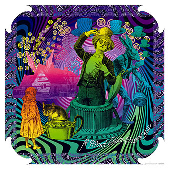
A Mad Tea-Party.
This is my favourite of all the pictures. I’d no idea what I was going to do for it until I set to work and it came together very easily. The Hatter is bursting out of a Victorian hat-maker’s contraption.
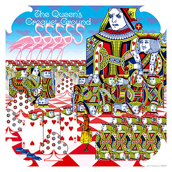
The Queen’s Croquet-Ground.
This one isn’t psychedelic at all but the playing cards—which are florid enough to begin with—looked best without any additional ornament.

The Mock Turtle’s Story.
Lots of aquatic decoration for the Mock Turtle’s undersea tales.

The Lobster Quadrille.
I decided against dancing lobsters; too time-consuming and even Tenniel only had one looking in a mirror. The peculiar roller-skates (skates…a pun, geddit?) are a genuine Victorian invention; the nautilus-headed woman isn’t.
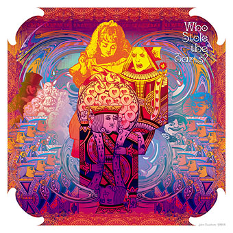
Who Stole the Tarts?
Rather a chaotic scene, as fits the chapter, but I would have done more with this had there been time. The background is an engraving of the House of Commons but you’d never guess unless I’d mentioned it.
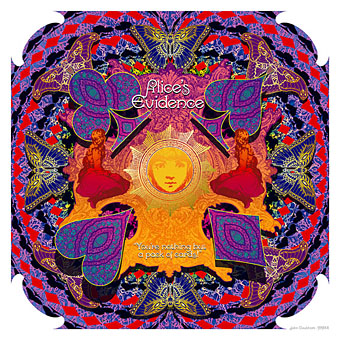
Alice’s Evidence.
Sharp shadows imply a return from dreamland. I’ve used those Art Nouveau butterfly shapes before and couldn’t resist slipping them in here. In the book the flying cards at the end turn into dead leaves which seems wrong for the month of May when the story is set; butterflies seem more suitable. For those who don’t want a calendar I’ll be putting these pictures together as a poster design at some point. Not just now, I’m feeling all psyched-out.
This series of pictures is dedicated to Michael English, of the great psychedelic design team Hapshash and the Coloured Coat, who died while work was in progress.
Previously on { feuilleton }
• Charles Robinson’s Alice’s Adventures in Wonderland
• Humpty Dumpty variations
• Michael English, 1941–2009
• Alice in Wonderland by Jonathan Miller
• The art of Charles Robinson, 1870–1937
• The Illustrators of Alice

Wow very nice calender I think I am going to go order it right now. I love Alice and so does my little girl. This will go over well for both of us. Thanks for the review.
utterly mindblowing. each of these images deserves a poster in its own right.
stunning John … just stunning!
Wonderful, chap! Congrats!
Rats – too expensive to ship to the US. I’d love to see this on my office wall every day next year
Thanks everyone. :)
Rina: CafePress are based in the US so postage should be standard US rates unless they’ve changed things recently.
Well done, John! I want it!!
Beautiful and very tempting.
Great work!
Beautiful! I just ordered it – sooo glad I came across this one :)
Thanks, Ashley, and to everyone who’s linked about this and ordered a copy.
Thanks for sharing the fact that you had a very tight schedule, and your plan for producing good work quickly. I have a lot to learn about this and it helped immensely.
Very nice artwork, it reminds me a great deal of the art that accompanied Randy Greif’s illustrious five CD audio series. You can see some samples here, if you’re interested: http://www.discogs.com/viewimages?release=131510
Thanks, I’d not come across that release despite having a few recordings on the same label.
I would heartily recommend seeking the box set out, if you can. It’s a completely surreal experience, quite unlike anything else out there.
Skates! I get it now!
Heh. Lameness of the joke aside, I suppose it suits Dodgson’s puns and word games.
This is perfect! How do I order one?
Thanks PD, they’re on sale here.
PLEASE PLEASE make this for 2012!!!!